49 Best Shopify Supplements Website Examples
I found the best Shopify supplements websites that boost sales sky-high!
These sites sell trust before they sell capsules. Here’s what actually works:
- Lead with proof, not promises. GEM
 pairs lifestyle photography with “30 million+ Bites enjoyed” and specific improvement stats… that’s conversion gold on Shopify’s rigid templates.
 - Organize by benefit, not SKU. Spacegoods
 uses color-coded cards for Focus, Restore, Sleep, Hydrate. This guided approach beats generic collection grids every time.
 - Stack micro-trust relentlessly. I’m Nutrients runs a scrolling marquee with “Mum-Founded” and “Australian Made”… because supplement buyers need constant reassurance.
Browse the full gallery for more Shopify supplements design inspiration.
Mimic your favorite site with AI!
- Select an image
- Describe your project
- Click generate
- Open in Lovable or copy the prompt to another AI builder
Mimic is free to use and no sign-up is required. Lovable has a free tier.
 Mimic this
This fiber supplement site leads with "#1 Product of the day" credibility and sells a subscription model with "10% discount on every recurring order" prominently displayed.
 Mimic this
This wellness supplement site uses fashion editorial photography and "MENTAL WELLNESS, REDEFINED." as hero copy, positioning nootropics as luxury lifestyle.
 Mimic this
This personalized nutrition site sells 3D-printed vitamin stacks customized through a quiz, using a warm terracotta gradient hero and serif typography in navy.
 Mimic this
This vitamin supplement site pairs hands holding bottles with a cream-to-teal gradient and leads with "Doctor-Developed Vitamins with Benefits You'll Feel."
 Mimic this
This natural supplements e-commerce site leads with "The Natural Way to Feel Your Best—From the Inside Out" and uses overlapping amber glass bottles and benefit badges like "Brain Fog" and "Gut Health" to anchor product discovery.
 Mimic this
This jet lag supplement site opens with "Jet lag is a choice" and stacks product shots, app interface, and athlete testimonials in a two-column hero.
 Mimic this
This plant-based protein site arranges product categories in a four-column grid with lifestyle photos and stacks a split-layout Autoship section with circular benefit icons.
 Mimic this
This French supplement e-commerce site uses a scrolling orange ticker for stacked promotions and anchors product cards with colored benefit tags like "Sommeil réparateur" and "Sans sucres."
 Mimic this
This supplements site uses a two-column hero pairing product lifestyle photography with "30 million+ Bites enjoyed" social proof and time-segmented results stats (69%-79% improvement metrics).
 Mimic this
This men's supplement site leads with "STAY IN YOUR PRIME" and stacks trust badges (Made in USA / Free Shipping / Money Back Guarantee) beneath an all-caps hero headline.
 Mimic this
This functional wellness DTC site organizes products by benefit—Focus, Restore, Sleep, Hydrate—in a four-column grid with color-coded card backgrounds.
 Mimic this
This children's supplements shop uses a split hero with emoji-filled product copy ("good gut bugs 🌱 & smooth moves 💩") and a scrolling trust marquee featuring "Mum - Founded" and "Australian Made."
 Mimic this
This plant-based protein site leads with mixed typography—italic "Delicious" paired with bold sans-serif product copy—and repeats a marquee promo code banner across the top.
 Mimic this
This women's supplement site headlines "see-results vitamins. powered by evidence based ingredients." with a lime-green CTA and a scrolling trust banner listing clinical credentials.
 Mimic this
This frozen supplements shop leads with a split hero—serif headline paired with a hand holding vibrant popsicle-like tubes against a cream background.
 Mimic this
This health supplement site sells green powder with a split layout pairing lifestyle photography against benefit callouts with circular green icons.
 Mimic this
This wellness supplement site leads with a mosaic hero grid mixing product packaging, food prep, and lifestyle imagery beneath "Nourish your body naturally with Noode."
 Mimic this
This protein supplement site uses a split hero with serif headlines, colorful gradient product photography, and a scrolling top ticker announcing restocks and shipping thresholds.
 Mimic this
This functional mushroom supplement site uses a marquee ticker with product claims ("Shrooms That Really Work," "No Fillers, Just Fungi") anchoring the hero.
 Mimic this
This meal replacement shop uses sky-blue hero section with inline product imagery, accordion-expandable use cases, and floating annotation badges on lifestyle photography.
 Mimic this
This plant-based nutrition site uses a thin promotional banner, ingredient trust badges, and press logos to build credibility before showing product cards.
 Mimic this
This natural sweetener brand site uses a split-layout quiz section pairing product photography with a cream-colored content block to segment new versus returning customers.
 Mimic this
This supplement e-commerce site leads with "Hormone Balance IN ALL STAGES OF LIFE" over a woman holding the product, then scrolls through a trust bar of certifications before showcasing best-selling DIM variants.
 Mimic this
This hair vitamins ecommerce site contrasts "Forget Thin, Damaged Hair" against product badges that promise "LESS SHEDDING" and "FASTER GROWTH" in yellow pill shapes.
 Mimic this
This probiotic supplement site leads with scattered polaroid photos against a wooden texture, then stacks three "#1 trusted" badges before showing products.
 Mimic this
This supplement landing page sells an Ayurvedic powder through subscription tiers with "30% OFF" and "40% OFF" badges positioned as savings anchors.
 Mimic this
This Norwegian wellness e-commerce site anchors its hero with a classical marble statue and uses "One tree *planted* per order" as the sustainability hook.
 Mimic this
This fitness supplements site introduces products with full-width hero featuring oversized product bottles and a bold "MOJO 2.0" serif headline over dark geometric backgrounds.
 Mimic this
This plant-based nutrition site headlines "Trust" in cyan italics and organizes supplements, proteins, and meal plans as three equal product columns with pill-shaped cyan buttons.
 Mimic this
This supplements e-commerce site organizes products by health outcome (heart, brain, digestive, immune) rather than ingredient type, using circular category icons and tropical botanical imagery.
What the Top 0.1% of Shopify Supplements Websites Get Right
I analyzed these high-performing supplement sites and found clear patterns that separate the winners from the wannabes.
Visual Identity: Color Psychology and Clean Aesthetics
Premium supplement brands lean heavily into trust-building color palettes that signal health and credibility.
- Earth tone dominance: About 75% use muted greens, beiges, or creams as primary backgrounds. Forest Super Foods
 uses warm beige (#f5f3ee) while Boosty
 employs lush green nature photography to reinforce their plant-based positioning
 - Strategic accent colors: Roughly 80% pair neutral bases with bold accent colors for CTAs. Spacegoods uses hot pink (#FF00AA) against black, while Mayven deploys bright lime green (#b8f5a2) for buttons to create urgency without sacrificing trust
- Typography hierarchy: Nearly every site mixes serif display fonts for headlines with clean sans-serif for body text. NARA
 Health and GEM both use this combination to balance approachability with scientific credibility
→ The winning formula combines calming earth tones with one punchy accent color that drives action.
Layout and UX: Trust-First Navigation and Social Proof
These sites prioritize credibility over flashy design, with navigation patterns that immediately establish authority.
- Press logo bars: 9 out of 10 sites feature media logos within the first two sections. Ally
 showcases Vogue, Harper’s Bazaar, and Cosmopolitan in a clean horizontal strip, while H-PROOF
 displays Fortune and Men’s Health to build instant credibility
 - Hero section splits: About 70% use asymmetrical layouts with product imagery taking 55-60% of hero space. Nourished
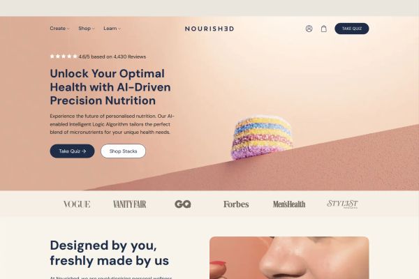 and Jiggies
 both position detailed product shots on the right while keeping copy concise on the left
 - Certification badges: Every site displays trust signals, but winners cluster them strategically. Aloha
 shows 7 certification icons (B Corp, Fair Trade, Non-GMO) in a dedicated strip, while ZOHI
 uses 4 circular badges for “Sans sucres” and “Végétariens”
→ Lead with press credentials, then let product imagery do the heavy lifting while keeping copy minimal.
Copy and Messaging: Benefit-Forward Headlines and Scientific Language
The best supplement sites avoid generic wellness speak and get specific about outcomes and ingredients.
- Outcome-driven headlines: Top performers lead with results, not features. GEM uses “The purest source of vitamins come from real food” while Flykitt
 declares “Jet lag is a choice” to immediately position their solution
 - Scientific credibility: About 85% include clinical or research language in their messaging. NARA Health mentions “Science-backed, super delicious nutrition” while Adaptogents
 emphasizes “STRENGTH. CLARITY. CONTROL. CONFIDENCE” with specific benefit callouts
 - Social proof integration: Winners weave customer numbers into headlines rather than hiding them in footers. Forest Super Foods prominently displays “300K+ Orders Sent” and “4.9 Average Rating” directly in their hero copy
→ Start with the transformation, back it up with science, then prove it with real customer data.
Skip the generic “wellness journey” language and get specific about what your supplement actually does. The top performers know their customers want results, not inspiration, and their design choices reflect that laser focus on outcomes over aesthetics.