How to Add Glassmorphism on Webstudio (Let’s Blur!)
How to add a blur effect in Webstudio to achieve glassmorphism and other tips to polish it. Plus a demo on Webstudio for you to copy and paste.


Ahhh Glassmorphism… 😍 makes for such an ascetically awesome UI!
But how does one implement such awesomeness in Webstudio?
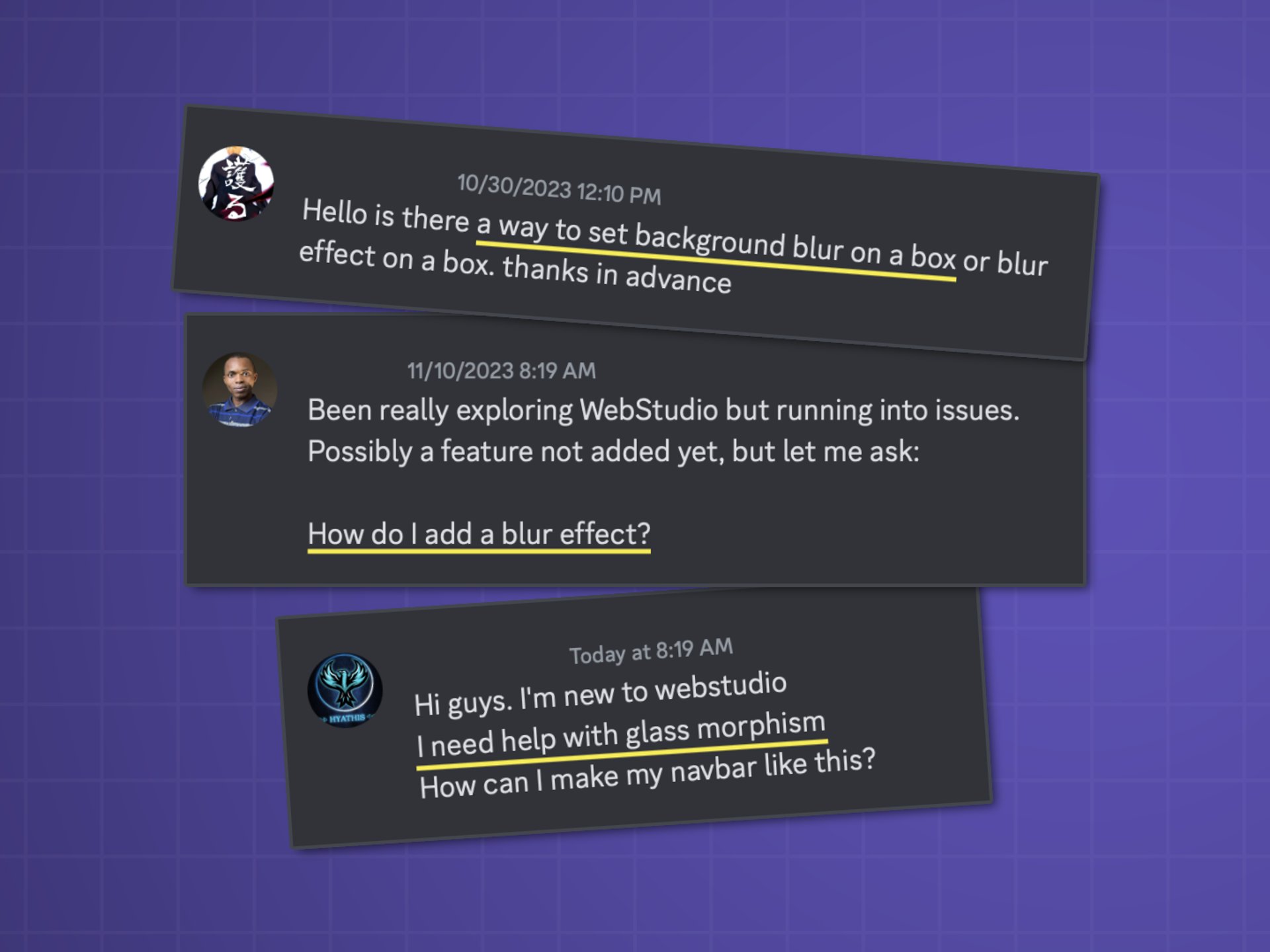
Well, you’re not alone for wondering. This is probably the most frequently asked question in the Webstudio Discord.
See…
In this guide, I’m going to show you how to add a blur effect in Webstudio to achieve a glassmorphism design + some tips to make it look extra good!
And in this course, I'll show you how to go from zero to complete website including SEO in Webstudio.
It’s actually quite simple. So let’s dive in!
How to add a blur effect and achieve glassmorphism in Webstudio
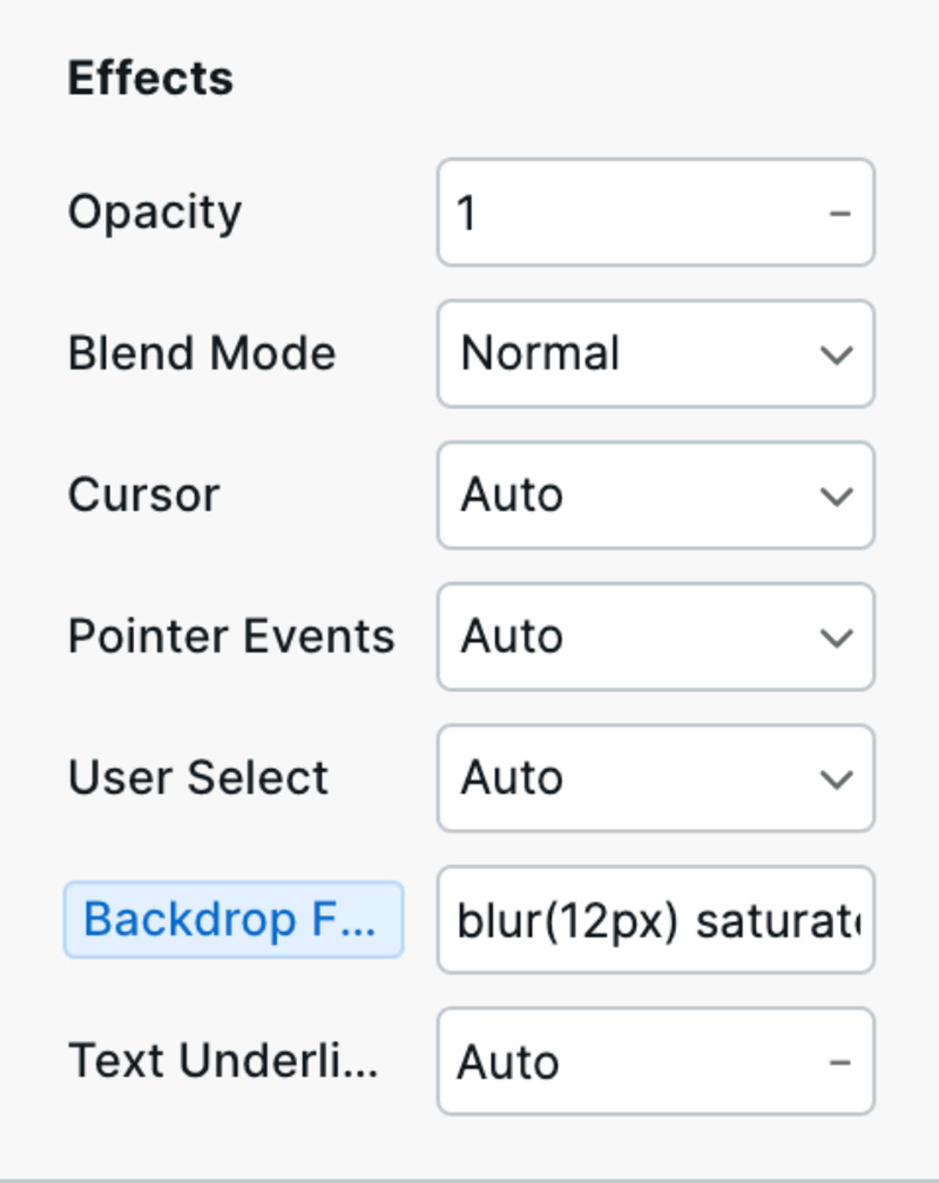
- Go to style panel on the right and find “Effects” towards the bottom
- In the Backdrop Filter field type (or paste) “blur(10px)” in it
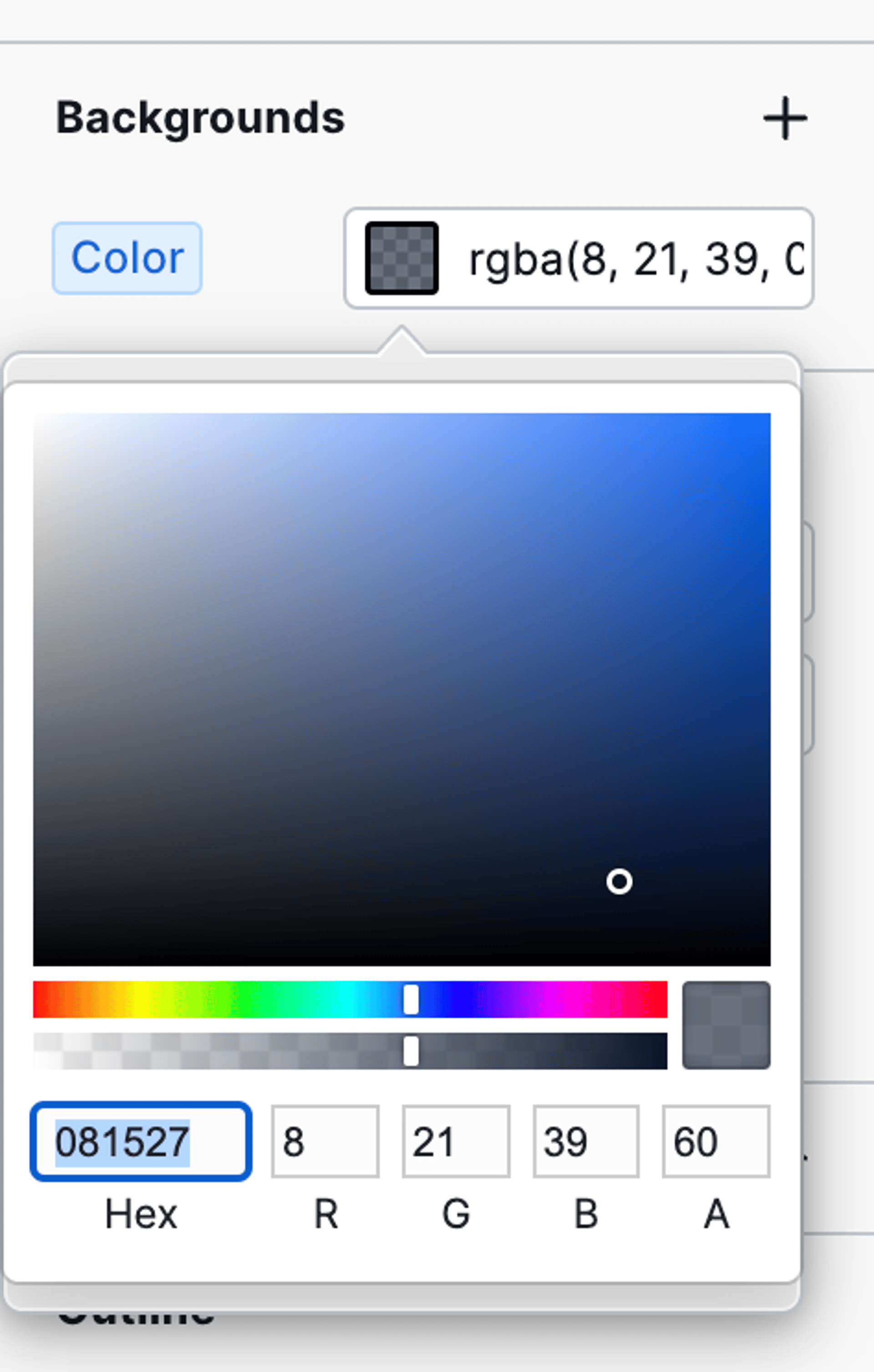
- Nothing will show unless you also add a background to the same box. You can add a background and drag the opacity slider all the way to the left for no background. Or you can make it slightly opaque if you wish to make it darker or lighter. Just mess around with it an see what works for you.
You can reference my glassmorphism demo in Webstudio and and even copy the box and paste it into yours!
Make it look polished!
Beyond adding blur there are several more things that will give your glassmorphism a better look.
Add saturation to make colors more vibrant
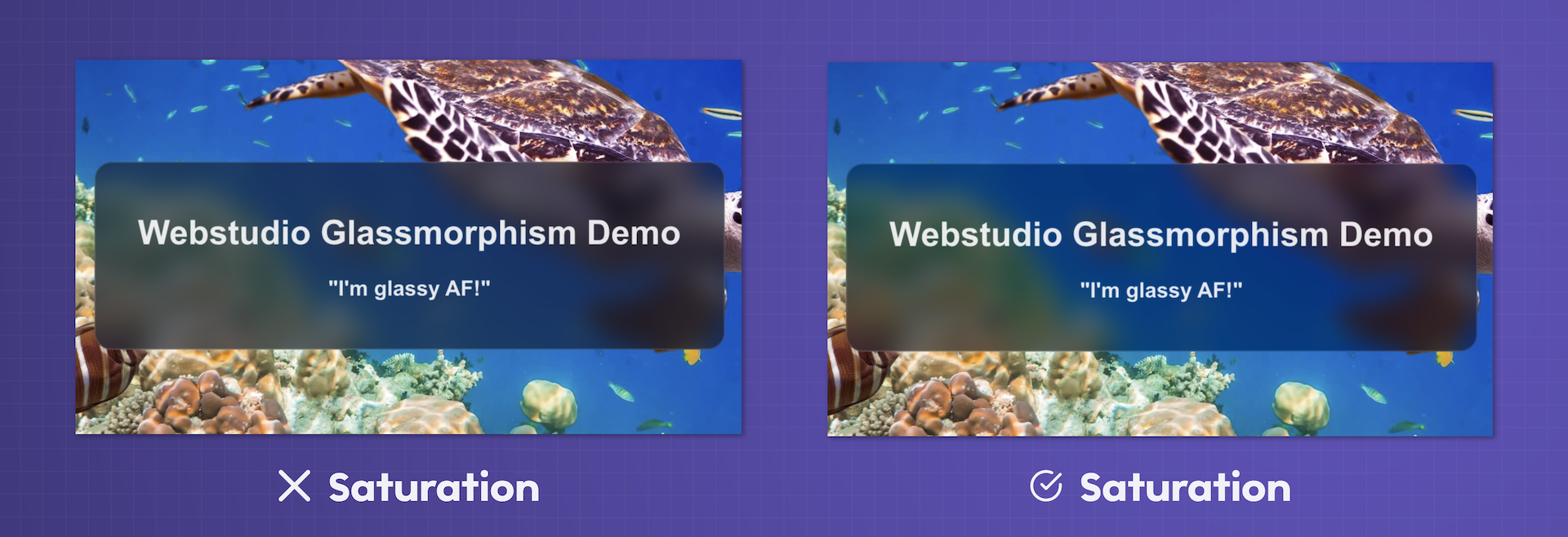
When you blur, the colors can fade a little.
So I like to add another Backdrop Filter called saturation.
My field looks like this blur(12px) saturate(180%).
Mess around this the values to tune it for your scenario and preferences.
You can add other filters that can be found in the official spec guide.
Add an opaque border
Adding a border with an opacity to it will make your glassmorphism look more polished. Kind of like there’s a shine to it.
So add a border that’s not super obvious, but instead subtle. I like to add a slight opacity to it so it also brings in some of the background colors.
Add a border radius
The radius seems to make everything look more polished. It’s something Steve Jobs insisted the icons have in Apple’s various OSs. And when people argued against it, he’d say look at any street sign and observe the edges. Are they rigid corners or round?
Speaking of Apple, they use glassmorphism too! Check out the dock for example:

Glassmorphism Resources
- My Glassmorphism demo for your reference
- A Glassmorphism generator
- Webstudio Course