 John Siciliano Some of my content contains affiliate links.
 How I Built a Minimalist Site
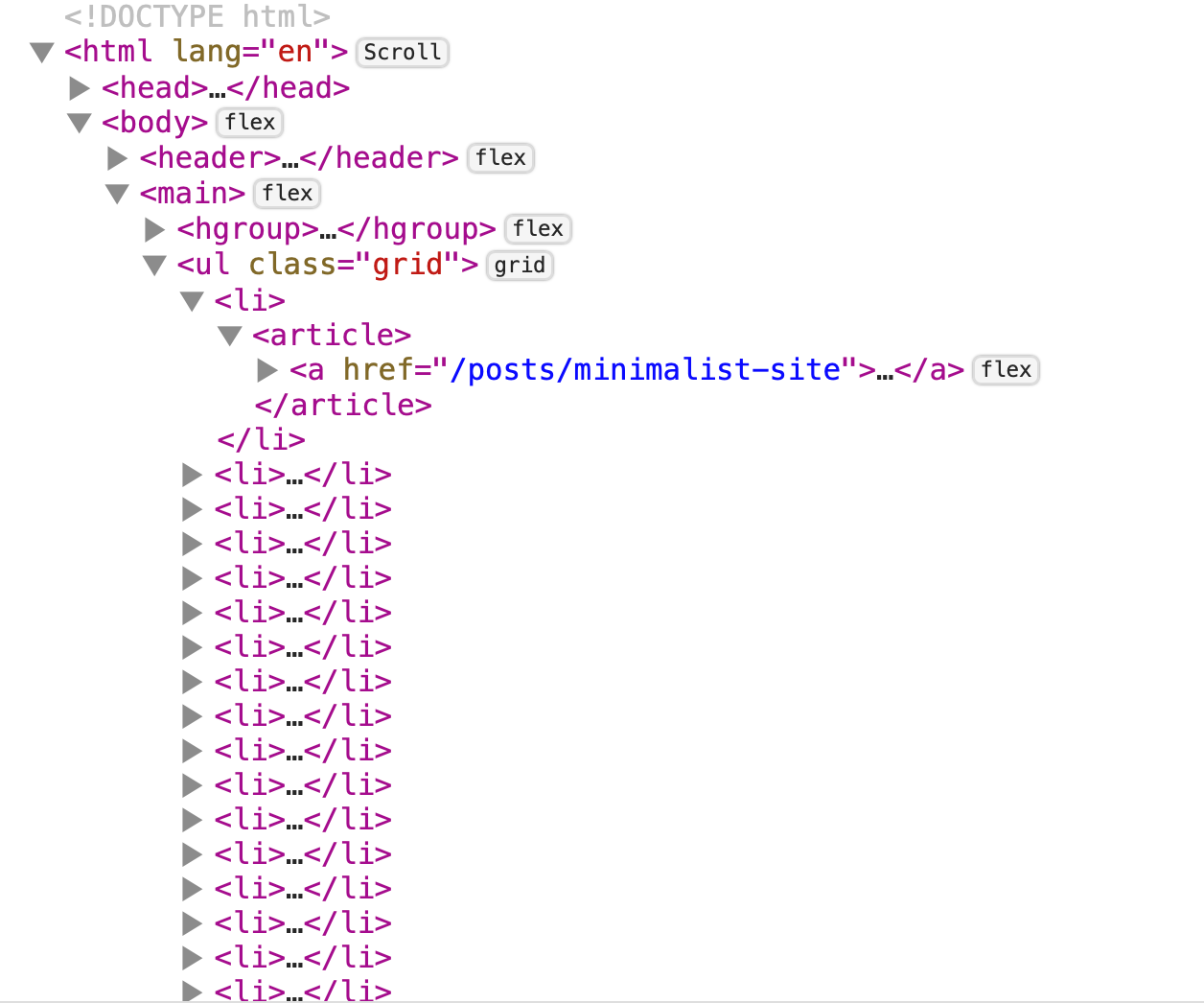
I built a site with just 15 classes without sacrificing maintainability. Here's why and how.
There are a gazillion CSS libraries and packages out there to build a website. And they are awesome. But I went with none of them.
Instead, I went library-less. Not even one of the minimalist varieties.
Here are my reasons why and some of my decision-making, which enabled the tiniest amount of CSS (while not sacrificing maintainability).
The Mental Model: Simplicity Over Perfection
I recently adopted a mindset that simple is better, even if the better thing is actually better. Huh?
Yeah, Notion is better than Apple Notes and iTerm is better than Terminal, but my theory is that the benefits these tools provide end up costing in research, decision making, configuration, maintenance, and sometimes $$$.
So I try to use the default stuff unless it's solving a critical part of my operations/business. Then I go pedal to the metal but still prioritize minimal maintenance.
If you're not totally convinced, frankly, I'm not either. I can see myself changing course on this, but I can't tell you how many times I've over-engineered something that is great in the moment but doesn't adapt well or just a pain to jump back into.
By staying lean, I can move faster.
So this mindset brings me to my website: how do I keep things simple?
The Stack
- Astro: HTML-first framework for building sites. Very simple.
- Sanity: Content operating system. Ultra flexible, minimal maintenance.
- Cloudflare Workers: Serverless infra. Supa fast and cheap.
That's it. And yeah, there is...
...no CSS library
This is the big one.
Sure, Open Props provides fire CSS variables and Tailwind offers like every style in a class, but it's overkill for my needs.
I started researching minimalist CSS libraries and mostly liked what I saw, especially with Pico CSS, but still, it was overkill. I didn't need most of it.
Though Pico did provide one important thing: inspiration from their classless version.
Designing a site without classes... is it possible?
No, but I got close, and this became my methodology.
How can I style this thingy without a class (while keeping things highly maintainable)?
Styling without classes (well, only 15)
In order to style with minimal classes, I needed to make some assumptions.
I started by solving for ultra-common layout stuff like sections, containers, and navigation.
The assumed structure was this:
body
  header
    nav
      ul
  main
    section
  footer
With this structure, I can apply layout-esque styles like containers.
Replacing .container
With the use of PostCSS mixins, I didn't need a container class. Instead, I apply the mixin to the elements that I assume need a container, such as body > header and body > main. This accomplishes reusability (DRY) and zero classes.
@define-mixin container {
  max-width: var(--size-lg);
  margin-inline: auto;
  padding-inline: var(--spacing-default);
}
The unavoidable classes
There's just not enough semantic HTML tags or attributes to style a site without classes. If I went completely classless, I'd have to sacrifice too much on the presentation.
The classes I needed can be classified like this:
- Utility
float-left: jkrich-text: For the parent of rich text, so proper margins can be added to the children.grid: A simple grid. For specific columns/rows, they can be overridden on a local level.trim: Probably specific to my project, but it was for trimming and fading out text when it was close to a boundary.round: Full border radius I could apply to profile images and more.sticky: Defaults styles and they can be overridden locally as needed.flex: See the flex section for more info.flex-column: See the previous point to see the other point.flex-between: See the previous point to know about the previous point to see the other point.no-wrap: Wrap is enabled by default, but there were a handful of cases I needed that disabled.layout: This defined some reusable layout I needed for several pages (e.g., sidebar and main).
- Variants
- <a>
is-a-button,is-button-even: These are "variants" I apply to links.
- <a>
- Components (not going into specifics because they were specific to my site)
- logo-wrapper
- related
- filter-wrapper
Flex and Grid
It seems there are no semantic HTML elements or even properties that could communicate layout like a grid of items.
Enter minimal flex and grid classes.
Minimalist grid
Here is the single class I use for grid:
:where(.grid) {
  grid-column-gap: var(--gap-s);
  grid-row-gap: var(--gap-s);
  display: grid;
  grid-template-columns: repeat(auto-fit, minmax(25%, 1fr));

  > * {
    min-width: 0;
  }

  @media (--screen-md) {
    grid-template-columns: 1fr;
  }
}With Astro's style engine, I apply grid as a global class, then override it with more specific declarations where necessary as scoped definitions. Learn more about styling in Astro.
Minimalist flex
There are a lot of variations I could write here, but I went with just a few. Sometimes I find myself wanting more, but decide to have some undesirable alignment in my UI rather than creating a class. A bit extreme, one could say.
:where(.flex) {
  display: flex;
  flex-direction: row;
  align-items: center;
  gap: var(--gap-xs);

  &:not(.no-wrap) {
    @media (--screen-md) {
      flex-wrap: wrap;
    }
  }
}

:where(.flex-column) {
  display: flex;
  flex-direction: column;
  gap: var(--gap-xs);
}

:where(.flex-between) {
  display: flex;
  flex-direction: row;
  align-items: center;
  justify-content: space-between;
  gap: var(--gap-xs);

  &:not(.no-wrap) {
    @media (--screen-md) {
      flex-wrap: wrap;
    }
  }
}
Little misc things that add up
- For success and error messages, I use emojis (✅/❌) instead of classes and styles.
- I didn't tweak the design/layout to perfection. There are a handful of awkward areas. This mindset really buys into "greater gains by keeping things simple".
- Astro has a concept of Global and Scoped styles. For example, if
flexis defined as a global and on one of my pages I target.flex { <some styles> }, Astro automatically adds some ID during compilation like.flex[data-astro-cid-hhnqfkh6]so that the styles are scoped to just that file. However, I didn't use this too much as I tried to keep all styles to a minimum. - I apply a muted color and smaller font size to
<small>. - I use just one breakpoint. You're either viewing on big screens or small screens. Some relative units help scale things without adding breakpoints (think
vw/h,%,clamp()). - "Modern" CSS can help target without classes. Like
a:has(> img). I use that to target linked images. - I heavily rely on semantic HTML such as
hgroup,footer(which can be used multiple times on a page), andaside(which I use for article callouts). - Rely on attributes where possible. For example, I use
[aria-current="page"]to target "active" links without.active. - Moving fragments of HTML to their own file/component enables the use of scoped style. I.e., I can apply
a {color: red;}and it will only affect the links in that file. I use this sparingly because I also like to keep my files to a minimum 🙃. - Use mixins for heading styles so I can do
h2 { @mixin heading-4;}. Muahaha.
What about Webstudio
For those who know me, know that I've been deeply involved with Webstudio—a visual frontend builder.
There are two reasons why I decided to build my site on Astro:
- I needed a 🤏 more code to achieve some more complex things. While some users of the Webstudio say it's too technical, I personally would like to see even more technical stuff added to it. Visual building has sooo many advantages over full code, but sometimes code serves as a better tool. That's why there are some areas of the platform, such as the Expression Editor, that allow a subset of JavaScript. But, I needed code in other areas too, and more than the current subset of JS.
- As I get more involved with Sanity, it's important to me to use the platform to its fullest potential. Plus, colocating my frontend and content system enables the use of agentic coding tools (e.g., "add a new field to my CMS, query that on the front-end, and style it").
Less is more ✌️