33 Best WordPress Portfolio Website Examples

Category
Platform
Style
 Mimic this
This author portfolio uses a split hero layout pairing uppercase serif headlines with a professional portrait, then sections the rest in light gray with decorative large-scale typography like "NEW BOOK RELEASE" in mixed-tone letters.
 Mimic this
This concept artist portfolio introduces itself with a full-viewport raven painting, then breaks the about section into overlapping photo and text columns with decorative mood board swatches.
 Mimic this
This 3D artist portfolio mixes serif italic headers with sans-serif for "INGAVERSE" and floats artwork in gold-bordered frames overlapping the hero text.
 Mimic this
This digital artist portfolio uses a typography-driven layout with minimal navigation, letting vibrant geometric artwork against black backgrounds dominate the 2-column grid.
 Mimic this
This photography platform site uses a knockouteffect where oversized "DARKLIGHT" text overlaps a centered black-and-white ocean photograph.
 Mimic this
This ceramics artist site frames product photos in rotated Polaroid borders stacked against a solid cornflower blue background.
 Mimic this
This abstract artist portfolio sells custom upcycled art with a dark gallery aesthetic and gold accent links throughout.
 Mimic this
This artist portfolio uses a centered 500px column with gold serif headings, Polaroid-style photo borders, and abstract circuit illustrations to frame the creator's practice.
 Mimic this
This wedding photography site arranges hero images in a rotated scrapbook collage and names itself after the groom's last name with irreverent copy like "Stalk Us (Please Not Literally) Here!"
 Mimic this
This video production site anchors its hero with a film-noir gun image and lists five service categories—from creative development through ads & marketing—in a five-column grid.
 Mimic this
This artist shop leads with a full-bleed surreal portrait, then pivots to "Explore the Wonderland" in italic serif above overlapping product frames.
 Mimic this
This creative agency site leads with a woman in spiral sunglasses against rainbow arcs, then sells services through italic serif copy on solid yellow before transitioning to a Warhol-style pizza grid.
 Mimic this
This artist site sells vinyl variants through a horizontal product carousel with "SOLD OUT" and "BUY NOW" states beneath earth-toned record imagery.
 Mimic this
Imageotory
This photography studio site layers overlapping portrait photos on the right against dark backgrounds, with the hero heading "Capturing Life's Best Moments" split across lines in serif italic.
 Mimic this
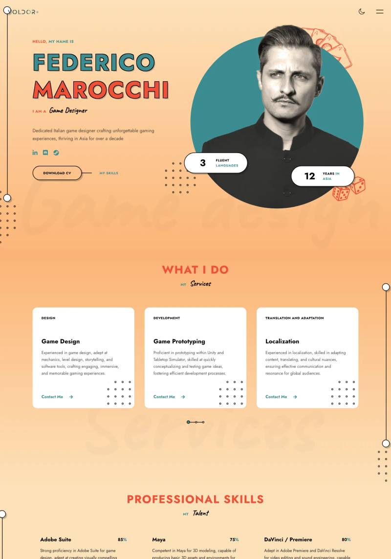
Federico Marocchi
This game designer portfolio uses a warm peach-to-cream gradient with scattered geometric dice illustrations and stat badges highlighting "12 YEARS IN ASIA" and language fluency.
 Mimic this
This photographer portfolio site uses a masonry grid hero of varied-aspect-ratio images, then alternates white and dark sections with gold accents to showcase events, corporate, and food photography.
 Mimic this
This newborn photography site layers overlapping baby portraits with script typography to anchor the emotional value proposition "for the sentimental mama."
 Mimic this
This wedding photography site layers watercolor florals and torn-paper textures over a self-portrait collage, pairing "Always joyful" tagline with decade-long experience copy.
 Mimic this
This photography services site pairs dark backgrounds with gold accents and anchors the hero with "Keep Your Memories **Forever**" — the word "Forever" isolated in gold with an underline.
 Mimic this
This family photography site overlaps three golden-hour portraits in an asymmetric collage, with stacked serif headlines in alternating cream and warm gold.
 Mimic this
Karlie The Golden Maeve
This newborn photography site uses circular credential badges and a hero split of warm beige copy paired with a cutout portrait of the photographer holding a camera.
 Mimic this
This artist portfolio cycles through rotating role titles above a dark gallery layout with overlapping, offset artwork cards.
 Mimic this
This wedding photography site opens with a full-width carousel hero and centers the value prop—"Wedding photography is more than just capturing moments"—in serif type over white space.
 Mimic this
This photography portfolio leads with a full-bleed seal-on-iceberg hero and organizes content as two-column layouts with photography dominating the left side.
 Mimic this
This wedding photography site opens with a macro shot of blonde hair instead of a couple, positioning destination weddings through fine art imagery rather than traditional portraits.
 Mimic this
This photography portfolio site stacks full-bleed service images with left-aligned headings and "More Information" buttons, letting the portraits, weddings, and headshots work speak for themselves.
 Mimic this
This lifestyle photography site uses polaroid-style photo collages with slight rotations arranged asymmetrically, anchored by the pull quote "I'm So Honored And Proud Of The Families I Get To Serve In My Community."
 Mimic this
This newborn photography site organizes service offerings as an asymmetric masonry grid with alternating image sizes, pairing "Baby Photoshoot" against smaller "Couple Casting" and "Baby Casting" cards.
 Mimic this
This photography portfolio opens with "I don't trust words. I trust pictures" and uses gold accents to highlight key words within white serif headings.
 Mimic this
This elopement photography site uses rotated photo frames with gold borders and teal text blocks to emphasize "YOU'VE NEVER SEEN YOUR LOVE LIKE THIS BEFORE."