93 Best Design Portfolio Website Examples

A design portfolio has to prove taste to someone who has never seen your work. The best design portfolio websites strip almost everything back to black, white and grey. I confirmed that pattern by running every site on this page through Claude. The examples below all share that monochrome restraint, and it works because the projects themselves supply the colour. That part is worth copying. But the centred, type-heavy heroes here suit a designer selling craft. If you are building for a different kind of business, lead with your product instead.
Category
Platform
Style
 Mimic this
This designer portfolio uses italic serif callouts within headings—"Interfaces that feel *inevitable*"—to embed editorial voice directly into the information hierarchy.
 Mimic this
This interaction designer's portfolio uses monospace typewriter fonts and cream-colored cards stacked against deep teal, with "Free. I audit one flow and send the fixes in writing" as the core pitch.
 Mimic this
This designer portfolio site annotates its hero headline with a hand-drawn yellow circle around "details others skip" and displays accessibility controls (reduced motion, line height, focus ring ratios) as a functional panel.
 Mimic this
This designer portfolio uses concentric circles and orbiting skill badges to visualize a desk-based workspace around a lifestyle photo.
 Mimic this
This brand design studio site emphasizes italicized descriptors—"Brand systems that feel *considered.* Motion that feels *alive.*"—paired with an interactive shape playground labeled "MOVE YOUR CURSOR."
 Mimic this
This graphic designer portfolio uses teal accents and serif typography on black to position music-focused branding work as "the intersection of type, texture and tempo."
 Mimic this
This UX writer portfolio rotates "UX WRITER & CONTENT DESIGNER" vertically alongside "the words inside digital products" as the core value prop.
 Mimic this
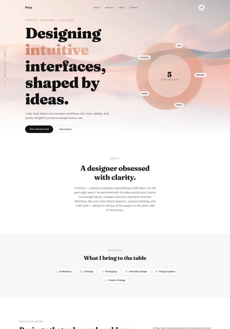
This product designer portfolio uses a dreamy peach-gradient hero with a 5-step orbital process diagram and italicized serif headings to anchor SaaS positioning.
 Mimic this
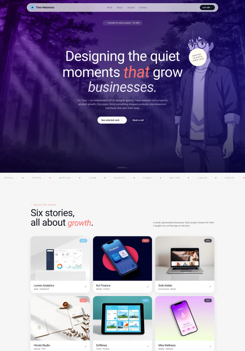
This product designer portfolio pairs a strikethrough headline ("Designing moments that grow businesses.") with a "STARTED IN A VERY DARK PLACE" sticker badge to signal unconventional thinking.
 Mimic this
This brand identity portfolio positions scattered mood-board objects as interactive drag elements alongside "Identity that *actually moves*" in italic serif.
 Mimic this
This portfolio site uses a three-part badge system in the hero—"Digital Solutions Architect" in black, "Austin" in outline—to break up the value proposition typography.
 Mimic this
This product designer portfolio pairs iPhone mockups fanned across an organic blob with serif-italicized "Human-Centered" in the headline to signal editorial craft alongside digital work.
 Mimic this
This designer portfolio uses a grayscale hero portrait with white overlay text and displays selected work as a 2-column grid mixing product shots and design mockups.
 Mimic this
This link-in-bio site uses monospace all-caps typography, washi tape corner graphics, and a dark green grid background to layer scrapbook aesthetics with brutalist design.
 Mimic this
This art director portfolio leads with an oversized custom "DII" logotype and embeds a real-time timestamp in the navigation bar.
 Mimic this
This industrial designer portfolio uses polaroid-style tilted photos with white borders and a "Designer Since Day 1" timeline spanning childhood to present.
 Mimic this
This product designer portfolio showcases six projects in an asymmetric grid, each in a soft pastel card, with no titles—only screenshots.
 Mimic this
This designer portfolio uses serif-italic styling within the hero headline to contrast "UI/UX Designer" against sans-serif "Google Certified," creating typographic hierarchy through font choice rather than size alone.
 Mimic this
This product designer portfolio opens with a full-width hero featuring a portrait and quote about "every pixel is a decision," then displays fintech case studies under frosted glass overlays.
 Mimic this
This creative director portfolio uses a two-column hero with surreal chrome-sunglasses portrait art and monospaced labels like "ALL THE THINGS I LOVE TO DO..."
 Mimic this
This 3D motion design portfolio sells freelance services with vintage tech renders and "makes products dance. Your one-stop shop, with more disco."
 Mimic this
This brand strategy portfolio leads with an ultra-bold lowercase wordmark and replaces the hero's head with clouds, anchoring credibility through client logos and section numbers.
 Mimic this
This product designer portfolio scatters six skill icons around the hero with hand-drawn arrows, then leads with "5 years of building products that work so users don't have to."
 Mimic this
This brand designer portfolio uses a dark navy hero with warm-lit portrait photography and numbered service items (#01 Brand Strategy, #02 Brand Identity Design, etc.) to structure offerings.
 Mimic this
This product designer portfolio uses hand-drawn yellow-green highlight boxes behind key words to annotate the hero section.
 Mimic this
This designer portfolio opens with an italic serif headline "I'm Emanuele, I design to make a difference" paired with purple-accented keywords and case study cards featuring product images.
 Mimic this
This designer portfolio uses a portrait collage of floating UI mockup cards and "Their Words Not Mine" testimonials to position freelance UI/UX work.
 Mimic this
This freelance designer portfolio uses a floating rounded card layout with neon yellow CTAs and stacked social proof badges to establish credibility immediately.
 Mimic this
This product designer portfolio uses a single-column card stack with project thumbnails, skill tags, and client testimonials to present Luna Rose's work.
 Mimic this
This communication designer portfolio uses a grid paper background and scatters tilted photos with rotating badge stickers across the hero collage.
Design Data
The colors, fonts, and layout choices used across 93 design portfolio websites.
Background color
How dark or light the page background is (background luminance).
- White / near white 65.2% (58)
- Black / near black 21.3% (19)
- Dark 6.7% (6)
- Light 4.5% (4)
- Mid-tone 2.2% (2)
Accent color
The color of each site's primary button, measured from its code (accent hue family).
- Black, white & gray 45.8% (33)
- Amber / orange 19.4% (14)
- Purple 11.1% (8)
- Blue 6.9% (5)
- Red 5.6% (4)
- Teal / cyan 5.6% (4)
- Green 4.2% (3)
- Lime 1.4% (1)
Hero layout
How the top section arranges its headline and imagery.
- Text above full-width media 32.5% (26)
- Centered text 32.5% (26)
- Text over a full-width image 11.3% (9)
- Asymmetric 11.3% (9)
- Text left, image right 10% (8)
Hero imagery
The kind of visual the top section leads with.
- Photography 33.3% (30)
- Illustration 30% (27)
- No imagery 23.3% (21)
- Product screenshot 7.8% (7)
- 3D artwork 4.4% (4)
Button shape
Corner rounding on primary buttons (border radius relative to height).
- Pill (fully rounded) 57.1% (12)
- Rounded corners 33.3% (7)
- Square corners 9.5% (2)
Font combination
How heading and body typefaces pair (serif vs. sans-serif).
- All sans-serif 62.2% (23)
- Serif headings, sans-serif body 37.8% (14)
Color intensity
How colorful the palette is, from black-and-white to bold color (saturation).
- Soft, muted color 48.3% (43)
- Black & white 44.9% (40)
- Bold, vivid color 6.7% (6)
Dark mode support
Sites whose code adapts to the visitor's light/dark preference (prefers-color-scheme).
- Yes 7% (3)
- No 93% (40)
Most-used fonts
The typeface each site leads with, read from its live CSS.
- Inter-SemiBold 8.1% (3)
- Fraunces 5.4% (2)
- Manrope 5.4% (2)
- Poppins 5.4% (2)
- Satoshi 5.4% (2)
Percentages are the share of sites where each trait could be measured, with counts in parentheses. Last updated August 2026.
The best design portfolio website examples skip hero photography
Photography leads hero sections on only 33.3% of these design portfolio website examples, compared with 64.1% across the full gallery. That’s a steep drop for a niche built on visual self-presentation, and it points to a different sales pitch: designers here are selling craft and concept rather than a face or a studio space. In its place, illustration (30%) and no media at all (23.3%) pick up the slack. Viplav Upadhyay builds its hero from illustration rather than a photo, and both Cynthia Hua
 and Mumin Wani
 run text-only heroes, letting typography carry the opening moment instead of an image.
Centered layouts dominate far beyond what’s typical elsewhere
Centered hero arrangements appear on 32.5% of pages here, against just 13% gallery-wide, tying stacked-copy-top at the same 32.5% share. That’s a genuine shift in composition logic: rather than staggering headline and supporting copy, portfolio sites plant everything on a single vertical axis. It reads as a designer’s instinct to treat the hero like a poster, a single focal statement rather than a layout puzzle. Anyone building a design portfolio website design around a strong personal statement should treat centered framing as the safe, proven default rather than an eccentric choice.
Monochrome color use runs well above the gallery norm
Monochrome palettes show up on 44.9% of these sites, well ahead of the 29.7% seen across the broader gallery, and nearly tied with muted (48.3%) for the top saturation profile. Vibrant color is rare at just 6.7%. This fits a field where the work itself needs to read as the loudest element on the page: Anslea Askew , Julian Petermaier
 , and Mia Creative
 all commit to black-and-white palettes, letting typography, spacing, and project imagery do the persuading instead of hue.
Buttons converge on pill shapes and neutral color almost universally
Pill-shaped CTAs account for 57.1% of measured buttons, more than the rounded (33.3%) and square (9.5%) options combined, and neutral black/white buttons lead the accent hue family at 45.8%. Paige Masri , Christopher Carney
 , and Cecilia Wilhelmy
 each pair a restrained black/white button with their layout, reinforcing that in this niche the interface chrome stays deliberately invisible so the portfolio content stays in front.