47 Best Electrician Website Examples

Someone looking for an electrician already has a problem. They want a phone number and a reason to trust whoever shows up. I ran the best electrician websites through Claude. The pattern that came back is amber and orange accents everywhere, far more than any other category in the gallery. That warm color choice signals urgency and works for trades, but it would feel wrong on a law firm. Compare the examples below and borrow the bold accents, but match them to your own brand.
Category
Platform
 Mimic this
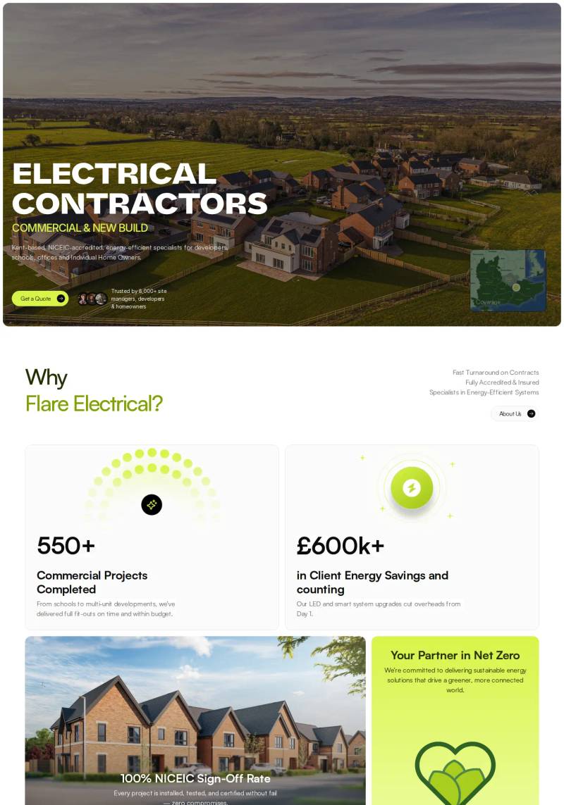
This electrical contracting site leads with aerial drone photography of new-build housing and positions energy savings with "£600k+ in Client Energy Savings and counting."
 Mimic this
This electrical contractor site uses bright lime green accents and a black-white section split to emphasize "RELIABLE ELECTRICAL SERVICES, WHENEVER YOU NEED THEM."
 Mimic this
This electrical services site pairs a cartoon mascot with uppercase green accents and a hero image grid showing EV chargers in use.
 Mimic this
This HVAC and electrical services site uses orange lightning bolts as repeated graphic markers and underlines "HERE." in the hero headline.
 Mimic this
This electrical services site uses uppercase slab-serif headlines and dark charcoal service cards with green accent icons to project industrial credibility.
 Mimic this
This electrical contractor site leads with an urgent banner and uses serif headings with trust badges—"MA License #8471-A1", "5 Rating (38 Reviews)"—to establish credibility above the fold.
 Mimic this
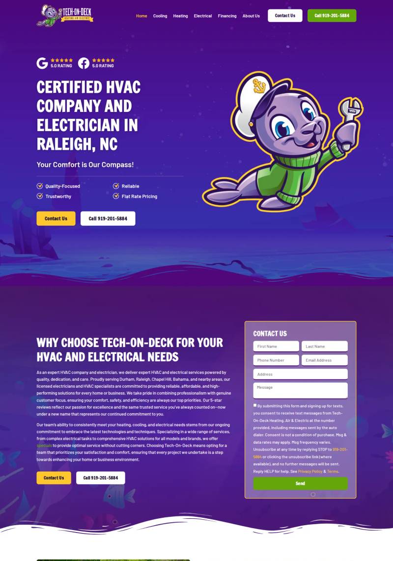
This HVAC and electrical services site uses a cartoon mascot (caped alien with wrench) against a starry purple gradient hero to humanize technical home services.
 Mimic this
This local electrical contractor site leads with a dark team photo, red pill-button CTAs, and a prominent right-column estimate form card.
 Mimic this
This electrical contractor site pairs a forest-scene hero with split-column layout: left-side value prop and right-side "Get a Free Quote!" form, anchored by orange accent color and trust badges showing review counts.
 Mimic this
This local service landing page stacks yellow action buttons and phone numbers throughout—header, hero, sidebar, alert banner—to funnel every visitor toward a single call-to-action.
 Mimic this
This electrical contractor site uses overlaid stats cards and selective orange accent type to break up the industrial hero imagery and guide attention toward service offerings.
 Mimic this
This electrical contractor site leads with a kitchen photo and "Your Power Is Our Priority," anchoring trust through residential imagery rather than service lists.
 Mimic this
This electrical services site leads with a hero featuring sun rays through trees and positions "CALL NOW" alongside a Google Reviews badge showing 5.0 stars.
 Mimic this
This local electrician site leads with "Turning Your Electrical Needs Into Light Work" over utility poles and uses orange accent buttons with prominent phone numbers throughout.
 Mimic this
This electrical contractor site pairs a slab-serif display font with red pill-shaped phone buttons and service van imagery to signal 24/7 availability.
 Mimic this
This electrical contracting site pairs dark luxury branding with serif typography and repeats "precision" and "expertise" to position premium service.
 Mimic this
This electrical services site anchors trust with a "5/5 Stars From over 81 customers" testimonial block and named client quotes from business leaders.
 Mimic this
This electrical contracting site uses a diagonal dark-to-light section split and reserves bright chartreuse green exclusively for CTAs, badges, and trust indicators.
 Mimic this
This electrician services site announces "24 Hours Emergency Call Out Service" in a full-width yellow banner above navigation and leads with trust badges from Google, Yell, and Houzz.
 Mimic this
This electrical services site uses lime-green accents against near-black backgrounds and displays trust badges as circular icons with supporting text below the hero.
 Mimic this
This local electrician site uses a close-up tradesperson portrait with diagonal red geometric overlay and stacks trust signals as checkbox bullets in the hero.
 Mimic this
This electrical services site anchors trust with a Google 5-star badge and repeats "Newcastle & Leeds" in bold throughout the layout.
 Mimic this
This electrical contractor site uses a luxury home hero photo and amber accent buttons to position trade work as premium service for affluent Park City homeowners.
 Mimic this
This electrical contractor site leads with the pun "WE'LL FIX YOUR SHORTS" in yellow type over a living room photo.
 Mimic this
This commercial contracting site leads with a branded van photo and emphasizes "fair pricing" and "integrity" through dark industrial aesthetics and orange accent corners on service cards.
 Mimic this
This electrician landing page opens with "NO SPARKS, / JUST SOLUTIONS." in split orange-and-white typography over electrical work imagery.
 Mimic this
This electrical services site uses diagonal geometric overlays and gold accents on dark backgrounds to position commodity work as premium smart-home technology integration.
 Mimic this
This local electrician site leads with a hero photo of workers on ladders and sells trust through "SPARKIES" in yellow highlight and a Google badge showing "184 Reviews."
 Mimic this
This emergency electrician site leads with "WE'RE AVAILABLE" status indicator, live clock, and "$0 CALL OUT FEE" as three competing headlines in the header.
 Mimic this
This electrical contractor site uses a split hero layout: dark van photo on left with trust badges, quote form card on right with AU phone prefix dropdown.
Design Data
The colors, fonts, and layout choices used across 47 electrician websites.
Background color
How dark or light the page background is (background luminance).
- White / near white 53.2% (25)
- Dark 19.1% (9)
- Black / near black 19.1% (9)
- Mid-tone 6.4% (3)
- Light 2.1% (1)
Accent color
The color of each site's primary button, measured from its code (accent hue family).
- Amber / orange 50% (23)
- Lime 13% (6)
- Red 13% (6)
- Green 13% (6)
- Blue 4.3% (2)
- Black, white & gray 4.3% (2)
- Pink 2.2% (1)
Hero layout
How the top section arranges its headline and imagery.
- Text over a full-width image 76.1% (35)
- Text left, image right 23.9% (11)
Hero imagery
The kind of visual the top section leads with.
- Photography 91.5% (43)
- Illustration 4.3% (2)
- Video 2.1% (1)
- No imagery 2.1% (1)
Font combination
How heading and body typefaces pair (serif vs. sans-serif).
- All sans-serif 85.7% (18)
- Serif headings, sans-serif body 9.5% (2)
- Monospace 4.8% (1)
Color intensity
How colorful the palette is, from black-and-white to bold color (saturation).
- Soft, muted color 63.8% (30)
- Black & white 27.7% (13)
- Bold, vivid color 8.5% (4)
Dark mode support
Sites whose code adapts to the visitor's light/dark preference (prefers-color-scheme).
- Yes 0% (0)
- No 100% (23)
Most-used fonts
The typeface each site leads with, read from its live CSS.
- Open Sans 10% (2)
- Oswald 10% (2)
- Sarabun 5% (1)
- Saira 5% (1)
- worker 5% (1)
Percentages are the share of sites where each trait could be measured, with counts in parentheses. Last updated August 2026.
Best electrician website examples lean on full-bleed photo heroes
Across this gallery of electrician websites, 76.1% of homepages use a full-bleed overlay hero, compared with 35.7% gallery-wide. That is a wide gap, and it lines up with a second differentiator: 91.5% of hero sections use straight photography rather than illustration or video, against a gallery-wide rate of 64.1%. Electrician website design in this niche is built around a single large photo of a technician or job site, with text and a call-to-action layered directly on top rather than sitting beside it. Expert Electrical Services , 2W Electrical
 , and AAA Bishop Electric
 all follow this pattern, filling the top of the page with a photograph and stacking headline copy over it instead of splitting the hero into separate image and copy columns. The split_copy_left layout survives in only 23.9% of cases, making it a minority approach rather than a real alternative.
Amber is the default accent, not just a favorite
Amber shows up as the accent hue on 50% of these sites, more than double the 23.7% share it holds across the broader gallery. This is the strongest color signal on the page: electricians reach for amber because it echoes warning tape, sparks, and hazard signage, giving the brand an immediate trade association without needing supporting imagery. AAA Bishop Electric, Electrician Today , Watt About Electrix
 , Albright Electrics
 , and ENG Electrical
 all pair amber buttons with white backgrounds, which is close to a house style at this point. Lime and red and green each sit far behind at 13% apiece, so where a site breaks from amber, it tends to land on one of those rather than converging on a second dominant hue.
Backgrounds skew light, but a real dark-mode minority exists
Near-white backgrounds account for 53.2% of sites, but near-black and dark backgrounds combine for close to two in five, at 19.1% each. That is enough volume that dark treatments are a legitimate design lane here, not a novelty. Brightwire and 24hr Valley Wide Electric
 both run dark backgrounds with muted palettes and photography-led heroes, proving the full-bleed-photo convention holds regardless of luminance. Notably, none of the sites measured for dark mode support actually implement it as a toggle, meaning these dark backgrounds are fixed design choices rather than a user-selectable theme.
Typography is almost uniformly sans-serif, top to bottom
Heading fonts are sans in 90.5% of cases and body copy is sans in 95.7%, with font pairings running sans-plus-sans in 85.7% of sites. 2W Electrical set in Oswald and Davidson Electrical Services set in DM Sans both fit this mold exactly. Serif or mono treatments, as seen in Texas Champion Services
 and VoltEdge Electric
 , are rare enough to read as deliberate departures rather than a viable second convention.