392 Kickass Food Website Examples
I found some of the best food websites to share for inspiration. Only 0.1% of reviewed website designs make it onto this list! Each website example includes a tall screenshot and a link to the live site and the platform it was built on.
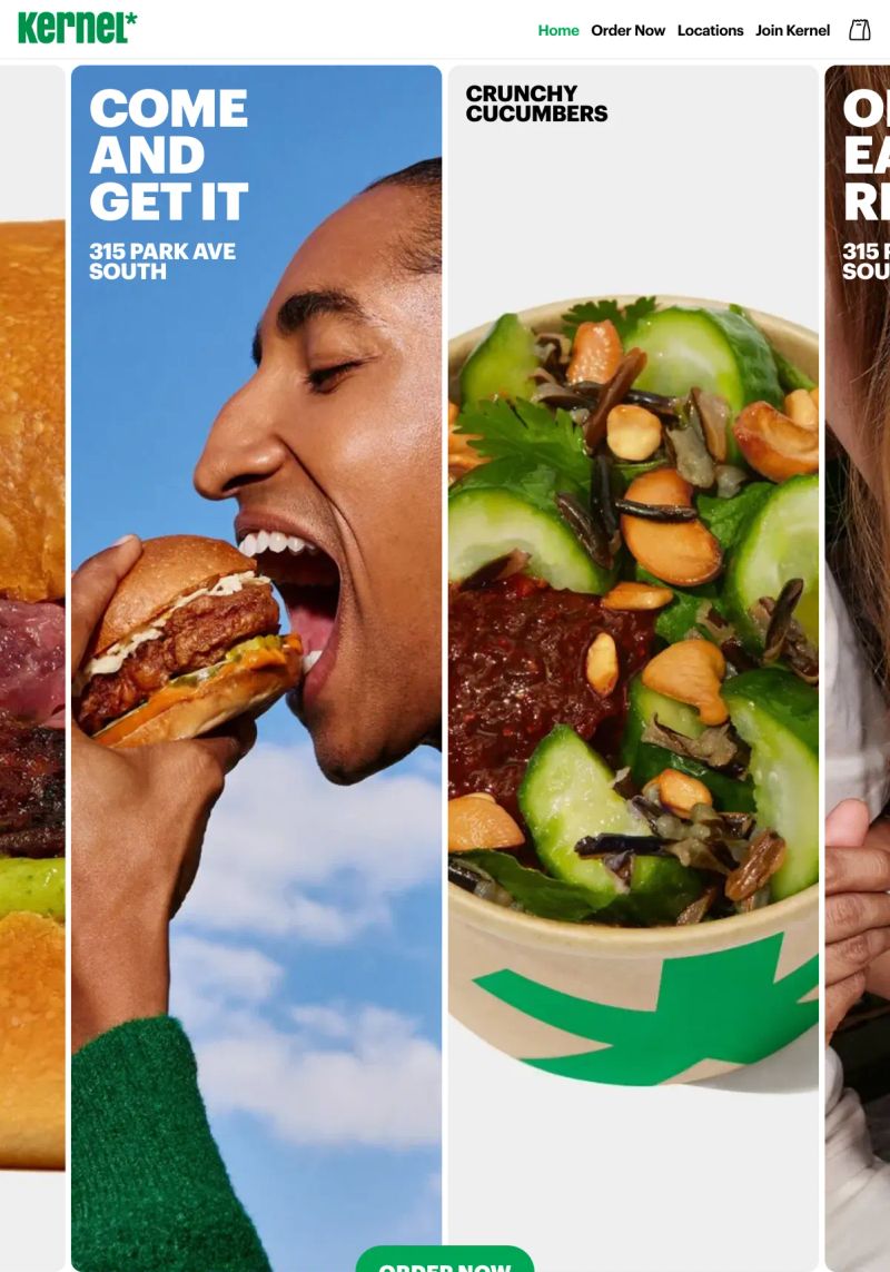
Eat Kernel
Bold typography punctuates the design, with statements like "COME AND GET IT" making a delicious call to action, which is great inspiration for any food website.
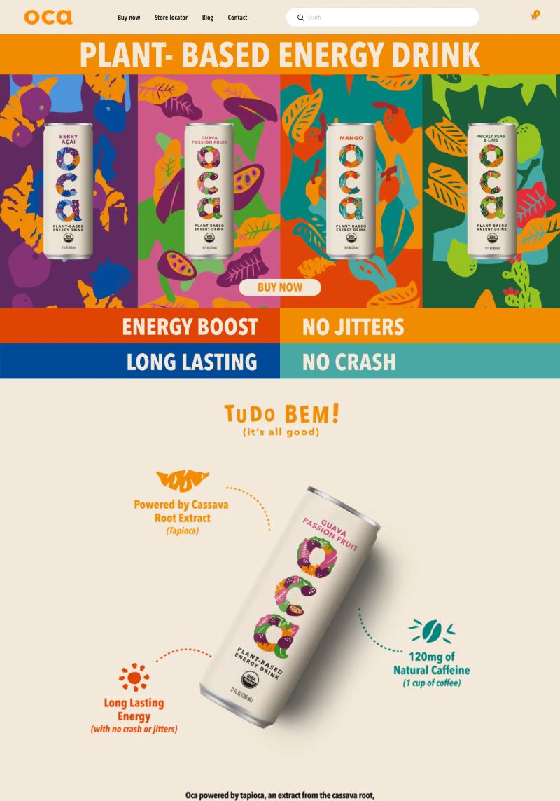
This Beverage website features enticing imagery in a grid layout that highlights vibrant product displays and creates a visual feast welcoming visitors to explore.
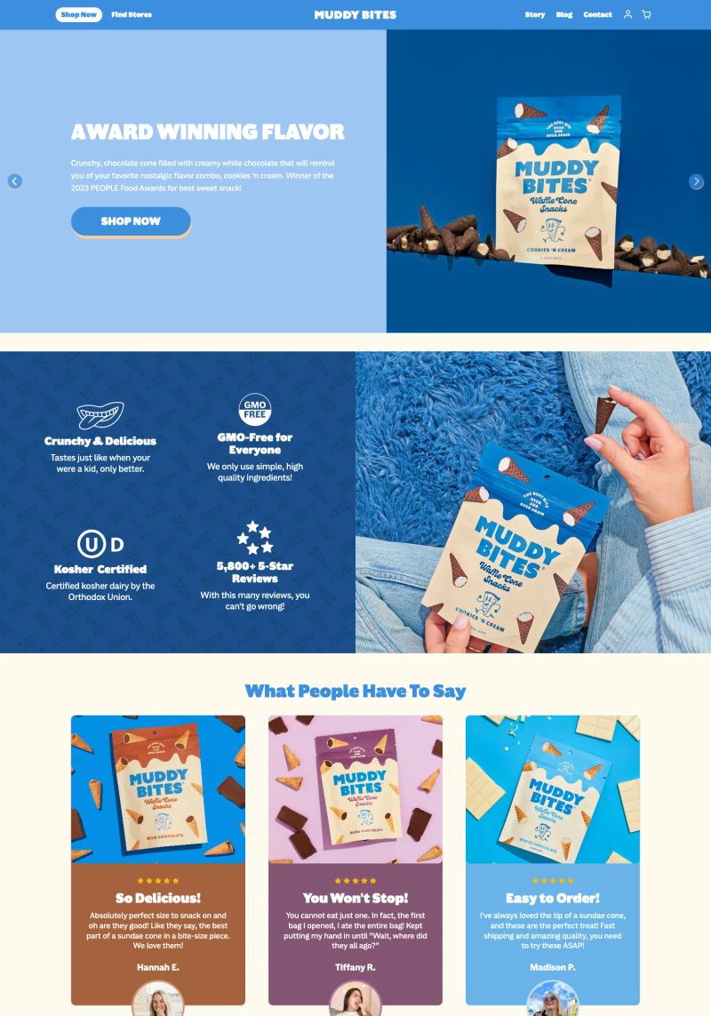
What a great layout in this website design! The overall use of contrasting colors and ample whitespace draws attention to the key messages, enhancing visual engagement and accessibility.
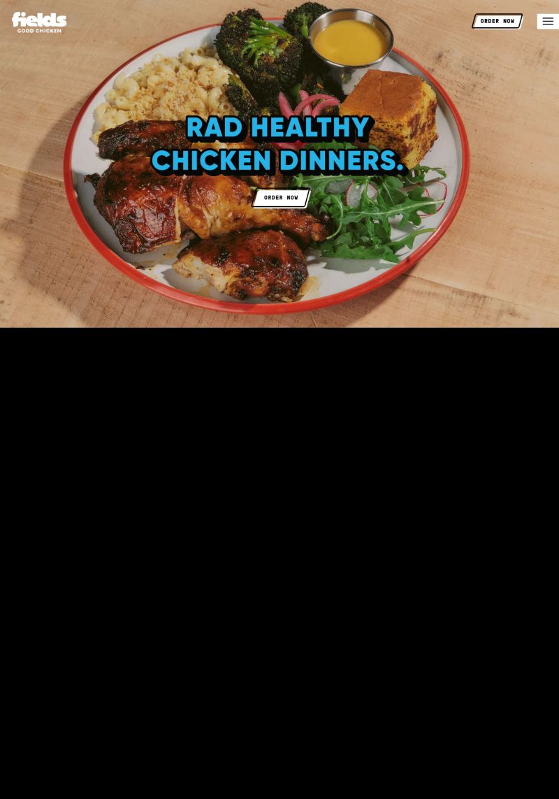
This website serves up engaging copy with "RAD HEALTHY CHICKEN DINNERS," immediately communicating vibrancy and flavor to draw in food lovers looking for healthy options.
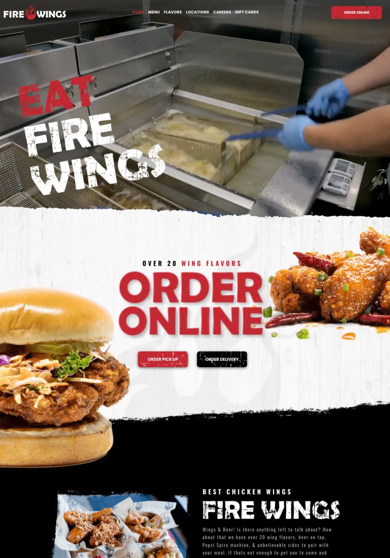
What a great feature! The strong "ORDER ONLINE" call-to-action stands out boldly against a vibrant food background, making it clear and enticing for hungry visitors.
This Shopify snacks website joyfully captures attention through its vibrant color palette and playful typography, making healthy eating feel inviting and fun.
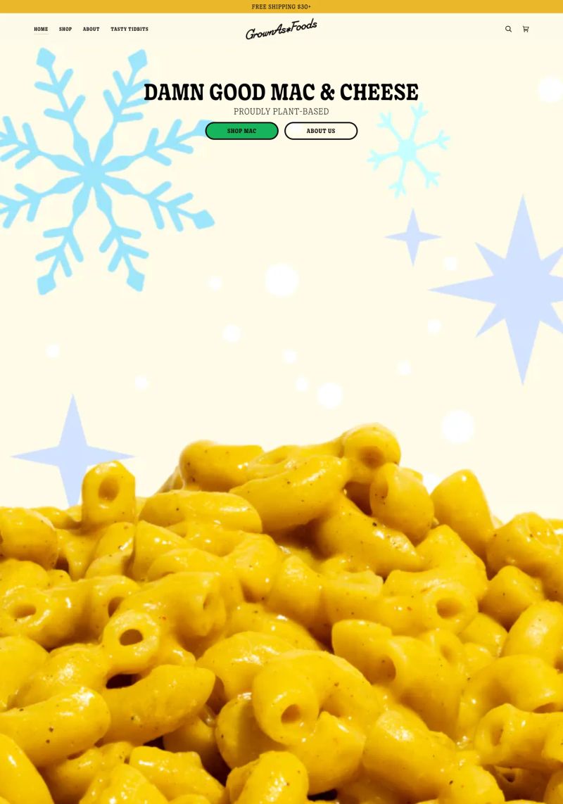
This website's bold typography against a simple background immediately captures attention, making "DAMN GOOD MAC & CHEESE" the focal point, great for food inspiration!
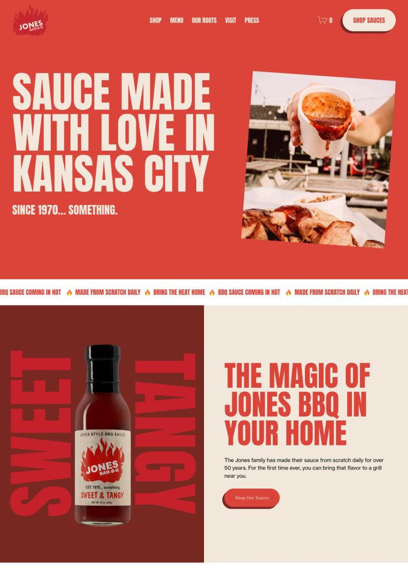
Use of vibrant reds and contrasting white typography together create a warm, inviting vibe perfect for this BBQ restaurant website, enhancing overall engagement.

This website features an engaging layout, using a grid to clearly categorize various products like smoothies and snacks, making navigation simple and intuitive for users wanting healthy beverage inspiration.
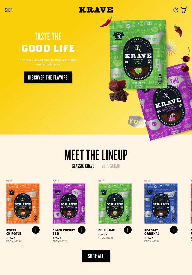
Check out the bold typography that truly makes a statement; "TASTE THE GOOD LIFE" instantly grabs attention and perfectly reflects the casual vibe of the snack brand.
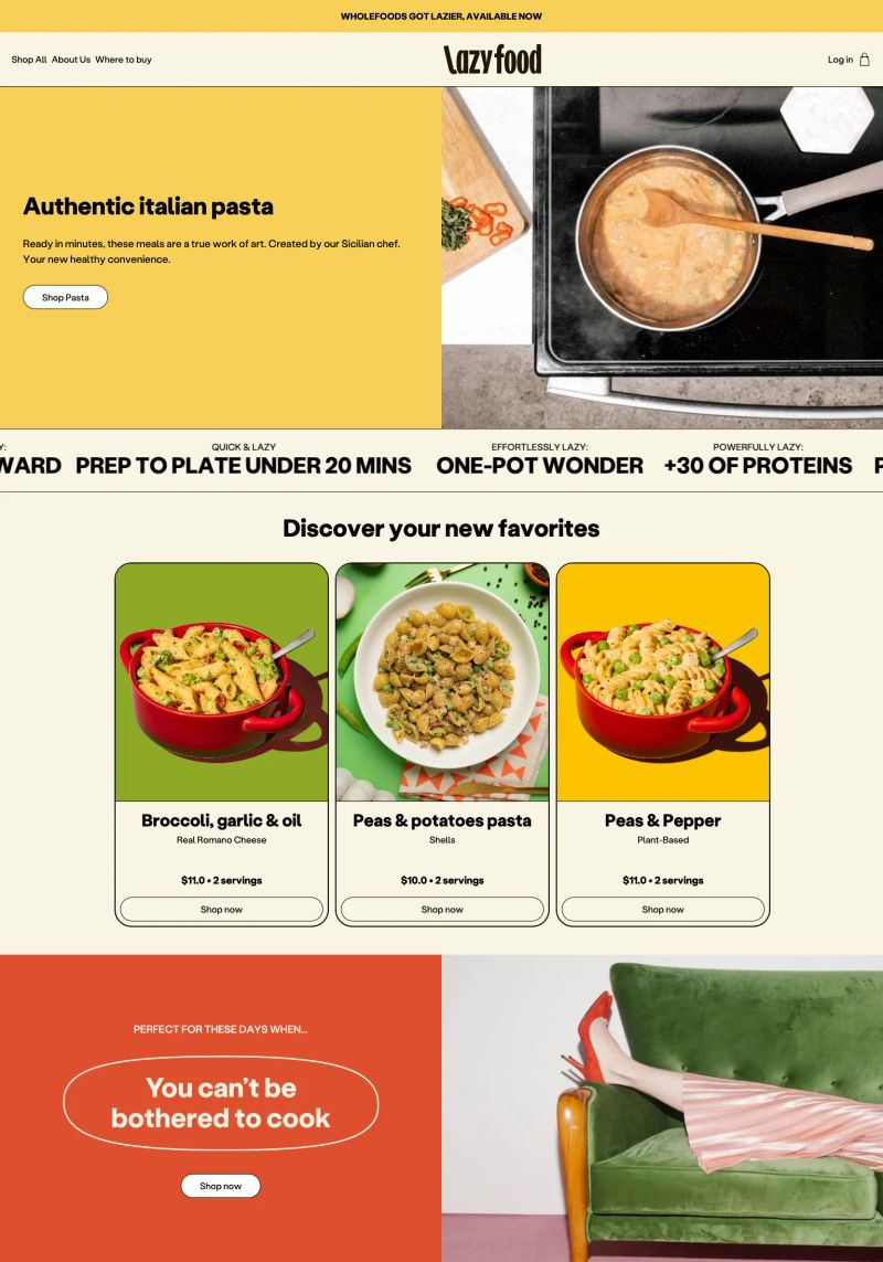
The copywriting shines with "Authentic italian pasta" and thoughtful descriptions like "Ready in minutes," placing deliciousness front and center while conveying ease.
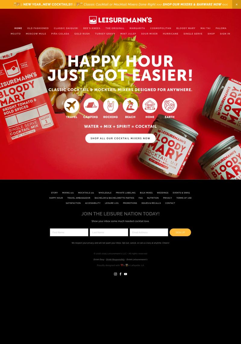
With bold colors and a large, eye-catching header, this website design makes a strong statement, instantly conveying excitement for cocktail mixed moments.
The color contrast between the energetic blue and warm textures enhances visual engagement, making this Shopify Snacks website a vibrant design inspiration.
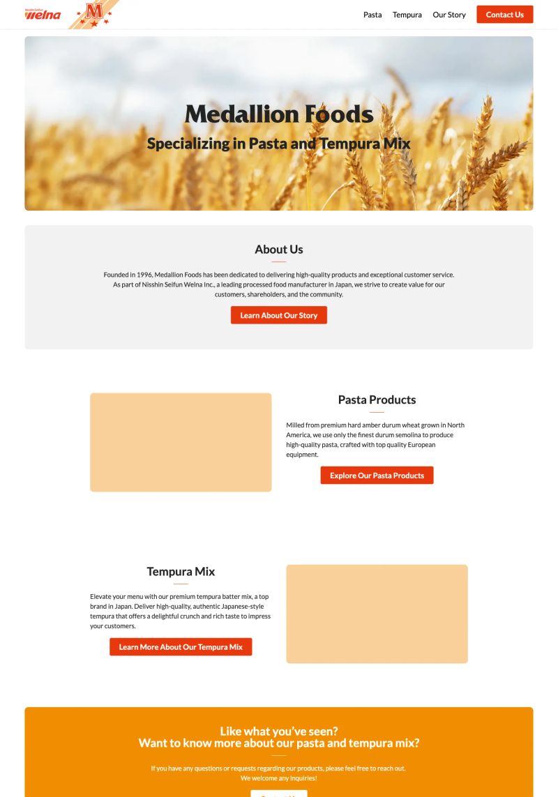
This example features great use of typography with a clear hierarchy, highlighting "Medallion Foods" prominently for easy brand recognition, essential for a food website.
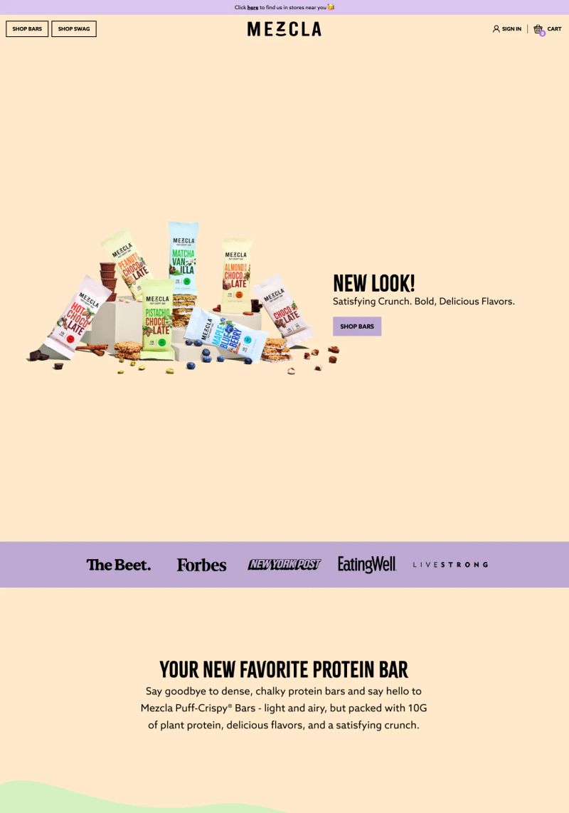
This website does a great job with copywriting, highlighting its product with a compelling call-to-action: “NEW LOOK! Satisfying Crunch. Bold, Delicious Flavors,” encouraging user engagement around its protein bars.
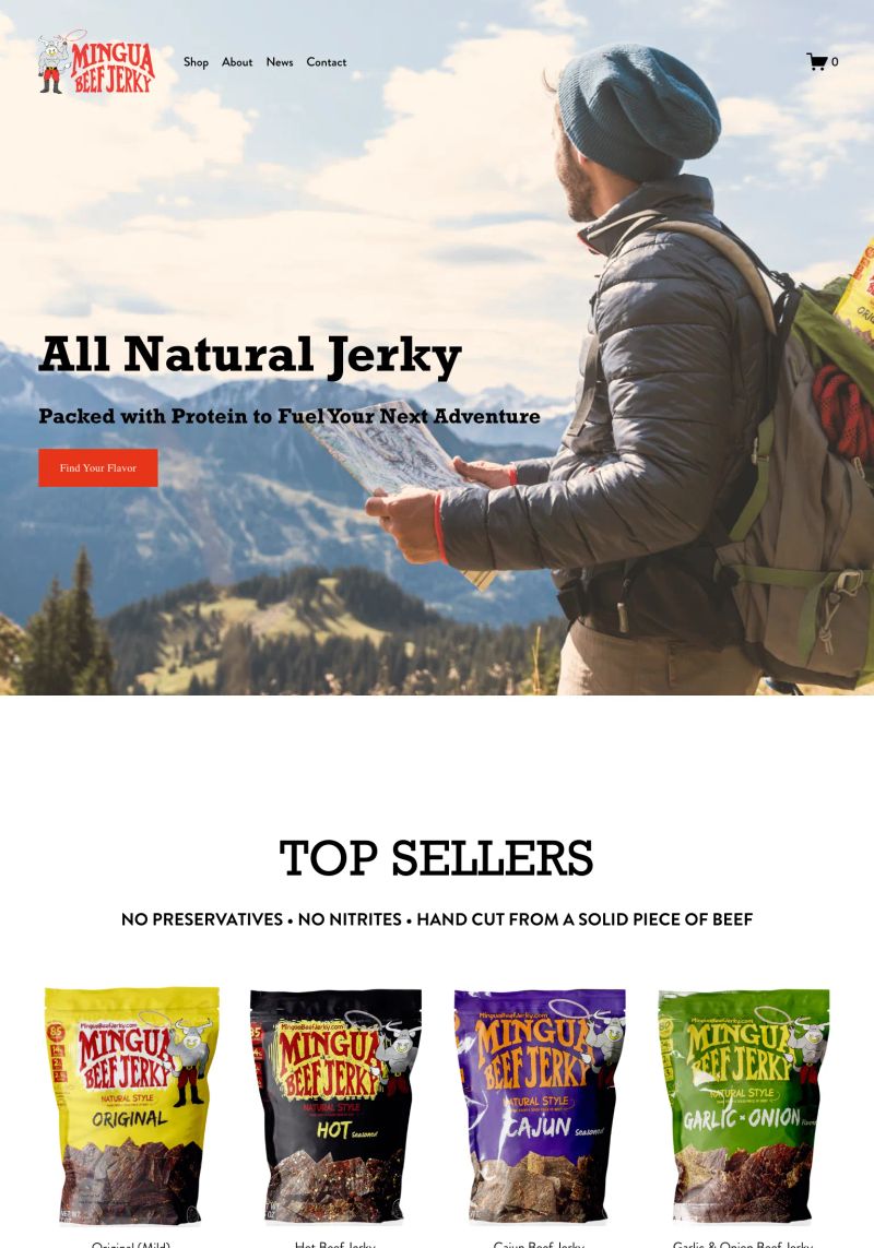
What a great hero section! Using bold typography for "All Natural Jerky" instantly grabs attention, perfectly aligning with this Squarespace Snacks site’s outdoor adventure theme.
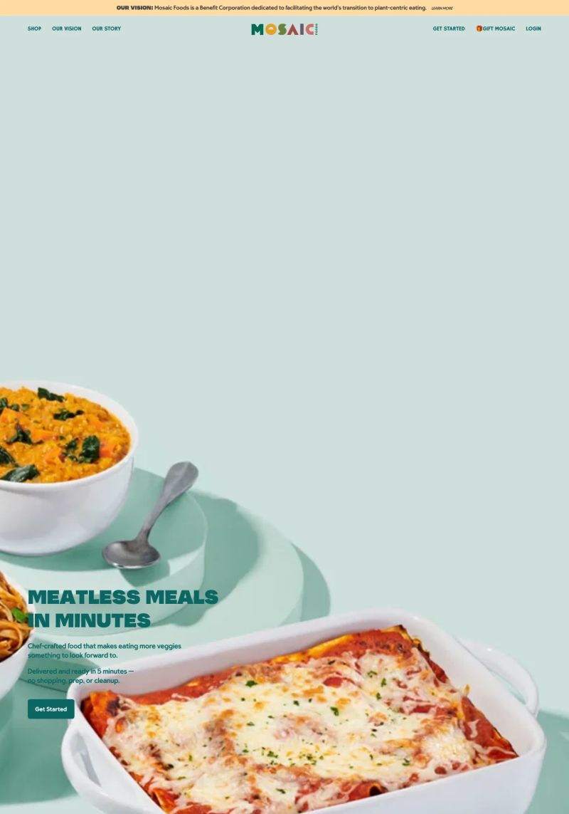
The bold copy "MEATLESS MEALS IN MINUTES" grabs attention and instantly communicates the products' convenience, making this Shopify snacks website stand out as an inspiring example.
Bright and playful colors paired with clear typography create an engaging vibe on this Shopify snacks site, drawing attention to the tasty offerings in an inviting way.
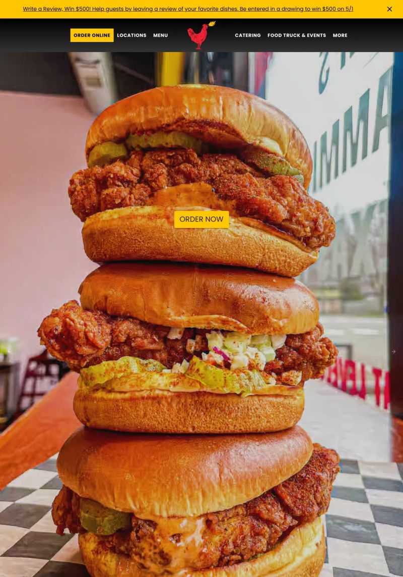
What a fantastic feature with the bold "ORDER NOW" button that stands out visually against the warm tones of the stacked sandwiches, driving tempting curiosity to order.
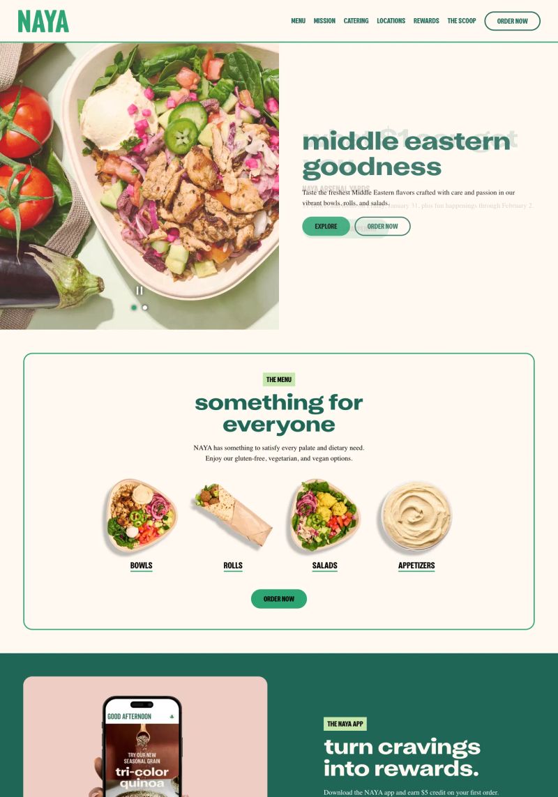
What a great use of layout with vibrant, fresh images paired with inviting copies like “something for everyone,” offering a clear guide to the menu categories. This layout effectively entices visitors to explore more.
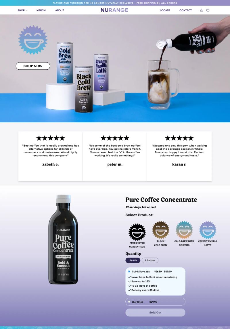
This website design captures attention with vibrant colors and a clean typography, effectively highlighting its range of beverage products while maintaining visual clarity.
Bright, bold colors combined with a playful layout create an eye-catching design on this Shopify beverage site, making the products truly stand out as standout energy drink options.
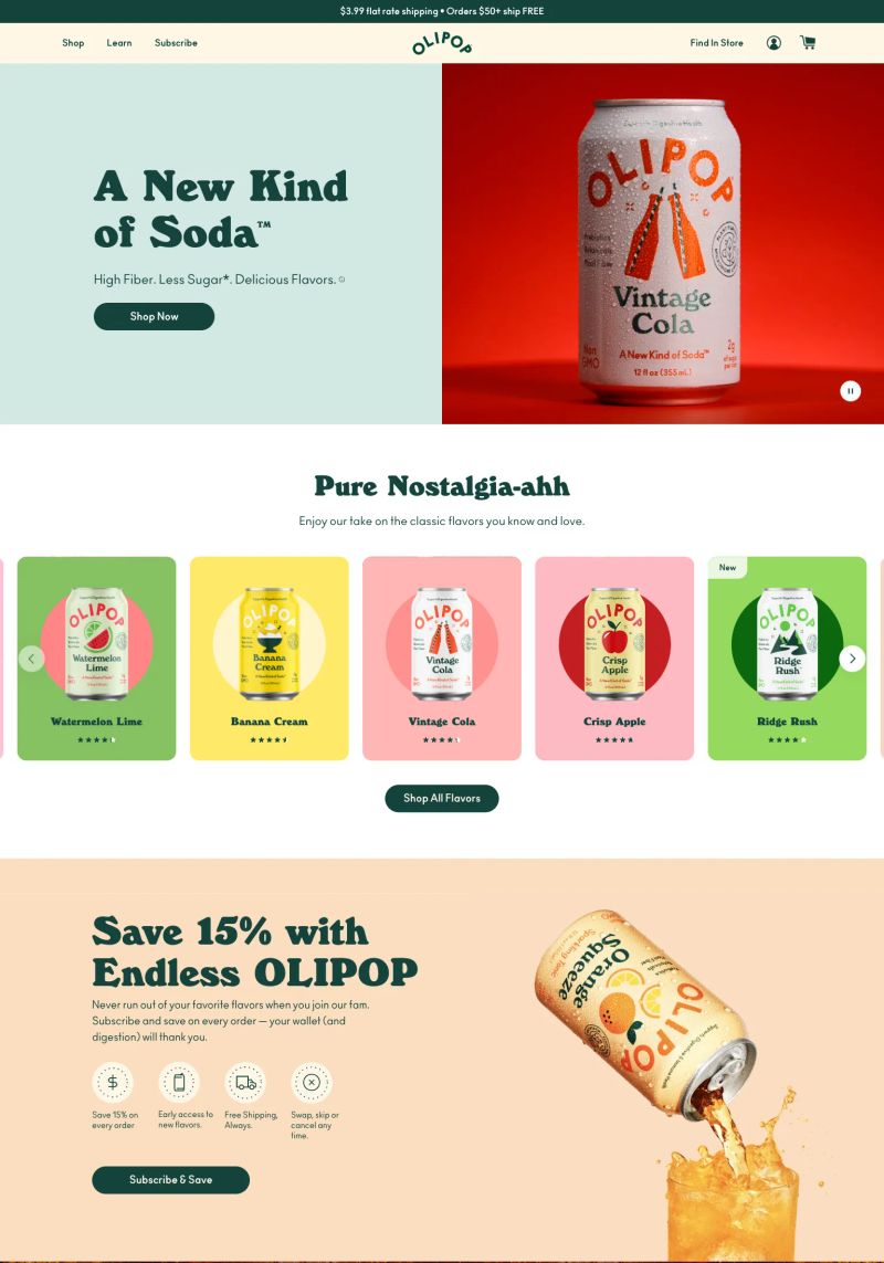
What a great use of copywriting here! "Enjoy our take on the classic flavors you know and love" connects nostalgia to their unique beverage offerings.
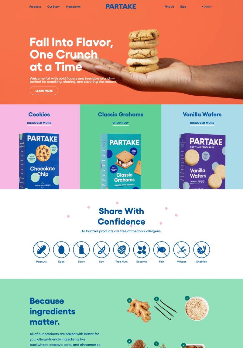
What a great hero section showcasing the cookies, using bold typography and vibrant colors that visually emphasize flavor and inclusivity as key themes for this snack brand.
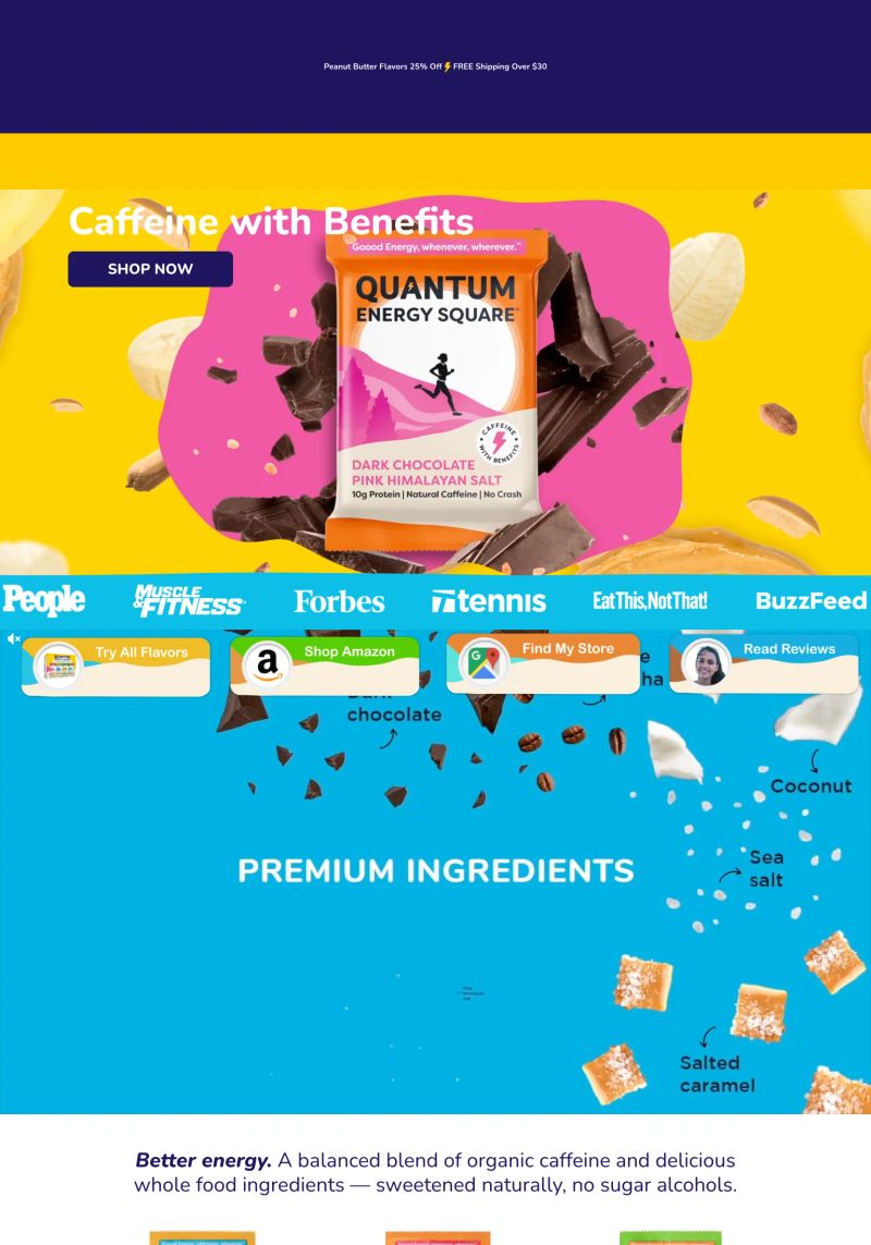
What a striking design with bold, vibrant colors that pop against contrasting hues, capturing attention while clearly showcasing the Quantum Energy Square.
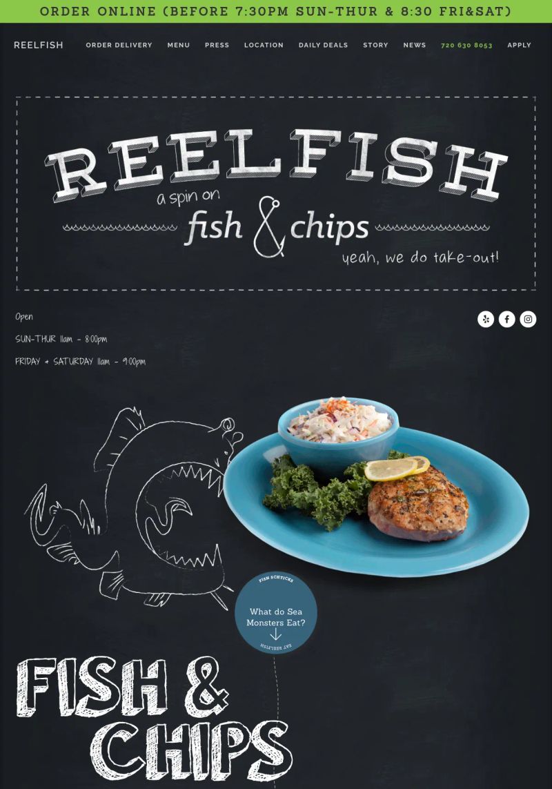
Reelfish Fish & Chips
The vibrant color scheme combined with bold typography makes this restaurant website stand out, offering great visual appeal and representing a fresh take on fish and chips.

The copy “Escape to the Great Outdoors” sets a vibrant tone, capturing the essence of a restaurant-focused experience, perfect for a nature-inspired dining website.
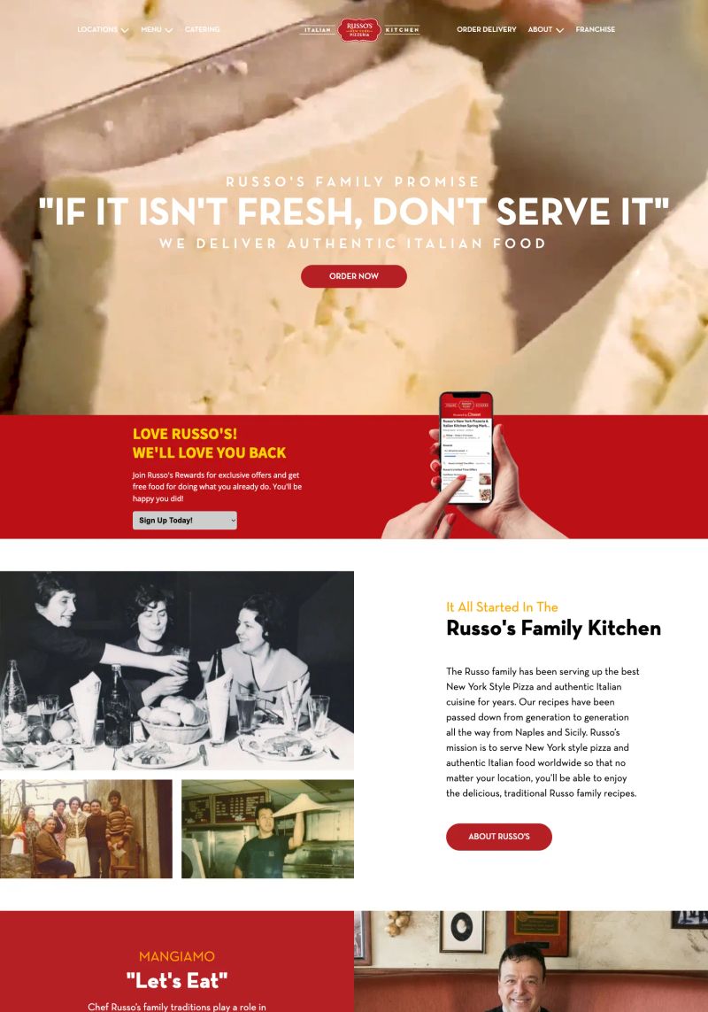
The use of the slogan "IF IT ISN'T FRESH, DON'T SERVE IT" not only communicates a strong promise but also builds trust with customers seeking quality Italian food.
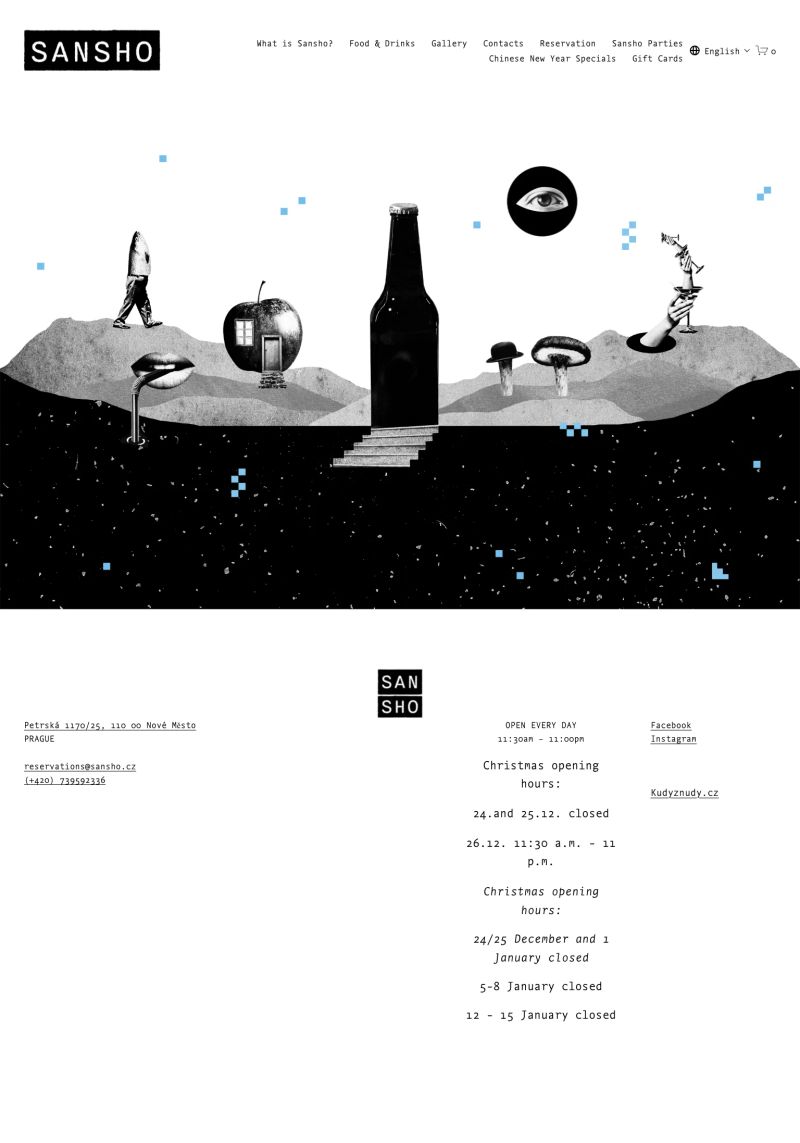
This restaurant's website design features striking visuals in black and white with playful pops of color, creating a unique atmosphere that draws visitors in.
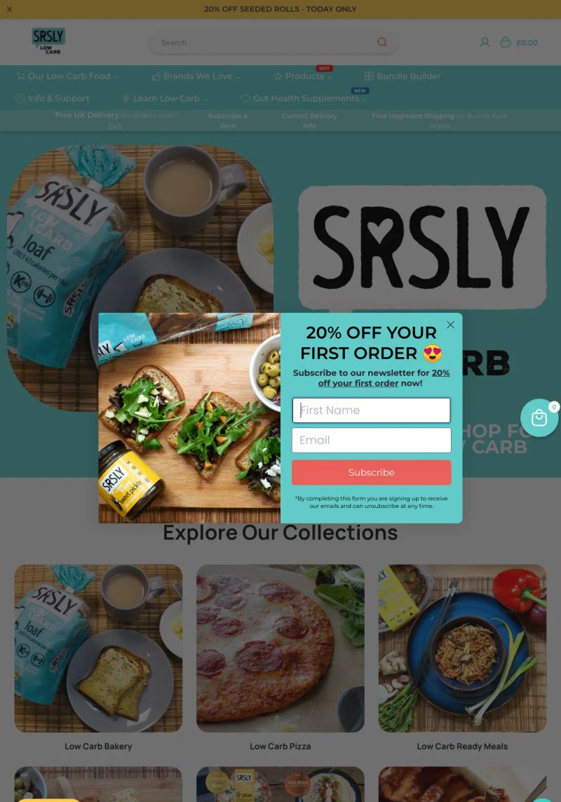
The vibrant colors in this website design not only attract attention but also create an enticing atmosphere, ideal for a bakery-inspired audience looking for delicious low-carb options.
About this collection
This is a collection of websites organized by the platform they are built on, category, and sometimes tags and the creator. They're here for inspiration. Most websites made it into this collection because they have beautiful designs, while others showcase exceptional copywriting or information architecture.
What this page contains
This page showcases 392 website examples in the Food category. Each website includes a tall screenshot and a link to the live site, the platform it was built on, and a description (generated with AI).
Quality may vary by category or platform
Some sites aren't an absolute 10/10, but they shine relative to their categorization. For example, categories like Notary or HOA don't reach the same design heights as Designer or SaaS sites. They're still included so people in those industries have relevant references when building their website.
How these websites are picked
While I won't reveal the exact details of my curation process (so competitors can't copy), I can share that:
- They are all organically sourced (i.e., I don't copy other inspiration galleries)
- It's an arduous process to find these gems. I typically review 10,000 sites to discover just 10 worthy additions.
The purpose of this collection
There are two primary reasons people view these website examples:
- To find design, copy, or general website inspiration from similar businesses in their industry
- To explore the capabilities of website platforms before making a decision
Oh yes, and affiliate marketing. I'm part of affiliate programs for some of the platforms, so if you purchase after clicking a link, I may earn a commission.
Want to suggest a site?
Reach out to me on LinkedIn.