392 Kickass Food Website Examples
I found some of the best food websites to share for inspiration. Only 0.1% of reviewed website designs make it onto this list! Each website example includes a tall screenshot and a link to the live site and the platform it was built on.
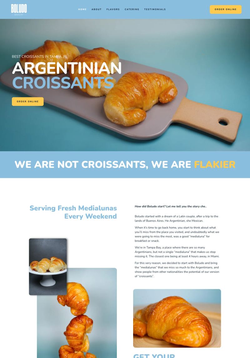
What a great example of copywriting! The playful phrase, "WE ARE NOT CROISSANTS, WE ARE FLAKIER," instantly captures attention and sparks curiosity about their unique offerings.

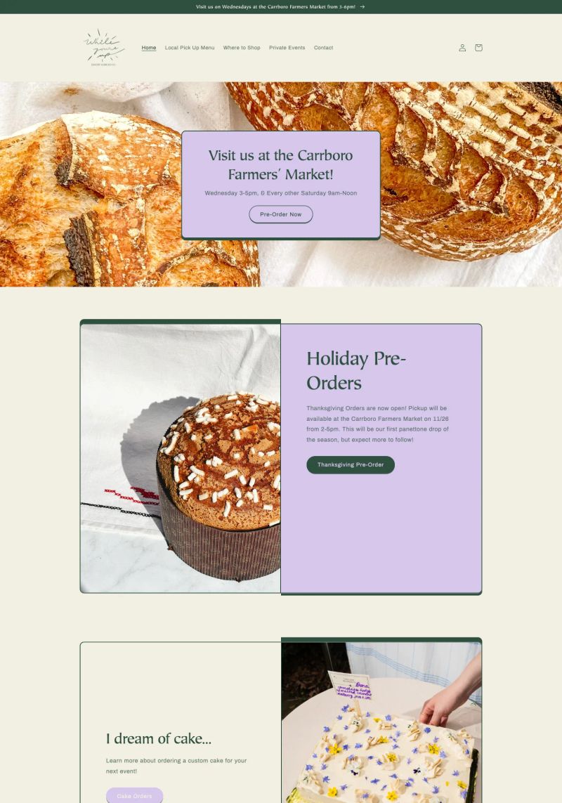
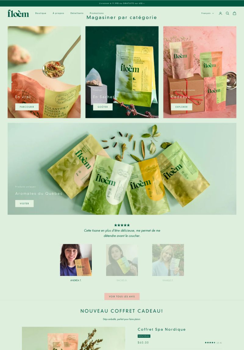
Bright greens paired with fresh food imagery make the website feel inviting and lively, perfectly embodying the vibrant spirit of a bakery.
The warm color palette gives a cozy, inviting feel, perfect for a bakery website; it evokes a homey vibe while keeping the design fresh and approachable.

Bold colors and rich imagery make this bakery website incredibly inviting, creating a warm and appetizing vibe perfect for attracting customers.
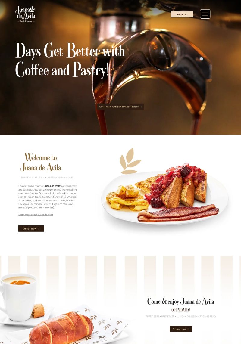
The use of inviting copy like "Days Get Better with Coffee and Pastry!" creates an engaging experience, capturing the essence of delicious offerings at this restaurant.
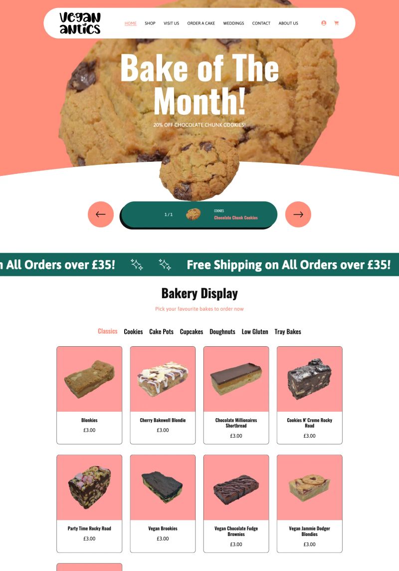
Bright colors and warm images create an inviting atmosphere in this vegan bakery website, perfect for attracting dessert lovers while emphasizing tasty options.
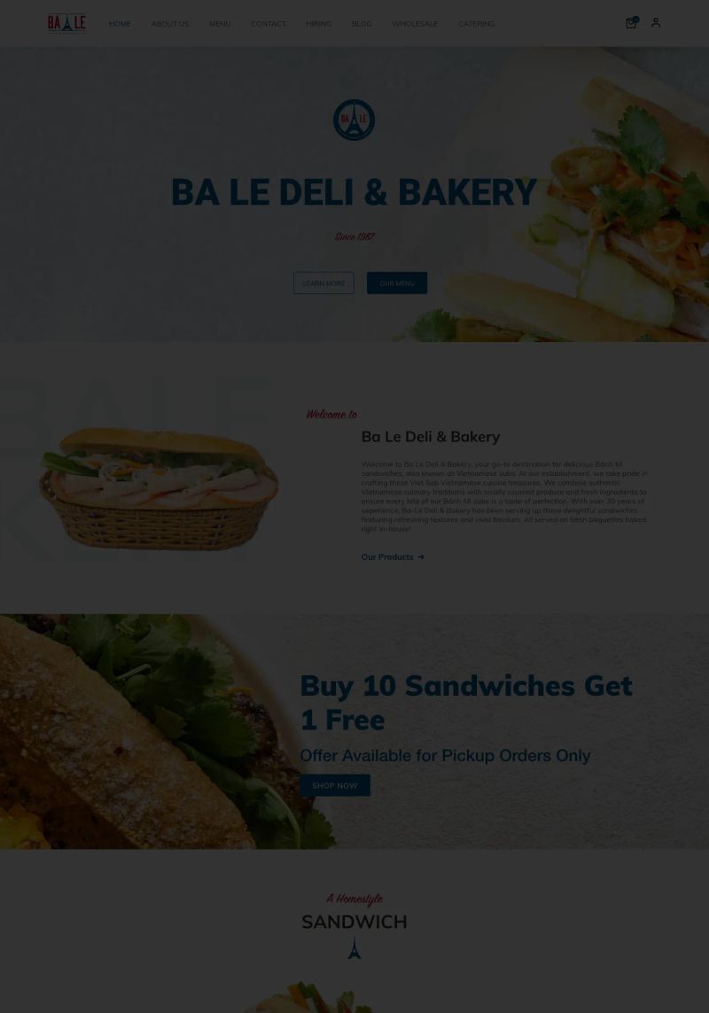
Talk about a compelling call to action! "Buy 10 Sandwiches Get 1 Free" grabs attention and engages visitors on this bakery website, making loyalty enticing.
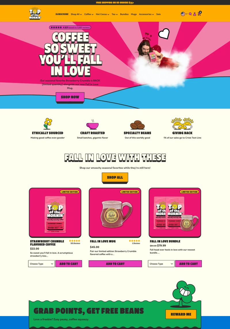
The copywriting stands out with phrases like "COFFEE SO SWEET YOU'LL FALL IN LOVE," crafting an engaging promise that aligns with the brand's fun, inviting attitude.
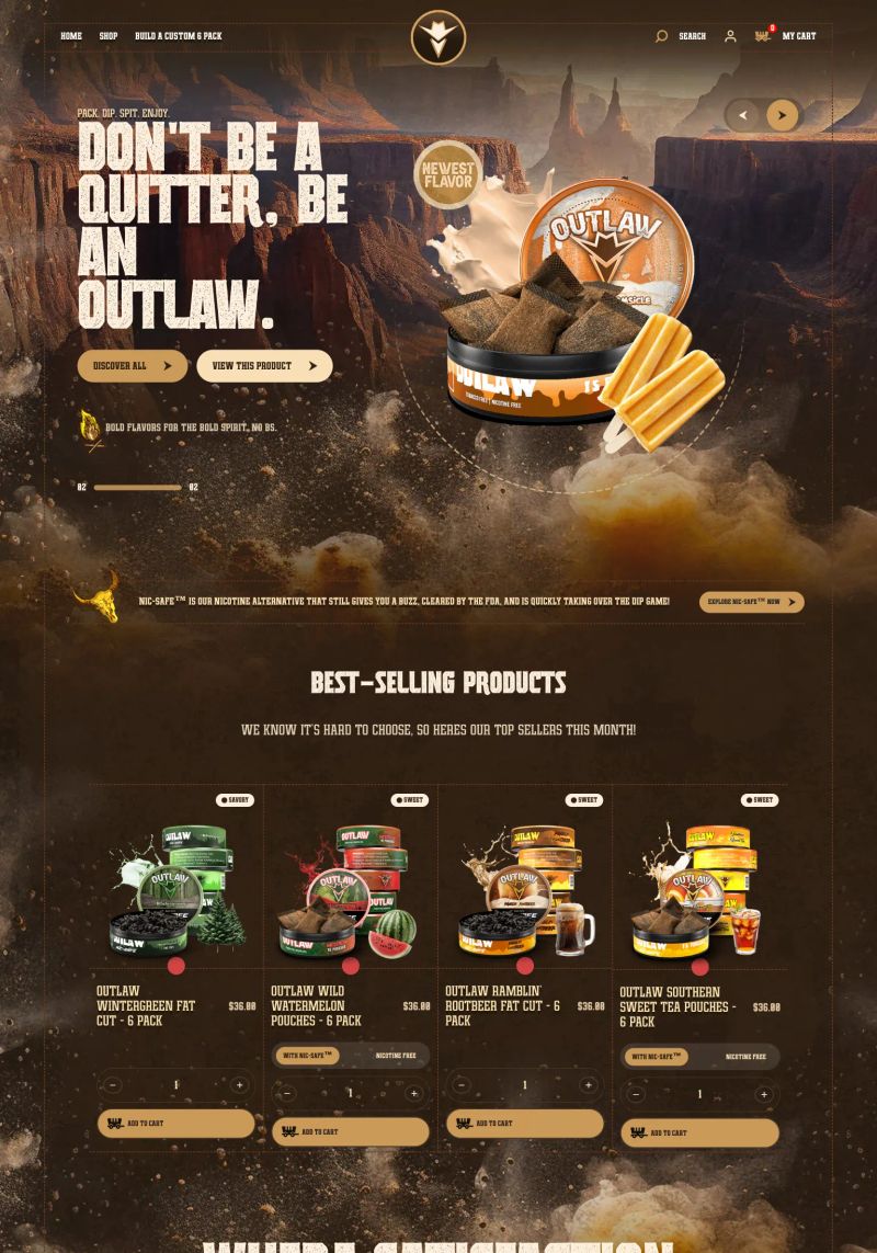
Bold typography like "DON'T BE A QUITTER, BE AN OUTLAW." grabs attention immediately, setting a daring, adventurous tone that aligns perfectly with snack culture and encourages exploration.
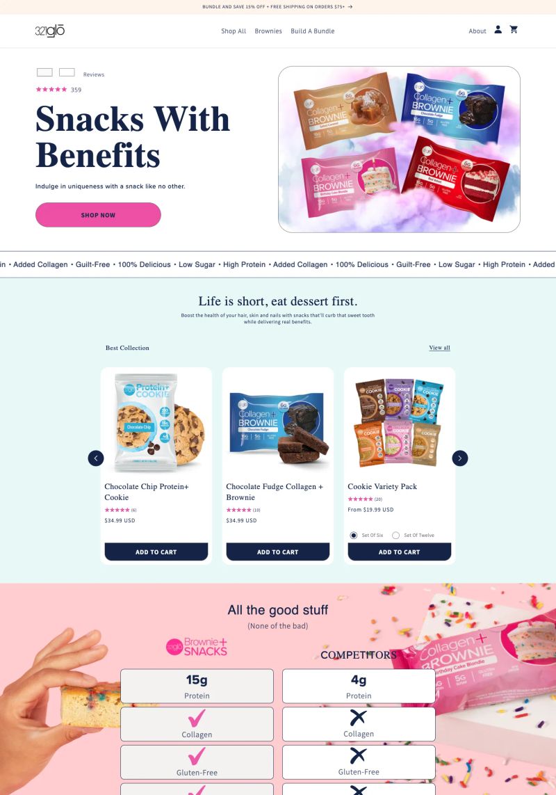
With a bold header stating, "Snacks With Benefits," this Shopify bakery website creates an inviting focus on unique offerings that combine fun and nutrition—great for inspiration!
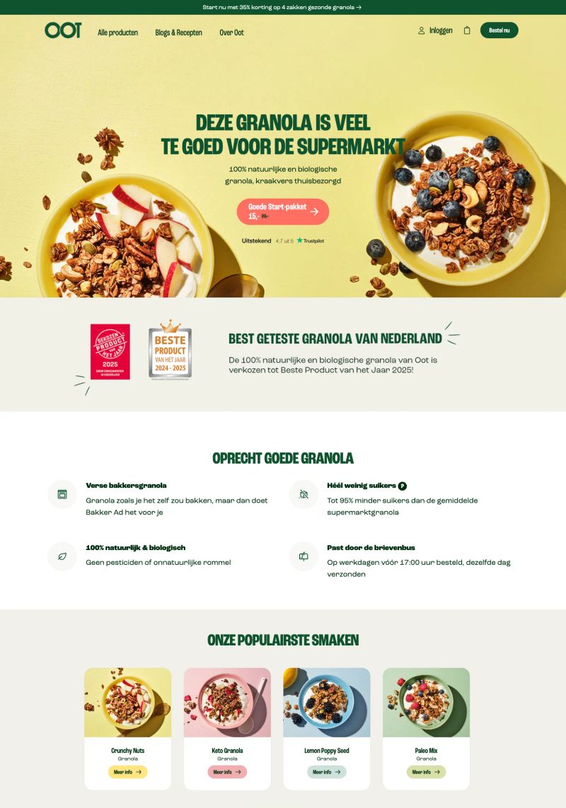
This website uses vibrant colors and playful typography to highlight its granola offerings, creating an inviting design that captures attention and communicates freshness.

This website is a great example of copywriting that engages visitors with clever phrases like "Rolling something this good is usually illegal," adding playful charm to the culinary experience.
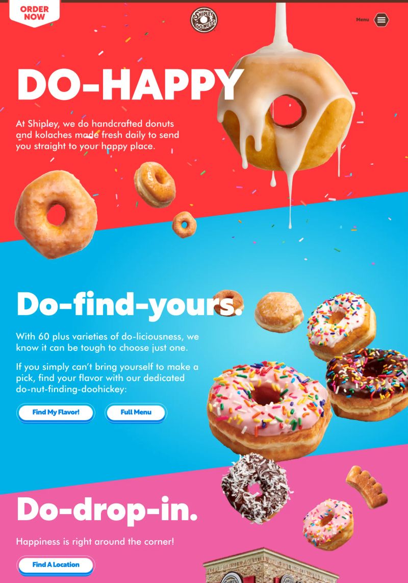
The vibrant use of contrasting colors in this bakery website creates an enticing visual experience that accentuates appetizing donut imagery, making it a stellar design example that draws customers in.
Bold typography combined with a vibrant color scheme on this agriculture website immediately captures attention and enhances brand identity, making it a standout inspiration.

What a great example of bold copywriting in "Favoriting encouraged," inviting customers to engage directly while showcasing menu options in a refreshing way.
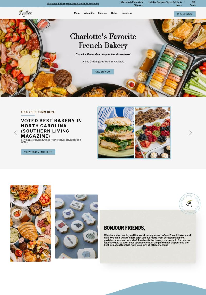
The vibrant use of images in this Bakery website showcases a mouthwatering array of treats, effectively enticing visitors to order from their wide selection.
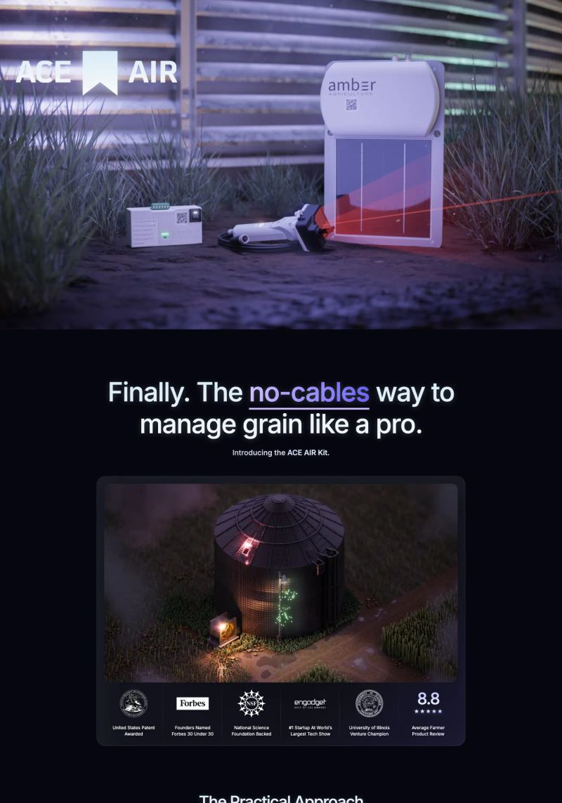
What a great feature with bold copy highlighting “no-cables” to emphasize innovative grain management in this agricultural design. This instant communicates clarity while engaging the audience.

The website excels in copywriting with engaging phrases like "NOT JUST AN EMPANADAS," effectively capturing the essence and uniqueness of its offerings.

The design uses warm colors and rustic visuals that embody an inviting country feel, perfectly reflecting the agricultural theme of the site.
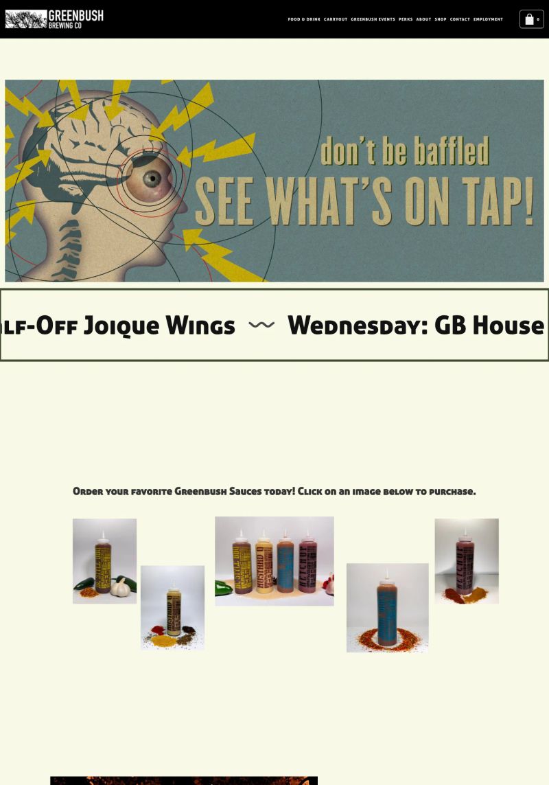
The engaging slogan "don’t be baffled SEE WHAT’S ON TAP!" combines punchy typography and quirky graphics, creating eye-catching visual intrigue perfect for a brewery website.
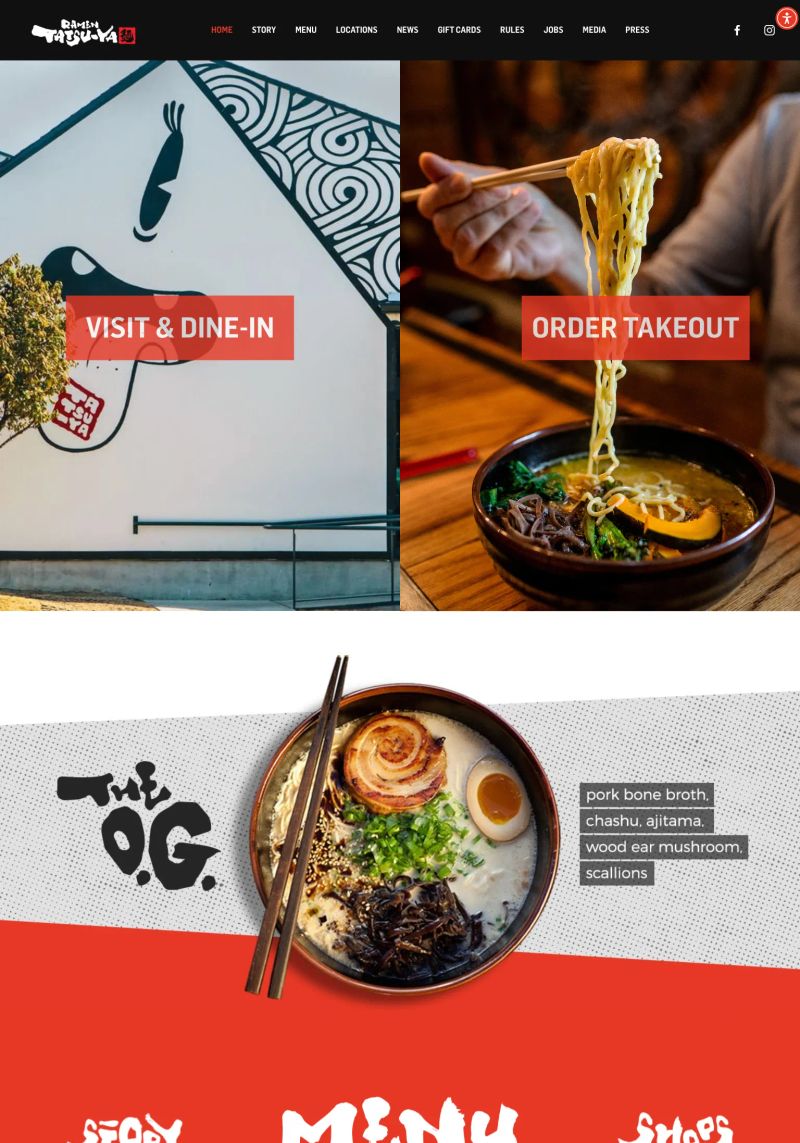
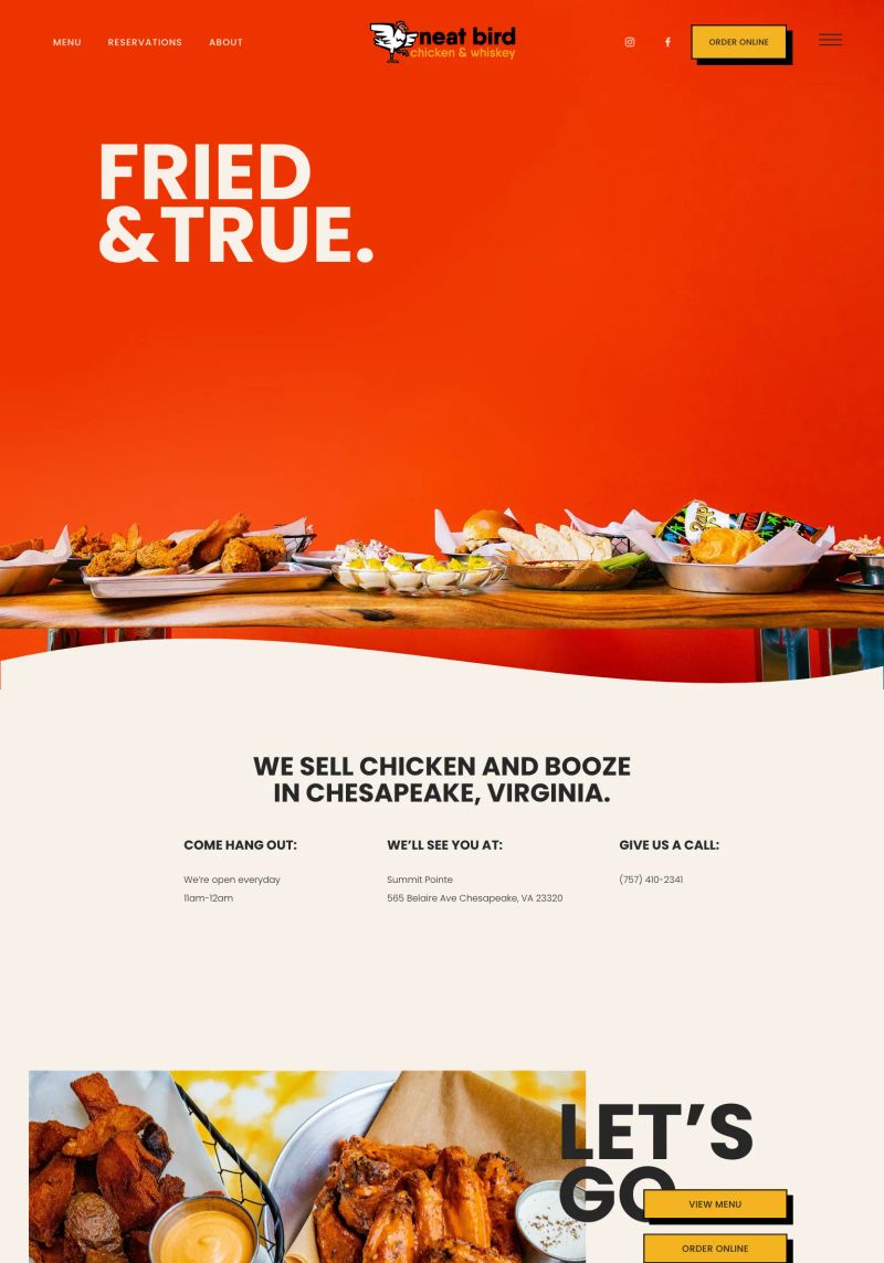
What a great feature with the clear call-to-action buttons for "VISIT & DINE-IN" and "ORDER TAKEOUT" which guide users instantly to options they crave on this restaurant website.
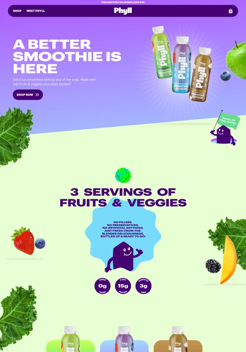
The vibrant colors and playful typography create a fun and lively atmosphere for Phyll, making the beverage website visually appealing and engaging for potential buyers.
The use of cohesive color blocks, vibrant photography, and readable typography distinctly enhances the visual appeal of this beverage website, making it a strong inspiration example.
The design spotlights vibrant colors that evoke a cheerful and appetizing vibe, effectively drawing attention to featured dishes and refreshing beverages.
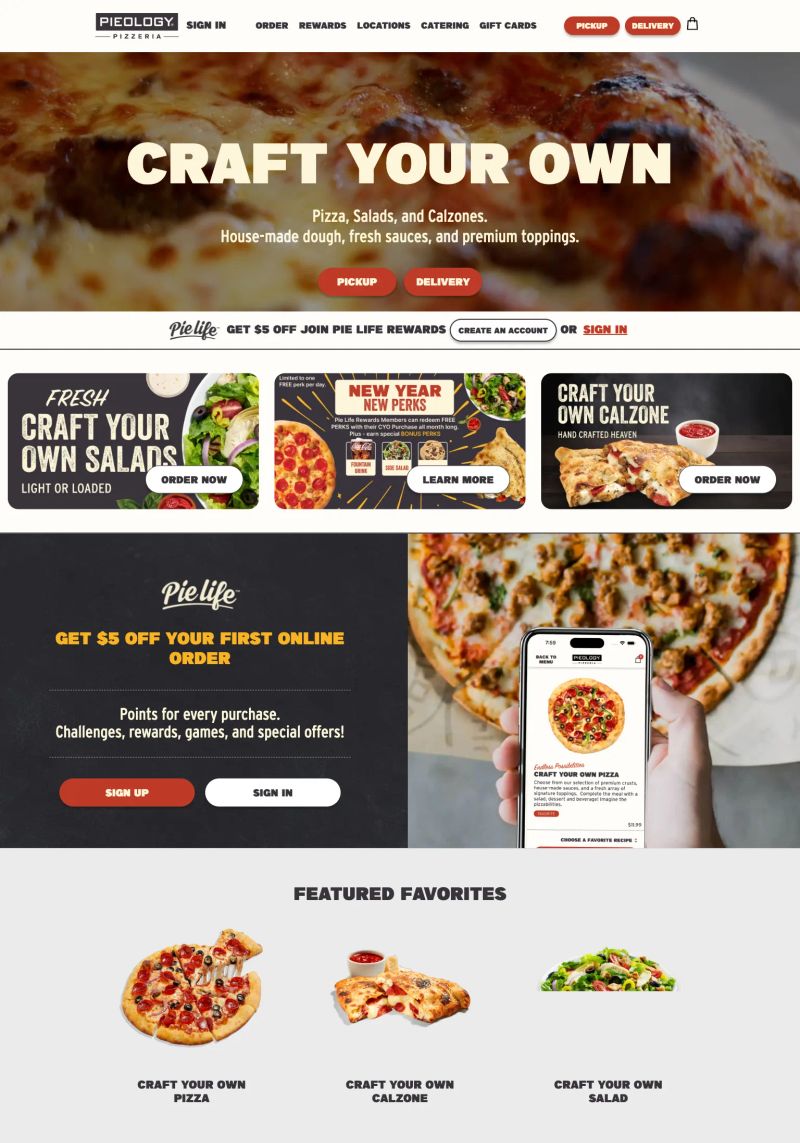
The bold header "CRAFT YOUR OWN" commands attention, effectively utilizing a strong visual hierarchy which enhances the overall design for this restaurant website.
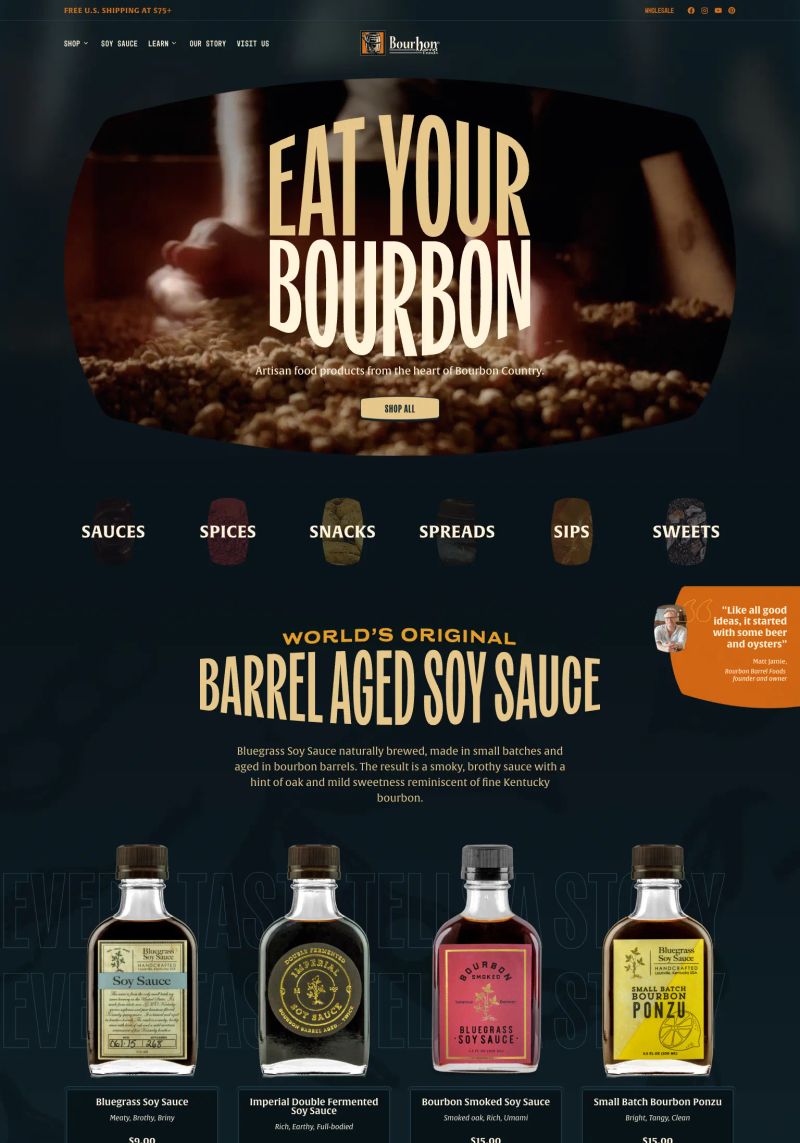
The bold, oversized typography in the hero section creates a striking focal point, powerful for compelling storytelling on this Shopify beverage website.
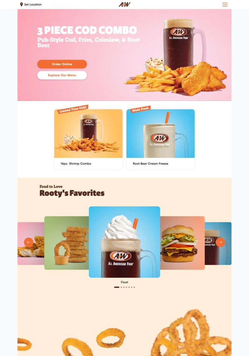
The striking color contrast of the bold orange background against playful typography truly captures attention and brings a vibrant energy to the restaurant's design.

Featuring a vibrant pink and green color palette, the Squarespace bakery website cleverly plays with bold typography that instantly captures attention, enhancing its playful vibe.

The copywriting here shines with the welcoming message, “WELCOME TO FAR OUT PIZZA,” creating an inviting vibe for visitors seeking a vibrant dining experience.
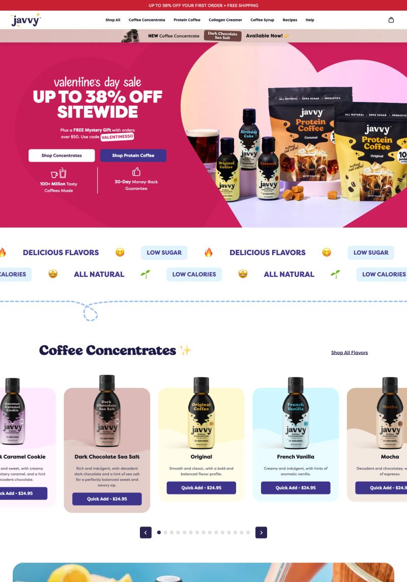
The design features a bold pink hero section with striking typography that grabs attention, especially with the clear promotion “UP TO 38% OFF SITEWIDE,” making this Shopify beverage website stand out effectively.
About this collection
This is a collection of websites organized by the platform they are built on, category, and sometimes tags and the creator. They're here for inspiration. Most websites made it into this collection because they have beautiful designs, while others showcase exceptional copywriting or information architecture.
What this page contains
This page showcases 392 website examples in the Food category. Each website includes a tall screenshot and a link to the live site, the platform it was built on, and a description (generated with AI).
Quality may vary by category or platform
Some sites aren't an absolute 10/10, but they shine relative to their categorization. For example, categories like Notary or HOA don't reach the same design heights as Designer or SaaS sites. They're still included so people in those industries have relevant references when building their website.
How these websites are picked
While I won't reveal the exact details of my curation process (so competitors can't copy), I can share that:
- They are all organically sourced (i.e., I don't copy other inspiration galleries)
- It's an arduous process to find these gems. I typically review 10,000 sites to discover just 10 worthy additions.
The purpose of this collection
There are two primary reasons people view these website examples:
- To find design, copy, or general website inspiration from similar businesses in their industry
- To explore the capabilities of website platforms before making a decision
Oh yes, and affiliate marketing. I'm part of affiliate programs for some of the platforms, so if you purchase after clicking a link, I may earn a commission.
Want to suggest a site?
Reach out to me on LinkedIn.