384 Kickass Health Website Examples
I found some of the best health websites to share for inspiration. Only 0.1% of reviewed website designs make it onto this list! Each website example includes a tall screenshot and a link to the live site and the platform it was built on.
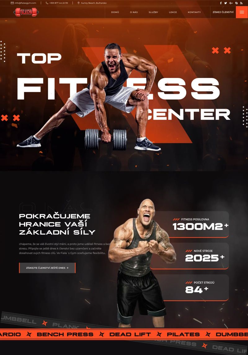
Bold typography dominates the design, making "TOP FITNESS CENTER" striking and immediately attention-grabbing, perfect for a fitness website inspiring potential members.
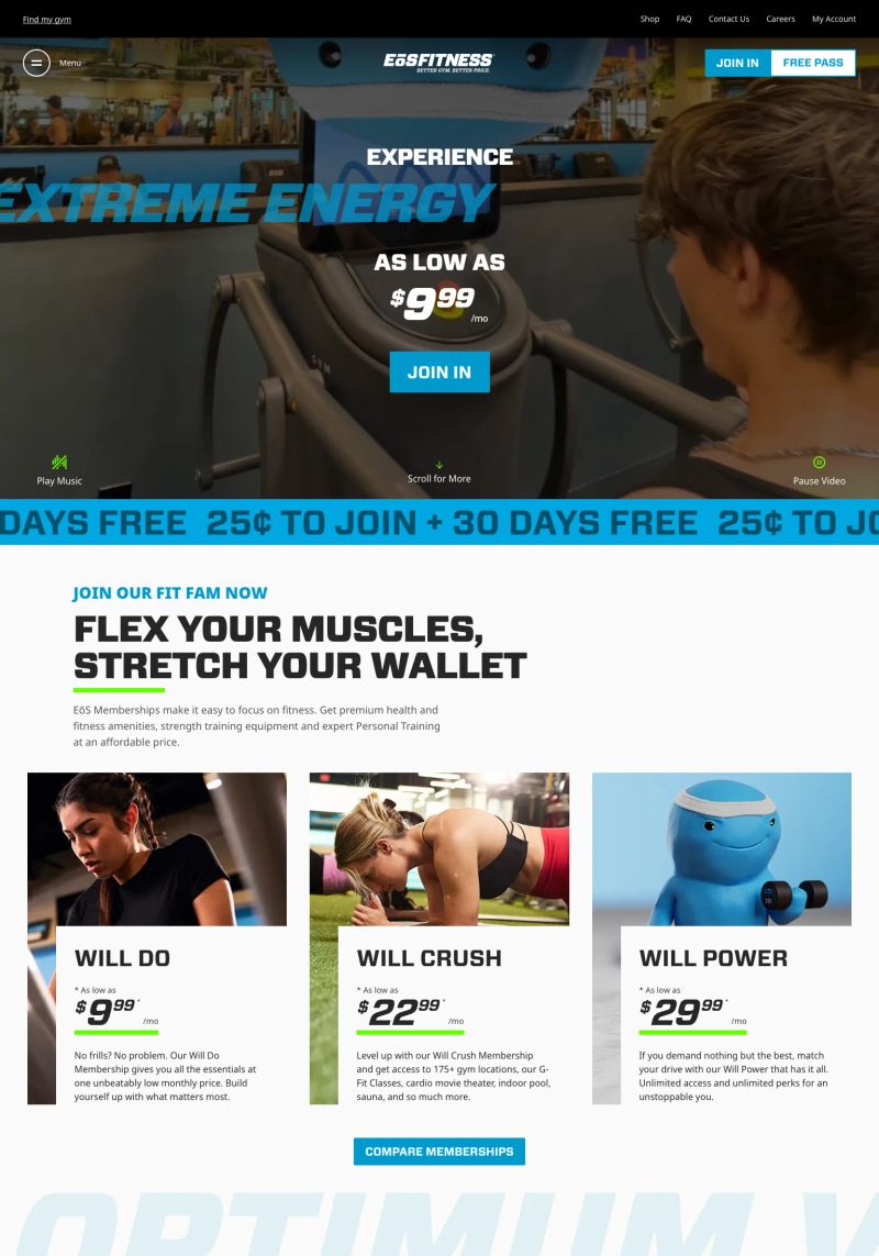
The dynamic copy, “JOIN OUR FIT FAM NOW” and “FLEX YOUR MUSCLES, STRETCH YOUR WALLET,” positions fitness as both communal and accessible, making this Fitness website truly engaging.
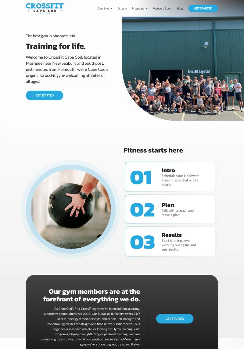
Inspired by the CrossFit Cape Cod website, the use of clear visuals and an inviting hero image immediately connects visitors to their fitness journey, enhancing user engagement in a fun way.
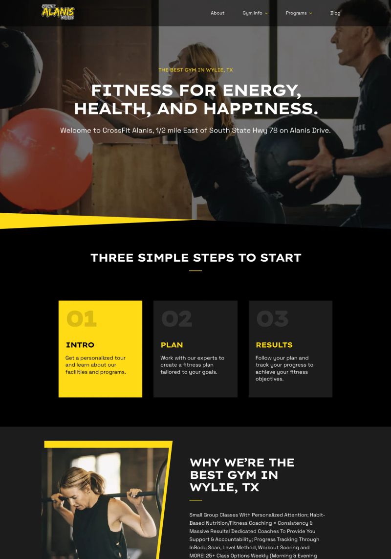
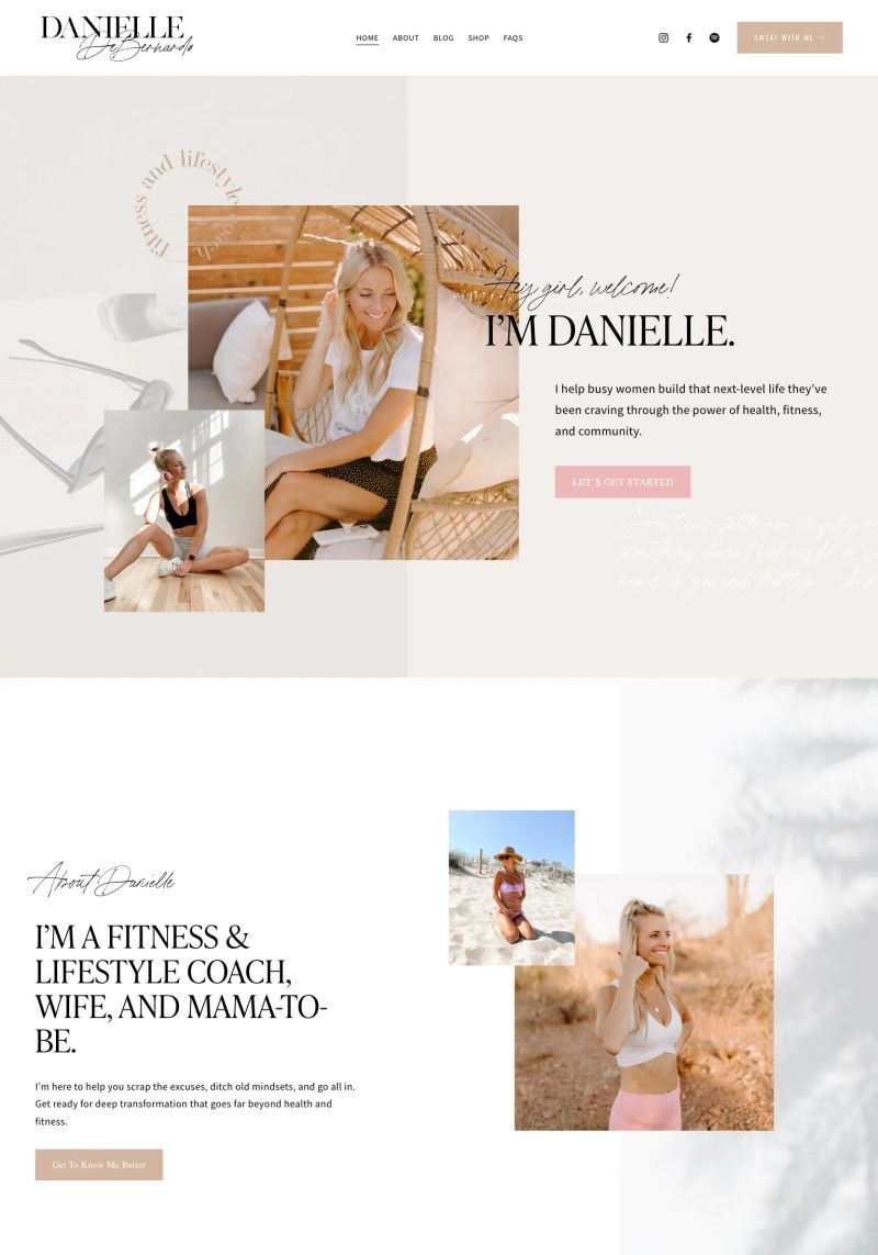
This fitness website shines with its concise and motivating copy, stating "Fitness for energy, health, and happiness" to clearly communicate its focus on overall well-being and positivity.

This website design features bold typography, bringing eye-catching attention to "THE CORE METHOD" and creating a strong visual impact that's great for fitness inspiration.
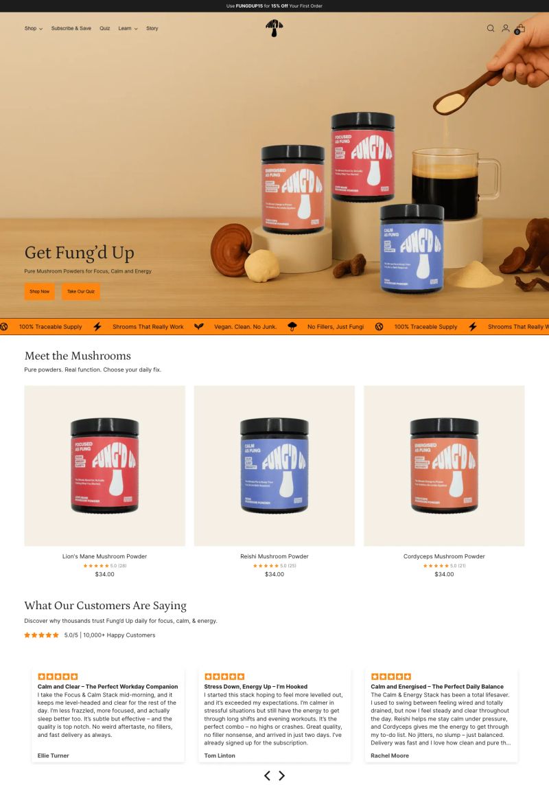
This website design features bold colors and a clean font that create a strong visual hierarchy, drawing focus to essential product information and calls to action.
This website uses a vibrant color palette that highlights the product packaging, creating an inviting and energetic feel, perfect for the alternative medicine space.

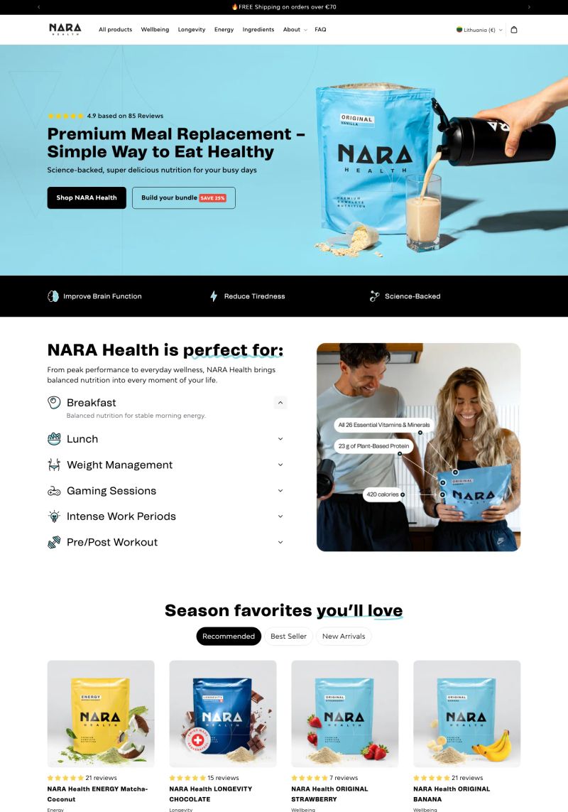
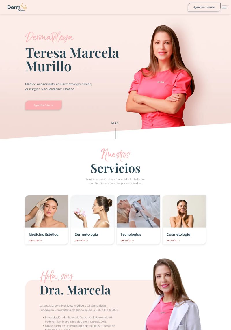
The vibrant use of colors enhances the website’s design, providing a dynamic contrast that draws attention to important medical practice features and services.
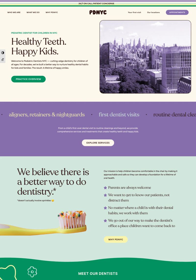
What a great hero section! The vibrant colors and friendly typography immediately convey a welcoming vibe, perfect for a pediatric dentist website aiming to attract families.
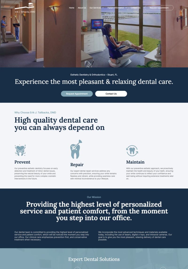
The design of this dentist website impressively combines calming colors and inviting visuals, creating a friendly approach that encourages patients to feel at ease.
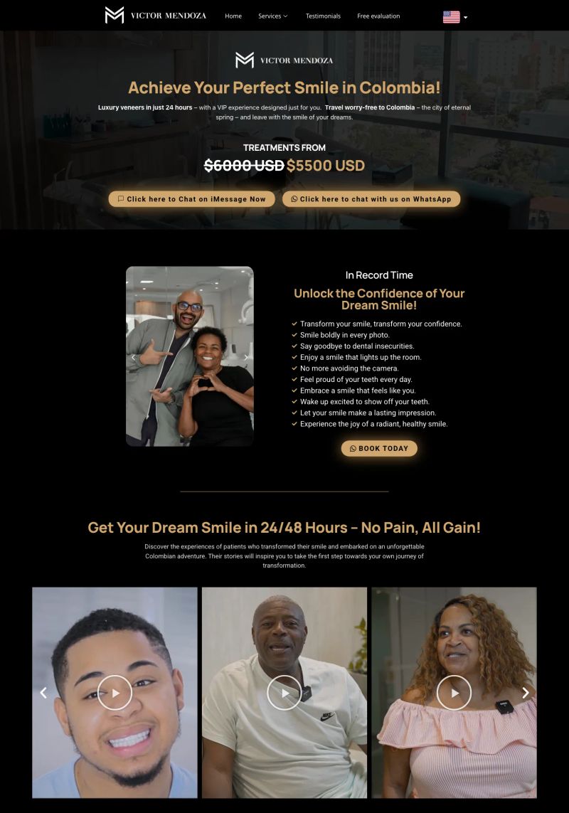
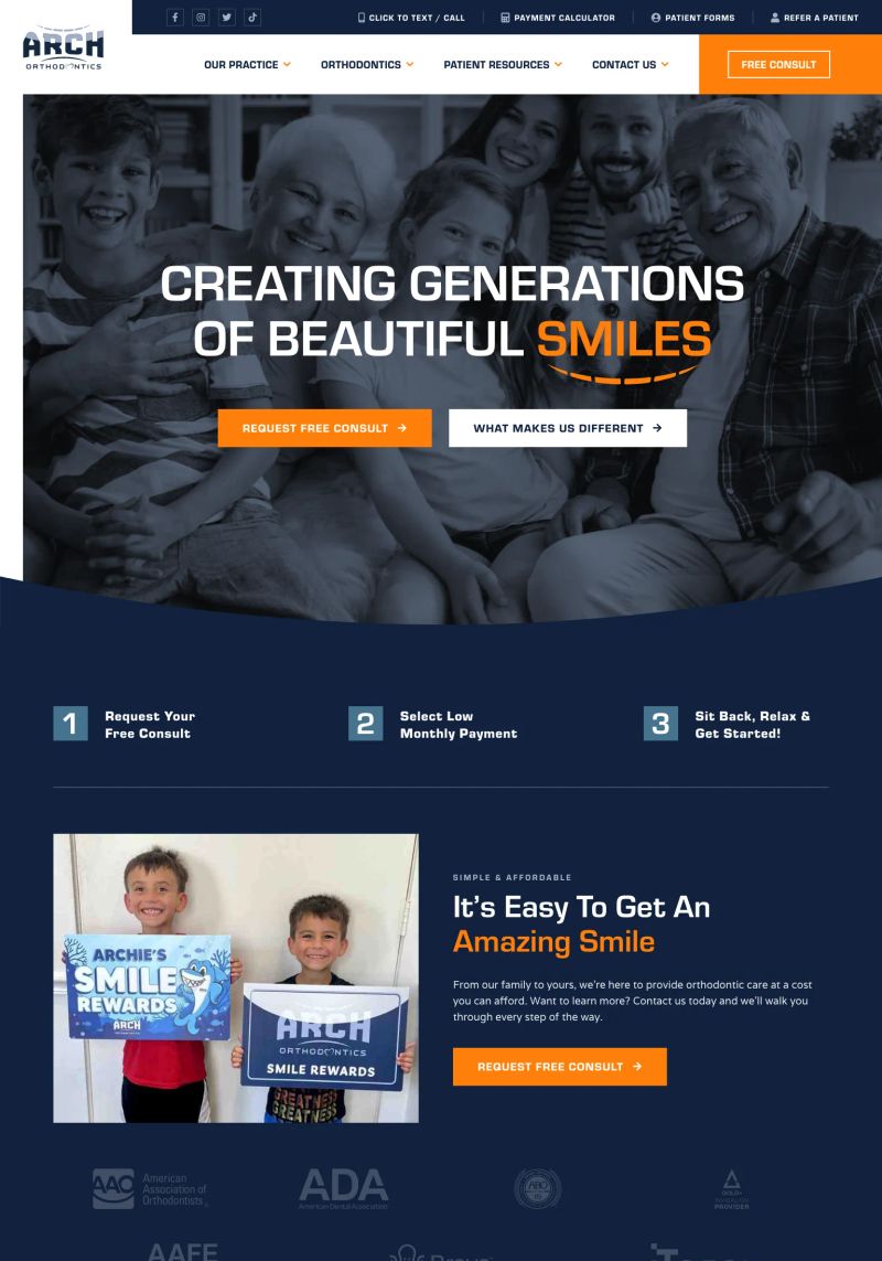
Bold and engaging copy like "Unlock the Confidence of Your Dream Smile!" not only draws in visitors but also clearly communicates the core transformation that dentistry offers.
The use of inviting colors and calming imagery creates a warm and welcoming atmosphere, illustrating a commitment to patient comfort in this delightful dental website design.
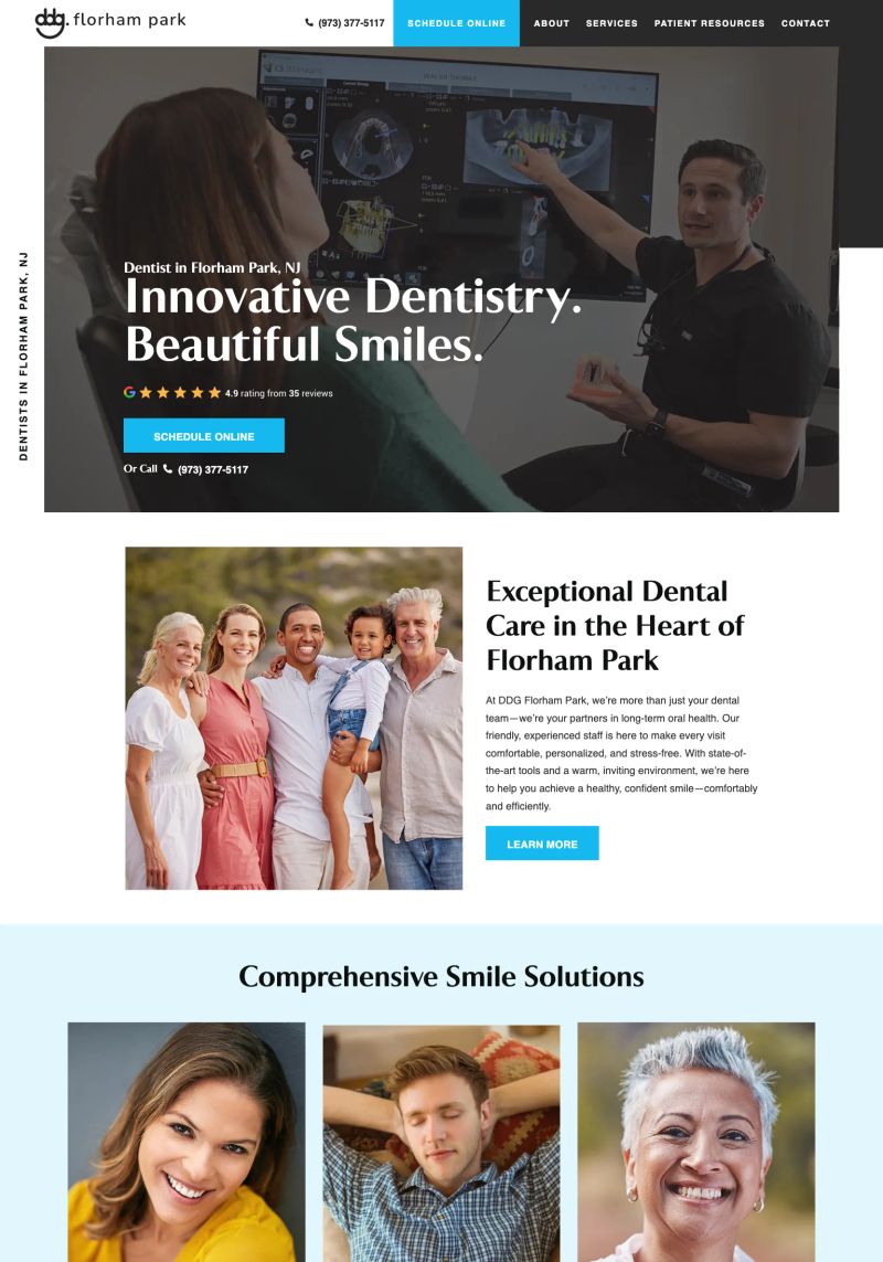
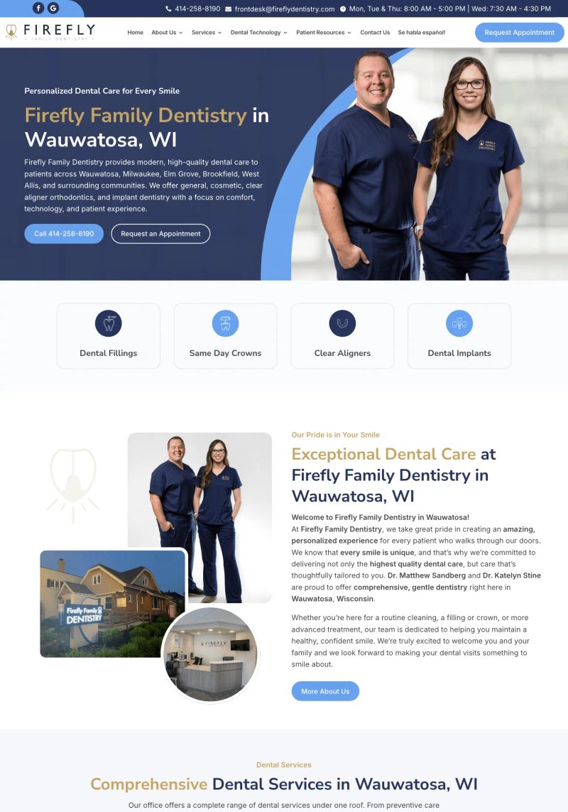
The clear use of real patient imagery alongside a warm, inviting slogan—"Exceptional Dental Care in the Heart of Florham Park"—instantly fosters trust and connection in this dentist website design.
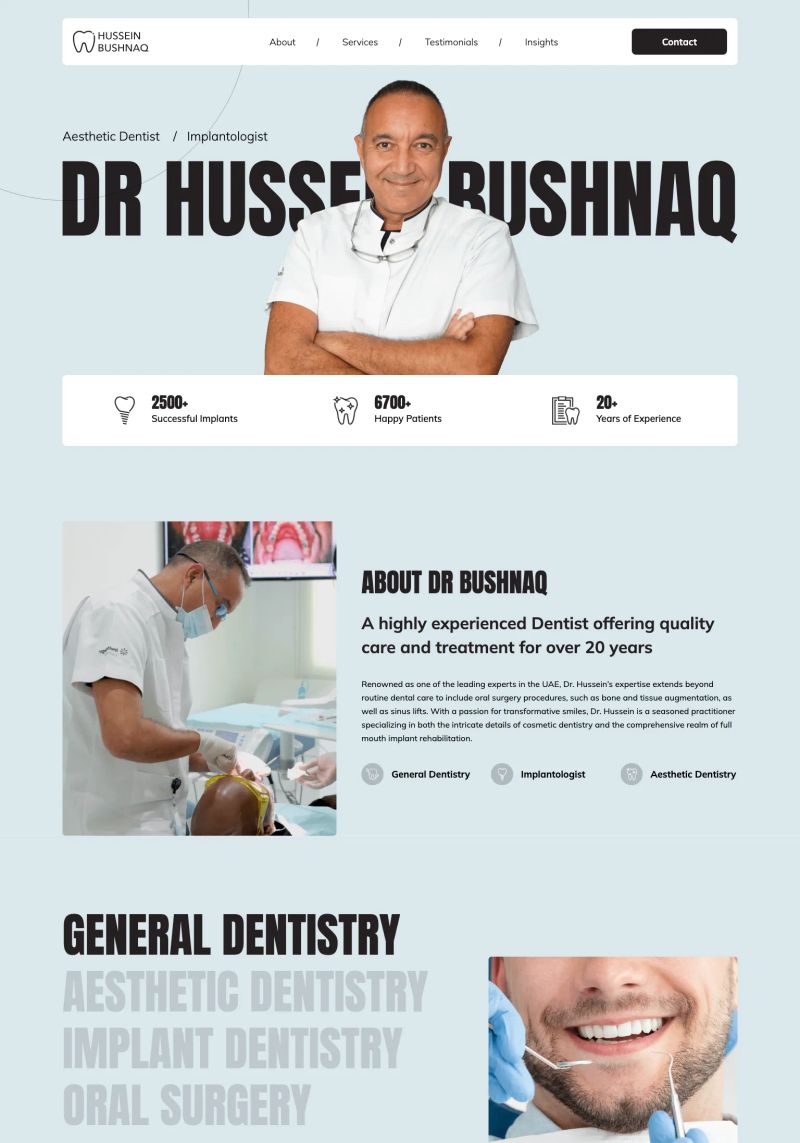
This WordPress website showcases impactful visuals through a distinct typography that highlights "DR HUSSEN BUSHNAQ," enhancing engagement and comfort for potential dental patients.
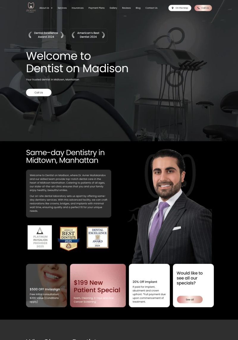
The layout impressively highlights the call-to-action with a prominent “Call Us” button that stands out against a striking black and white theme, perfect for a dental website inspiration.
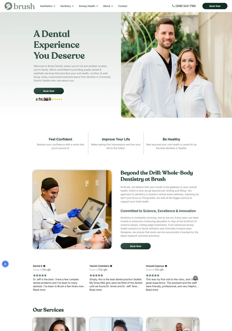
Bold typography tops a fresh, clean layout on this dentist website, making essential information pop while guiding users through its friendly and engaging design.
The compass-and-check.layout audible embraces a strong hierarchy with engaging colors and clear typography; it strategically guides visitors through the dentist’s services.
What a great use of happy imagery; the warmth and smiles in the visuals perfectly align with the site's mission in the medical practice of creating beautiful smiles.
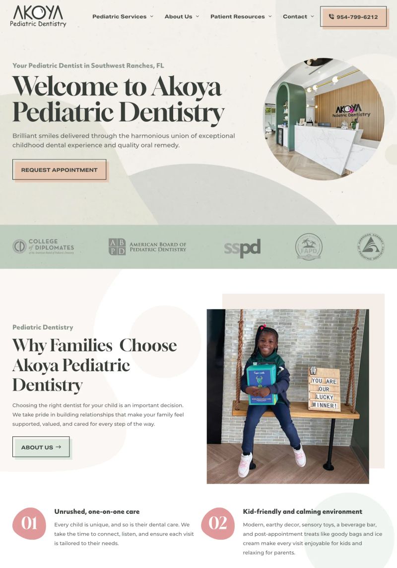
The design of the Akoya Pediatric Dentistry site beautifully balances playful typography and inviting colors, creating a warm atmosphere ideal for families seeking dental care for their kids.
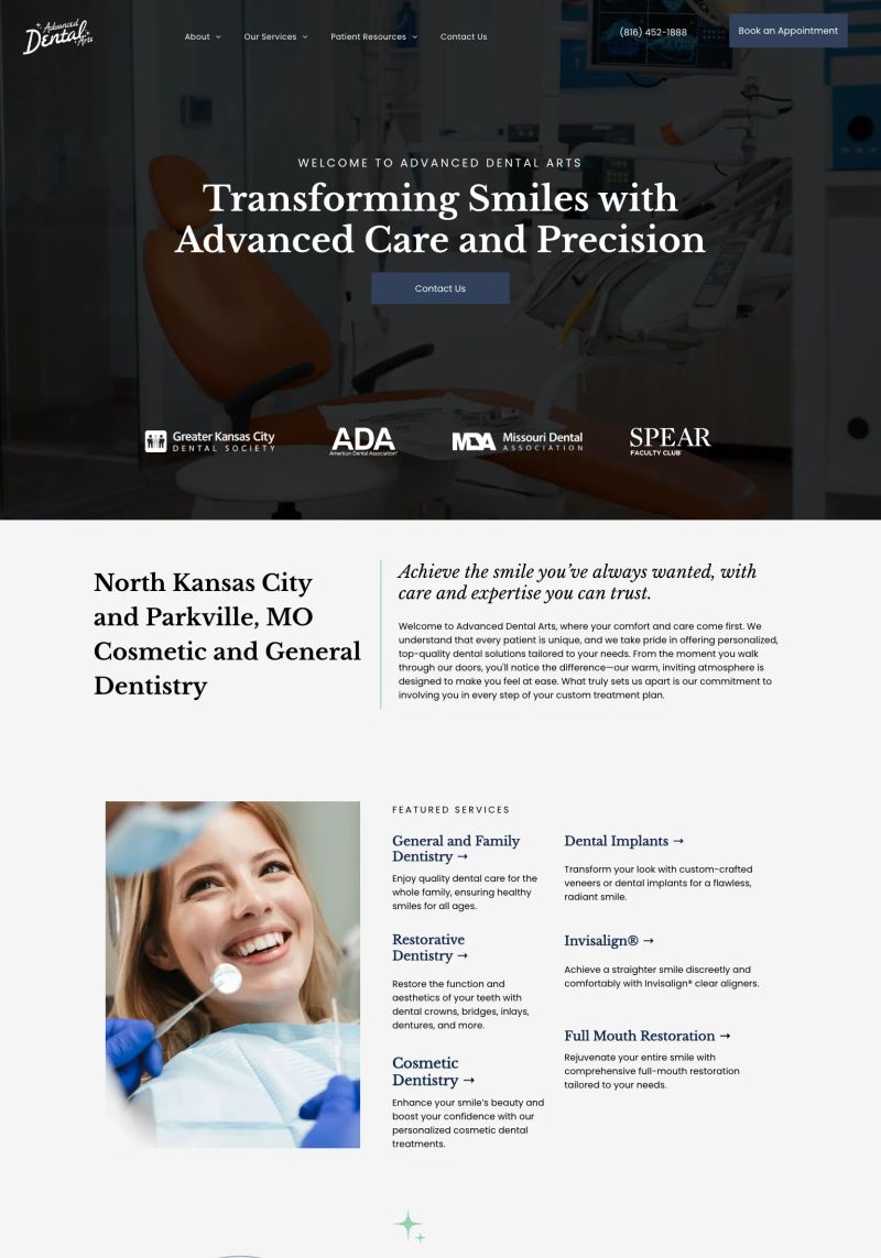
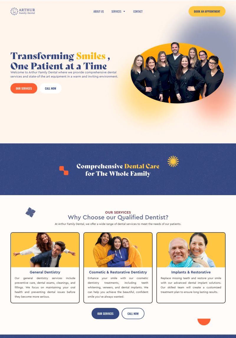
What a great use of visual hierarchy to guide users through the key services! The prominent headings like "Transforming Smiles with Advanced Care and Precision" catch the eye instantly.
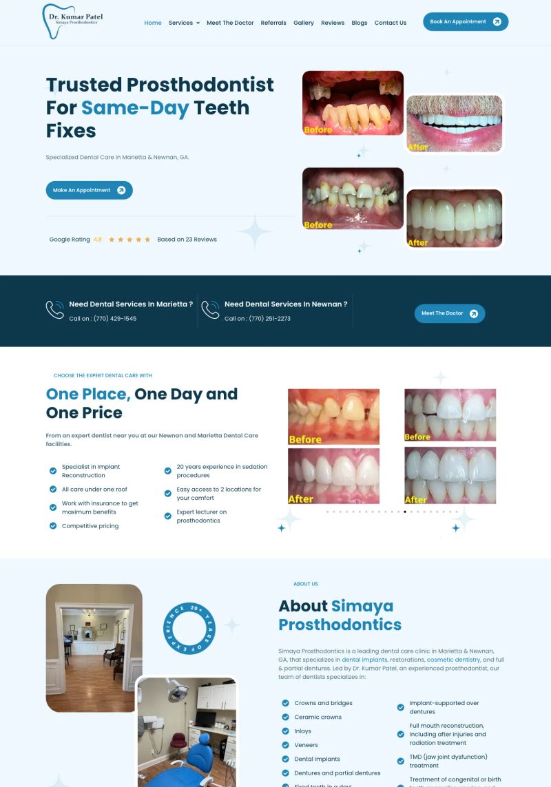
The typography stands out, blending approachable fonts for headings like "Trusted Prosthodontist" with crisp readability, enhancing the site's dental services appeal.

One standout feature of this medical practice website is its engaging hero section, highlighted by a focused tagline: "Personalised aesthetic care for what you truly need," inviting visitors to explore the services directly.
The soft color palette paired with elegant typography creates a welcoming and professional vibe for this medical practice website, great inspiration for user-friendly design.

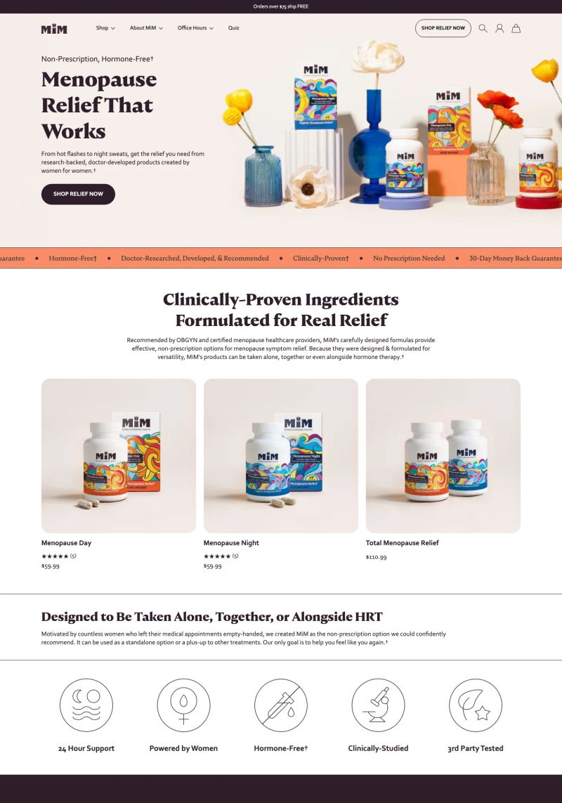
The copywriting on this site hits hard with the statement, "You deserve better healthcare. Period.", creating an impactful message that immediately resonates with the audience needing medical support for fertility.
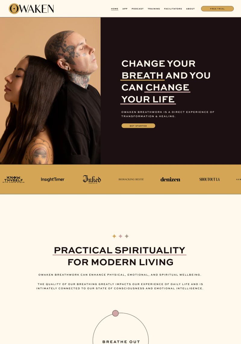
The thoughtful use of bold typography in the headline, "CHANGE YOUR BREATH AND YOU CAN CHANGE YOUR LIFE," draws immediate attention, making it a standout element in this alternative medicine website design.
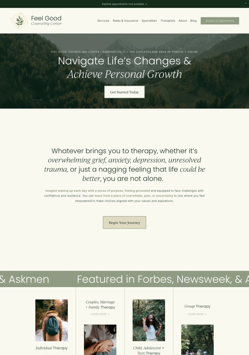
This Squarespace mental health services website uses soft colors and friendly fonts to create a calming atmosphere that encourages visitors to explore personal growth.
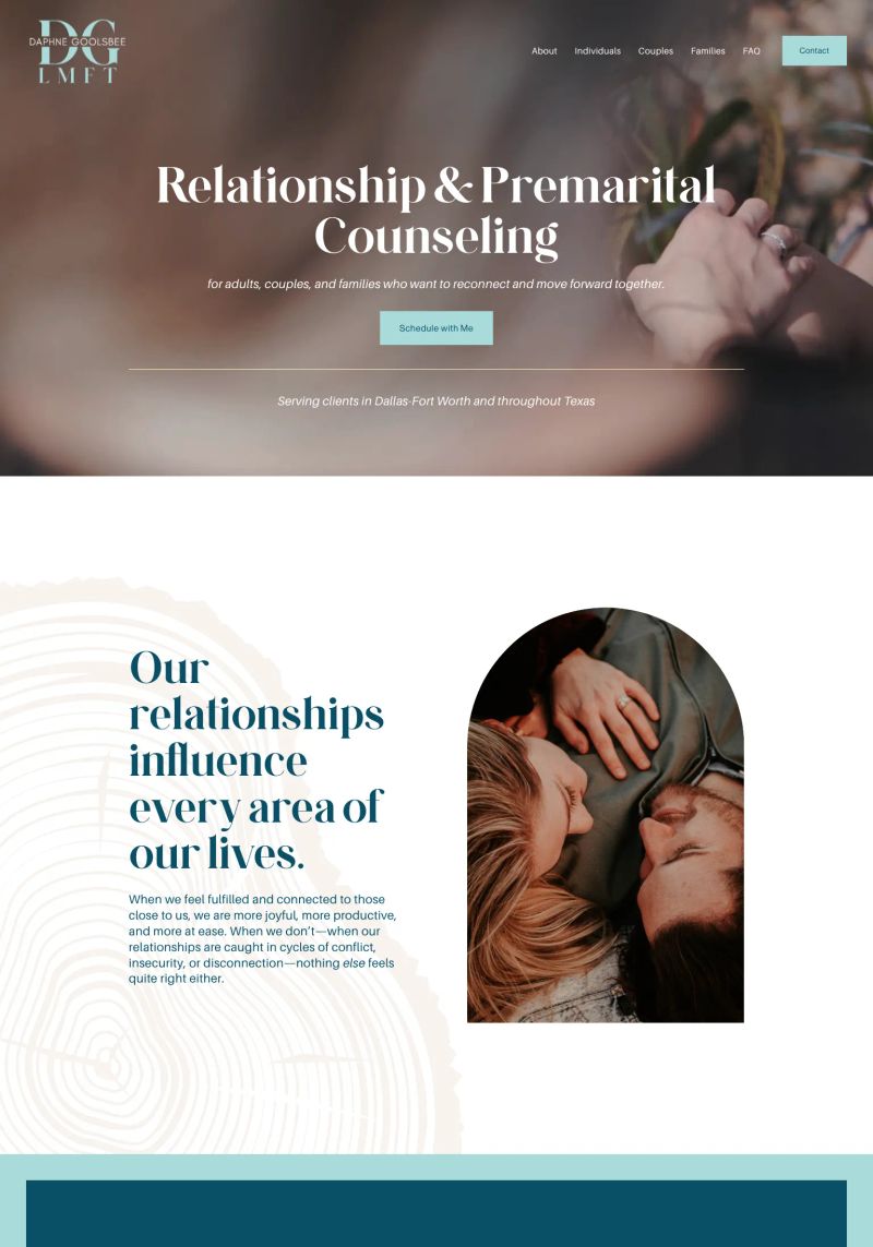
The color scheme blends soothing hues with copper accents, creating a warm, inviting atmosphere that enhances the overall aesthetic of this therapist website design.
This website design excels with its soft color palette and layered typography that creates a welcoming and modern feel, perfect for engaging a fitness-oriented audience.
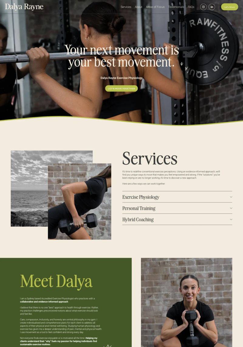
The design brilliantly combines warm colors and streamlined typography, making this Squarespace fitness website an inviting and polished inspiration.
About this collection
This is a collection of websites organized by the platform they are built on, category, and sometimes tags and the creator. They're here for inspiration. Most websites made it into this collection because they have beautiful designs, while others showcase exceptional copywriting or information architecture.
What this page contains
This page showcases 384 website examples in the Health category. Each website includes a tall screenshot and a link to the live site, the platform it was built on, and a description (generated with AI).
Quality may vary by category or platform
Some sites aren't an absolute 10/10, but they shine relative to their categorization. For example, categories like Notary or HOA don't reach the same design heights as Designer or SaaS sites. They're still included so people in those industries have relevant references when building their website.
How these websites are picked
While I won't reveal the exact details of my curation process (so competitors can't copy), I can share that:
- They are all organically sourced (i.e., I don't copy other inspiration galleries)
- It's an arduous process to find these gems. I typically review 10,000 sites to discover just 10 worthy additions.
The purpose of this collection
There are two primary reasons people view these website examples:
- To find design, copy, or general website inspiration from similar businesses in their industry
- To explore the capabilities of website platforms before making a decision
Oh yes, and affiliate marketing. I'm part of affiliate programs for some of the platforms, so if you purchase after clicking a link, I may earn a commission.
Want to suggest a site?
Reach out to me on LinkedIn.