80 Best WordPress Medical Website Examples
I found the best WordPress medical websites that attract more patients!
These sites prove that calming design and direct copy win in healthcare. Here are tips to make yours stand out:
- Address pain points immediately. Balanced Health Acupuncture
 opens with direct questions that hook anxious visitors… no fluff, just empathy. WordPress mental health services sites like Barber Mental Health Associates
 do this with earthy, reassuring tones too.
 - Stick to trust-building palettes. Blues and whites dominate top WordPress dental sites like Erik J. Tallbacka
 and DDG Florham Park
 … because calm colors signal competence.
 - Show transformation, not just credentials. Simaya Prosthodontics
 uses before-and-after imagery to prove results. WordPress chiropractic sites like Inner Balance Institute
 pair bold CTAs with strategic color accents to guide action.
Browse the full gallery below for more WordPress medical design inspiration.
 Mimic this
This wellness practitioner site organizes its value into three feature columns with minimalist leaf illustrations and repeats "balance" across headlines and tagline.
 Mimic this
This acupuncture practice site uses a two-column hero with serif headlines, handwritten script callouts ("Shouldn't You Be Next?"), and alternating teal/pink CTAs throughout.
 Mimic this
This naturopathic clinic site uses a hand-lettered display font paired with lifestyle photography and a burgundy-to-magenta color system to position online health services as editorial and intimate.
 Mimic this
This mental health practice site pairs forest imagery with a warm brown CTA button to signal "safe space" alongside clinical credibility.
 Mimic this
This integrative health coaching site leads with a full-bleed hero portrait and italicizes "root cause" to anchor its philosophy of addressing underlying health issues rather than symptoms.
 Mimic this
This pediatric dentistry site pairs mint-green and deep-purple sections with a playful footnote ("*doesn't actually involve sprinkles 🧁") to position itself as child-friendly.
 Mimic this
This dental practice site separates service offerings into icon cards and positions two provider portraits with overlapping exterior building photos in the welcome section.
 Mimic this
This dental tourism landing page positions Colombian veneers against US pricing with strikethrough comparisons and overlapping before-after photo grids.
 Mimic this
This dental practice site opens with a patient-in-chair hero and sells comfort with "Experience the most pleasant & relaxing dental care" as the primary headline.
 Mimic this
This dental practice site uses a serif display headline "Innovative Dentistry. Beautiful Smiles." paired with a dentist-at-work hero image and cyan scheduling buttons.
 Mimic this
This dental practice site layers the doctor's portrait behind oversized serif typography and uses slash-separated navigation to signal clinical precision.
 Mimic this
This dental practice site uses dark moody hero imagery with gold accents and credential badges to position same-day service as premium care.
 Mimic this
This dental practice site pairs serif italic headlines with warm cream backgrounds and positions whole-body dentistry as "A Dental Experience You Deserve."
 Mimic this
This dental practice site highlights team diversity through a two-column hero with organic blob shapes and colorizes "Smiles" orange in the headline.
 Mimic this
This orthodontics practice site uses a multigenerational family portrait in the hero with "SMILES" highlighted orange, anchoring messaging around generational care.
 Mimic this
This pediatric dentistry site anchors credibility with a credentials bar of dental board logos, then uses candid photos of children in organic rounded frames to build trust.
 Mimic this
This prosthodontist site leads with "Same-Day" teeth fixes and uses before/after grids to anchor value propositions across repeating sections.
 Mimic this
This women's telehealth site uses stacked serif headlines with mixed coral and green lettering and hot pink category cards with rounded image corners.
 Mimic this
This counselor site separates service offerings into square-cornered cards with clinical specificity like "ADD/ADHD Counseling & Evaluation using the T.O.V.A Test."
 Mimic this
This dental implant clinic site emphasizes cost comparison by highlighting "70% cheaper" prices and "in Europe" alongside patient testimonial videos in a maroon-and-white clinical layout.
 Mimic this
This therapy practice site frames emotional healing with "freedom from the physical, mental and spiritual bonds" and uses rounded photo cutouts with layered sage-green circles.
 Mimic this
This healthcare SaaS site uses neon green accent text and a black-hole visual to position remote patient monitoring as futuristic infrastructure.
 Mimic this
This family dentistry site structures its value in three icon cards—"Expert Dentists," "New Technology," "Accept Insurance"—below a hero with script-cursive accent on the word "smile."
 Mimic this
Teeth & Face
This dental practice site uses a circular badge reading "SMILE · LIVE · BREATHE" and pairs serif headings with colorful abstract face illustrations in the treatments section.
 Mimic this
Elemy
This pediatric autism care site uses serif headlines paired with circular image masks and soft blue-gray decorative arcs overlapping photo boundaries.
 Mimic this
This psychedelic retreat site uses an upside-down wildflower meadow hero image and serif headings stating "Attune to purpose and connection" over cream backgrounds.
 Mimic this
This chiropractic practice site uses a navy-and-gold color split with feature cards labeled "Every Patient Is Different" to emphasize personalized treatment plans.
 Mimic this
This chiropractic site leads with "Who Thought They Could Not Be Helped" in the hero headline, positioning itself as a specialist for difficult cases.
 Mimic this
This chiropractic practice site uses organic blob shapes in warm terracotta and sage to frame the hero image, replacing geometric layouts with natural forms.
 Mimic this
This chiropractic practice site leads with a "$47 New Patient Special" banner and repeats the offer across hero, cards, and CTAs to anchor pricing.
Design Data
The colors, fonts, and layout choices used across 80 WordPress medical websites.
Background color
How dark or light the page background is (background luminance).
- White / near white 67.5% (54)
- Mid-tone 8.8% (7)
- Dark 8.8% (7)
- Light 7.5% (6)
- Black / near black 7.5% (6)
Accent color
The color of each site's primary button, measured from its code (accent hue family).
- Black, white & gray 38.5% (30)
- Amber / orange 23.1% (18)
- Teal / cyan 9% (7)
- Green 9% (7)
- Blue 7.7% (6)
- Pink 3.8% (3)
- Purple 3.8% (3)
- Red 2.6% (2)
- Lime 2.6% (2)
Hero imagery
The kind of visual the top section leads with.
- Photography 92.3% (72)
- Illustration 3.8% (3)
- No imagery 2.6% (2)
- 3D artwork 1.3% (1)
Button shape
Corner rounding on primary buttons (border radius relative to height).
- Pill (fully rounded) 45% (18)
- Square corners 30% (12)
- Rounded corners 25% (10)
Font combination
How heading and body typefaces pair (serif vs. sans-serif).
- All sans-serif 68.4% (26)
- Serif headings, sans-serif body 31.6% (12)
Color intensity
How colorful the palette is, from black-and-white to bold color (saturation).
- Soft, muted color 70% (56)
- Black & white 21.3% (17)
- Bold, vivid color 8.8% (7)
Dark mode support
Sites whose code adapts to the visitor's light/dark preference (prefers-color-scheme).
- Yes 6.3% (3)
- No 93.8% (45)
Most-used fonts
The typeface each site leads with, read from its live CSS.
- Poppins 15.8% (6)
- Montserrat 15.8% (6)
- Playfair Display 10.5% (4)
- Fraunces 5.3% (2)
- Raleway 5.3% (2)
Percentages are the share of sites where each trait could be measured, with counts in parentheses. Last updated July 2026.
The best WordPress medical website examples agree on white, not dark
Across this gallery of 80 WordPress medical sites, 67.5% run a near-white background, and another 7.5% sit in the light bucket. That means roughly three in four sites keep the canvas bright. Dark and near-black backgrounds each account for just 8.8% and 7.5% respectively, small enough that neither reads as a real alternative style, more like an occasional outlier. Warsaw Chiropractic & Wellness Center and Life Aligned Chiropractic
 both build on white, and they’re the norm, not the exception. Dentist on Madison
 and Chiropractor Leeds
 show the near-black minority still works, but a builder chasing WordPress medical design should treat white as the safe, expected default and reserve dark as a deliberate contrast move, not a coin flip.
Muted color, not vibrant color, carries the trust signal
Saturation profile splits 70% muted, 21.3% monochrome, and only 8.8% vibrant. Combined with neutral leading the accent hue family at 38.5% and amber a clear second at 23.1%, the pattern is consistent: medical sites lean on restrained palettes rather than saturated brand color. Adams Chiropractic Health Center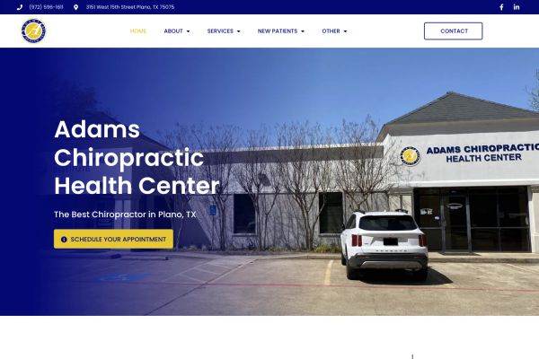 and South Bay Chiro
 both pair muted tones with amber accents, while Seven Oaks Therapy
 goes fully black-and-white. Blue and teal trail behind amber, each in single digits of representation, visible in Florida Orthopaedic Institute
 and Dana McNeil
 . This matters for anyone building in adjacent categories like WordPress Chiropractic Websites or WordPress Physical Therapy Websites: loud color reads as off-brand here, muted and neutral reads as credible.
Photography does the persuading, not illustration
Hero media is photo-led in 92.3% of sites, dwarfing illustration at 3.8% and 3D at 1.3%. Patient-facing medical brands sell trust through real faces and real clinics, not abstract graphics. Every example cited here, from Kinetic Health to Gem State Counseling
 to Elevate Counseling
 , opens with a photographic hero. Anyone designing for WordPress Mental Health Services Websites or WordPress Nutritionist Websites should treat a photography-led hero as close to mandatory rather than optional polish.
Pill buttons edge out square and rounded, but the race is close
CTA shape splits pill at 45%, square at 30%, rounded at 25%. Pill leads, but with only eighty sites in the sample and the gap between square and rounded sitting at a handful of sites, none of the three shapes dominates outright. Dana McNeil and Jaclyn Lim Psychology use pill buttons, Life Aligned Chiropractic and Scott County Chiropractic
 use square, and Adams Chiropractic Health Center rounds its corners. The median CTA radius of 10px confirms most sites choose a soft, moderate curve rather than a sharp square or a fully circular pill, useful guidance for anyone starting a WordPress Medical Practice Websites build from scratch.