80 Best WordPress Medical Website Examples
I found the best WordPress medical websites that attract more patients!
These sites prove that calming design and direct copy win in healthcare. Here are tips to make yours stand out:
- Address pain points immediately. Balanced Health Acupuncture
 opens with direct questions that hook anxious visitors… no fluff, just empathy. WordPress mental health services sites like Barber Mental Health Associates
 do this with earthy, reassuring tones too.
 - Stick to trust-building palettes. Blues and whites dominate top WordPress dental sites like Erik J. Tallbacka
 and DDG Florham Park
 … because calm colors signal competence.
 - Show transformation, not just credentials. Simaya Prosthodontics
 uses before-and-after imagery to prove results. WordPress chiropractic sites like Inner Balance Institute
 pair bold CTAs with strategic color accents to guide action.
Browse the full gallery below for more WordPress medical design inspiration.
Mimic your favorite site with AI!
- Select an image
- Describe your project
- Click generate
- Open in Lovable or copy the prompt to another AI builder
Mimic is free to use and no sign-up is required. Lovable has a free tier.
 Mimic this
This wellness practitioner site organizes its value into three feature columns with minimalist leaf illustrations and repeats "balance" across headlines and tagline.
 Mimic this
This acupuncture practice site uses a two-column hero with serif headlines, handwritten script callouts ("Shouldn't You Be Next?"), and alternating teal/pink CTAs throughout.
 Mimic this
This naturopathic clinic site uses a hand-lettered display font paired with lifestyle photography and a burgundy-to-magenta color system to position online health services as editorial and intimate.
 Mimic this
This mental health practice site pairs forest imagery with a warm brown CTA button to signal "safe space" alongside clinical credibility.
 Mimic this
This integrative health coaching site leads with a full-bleed hero portrait and italicizes "root cause" to anchor its philosophy of addressing underlying health issues rather than symptoms.
 Mimic this
This pediatric dentistry site pairs mint-green and deep-purple sections with a playful footnote ("*doesn't actually involve sprinkles 🧁") to position itself as child-friendly.
 Mimic this
This dental practice site separates service offerings into icon cards and positions two provider portraits with overlapping exterior building photos in the welcome section.
 Mimic this
This dental tourism landing page positions Colombian veneers against US pricing with strikethrough comparisons and overlapping before-after photo grids.
 Mimic this
This dental practice site opens with a patient-in-chair hero and sells comfort with "Experience the most pleasant & relaxing dental care" as the primary headline.
 Mimic this
This dental practice site uses a serif display headline "Innovative Dentistry. Beautiful Smiles." paired with a dentist-at-work hero image and cyan scheduling buttons.
 Mimic this
This dental practice site layers the doctor's portrait behind oversized serif typography and uses slash-separated navigation to signal clinical precision.
 Mimic this
This dental practice site uses dark moody hero imagery with gold accents and credential badges to position same-day service as premium care.
 Mimic this
This dental practice site pairs serif italic headlines with warm cream backgrounds and positions whole-body dentistry as "A Dental Experience You Deserve."
 Mimic this
This dental practice site highlights team diversity through a two-column hero with organic blob shapes and colorizes "Smiles" orange in the headline.
 Mimic this
This orthodontics practice site uses a multigenerational family portrait in the hero with "SMILES" highlighted orange, anchoring messaging around generational care.
 Mimic this
This pediatric dentistry site anchors credibility with a credentials bar of dental board logos, then uses candid photos of children in organic rounded frames to build trust.
 Mimic this
This prosthodontist site leads with "Same-Day" teeth fixes and uses before/after grids to anchor value propositions across repeating sections.
 Mimic this
This women's telehealth site uses stacked serif headlines with mixed coral and green lettering and hot pink category cards with rounded image corners.
 Mimic this
This counselor site separates service offerings into square-cornered cards with clinical specificity like "ADD/ADHD Counseling & Evaluation using the T.O.V.A Test."
 Mimic this
This dental implant clinic site emphasizes cost comparison by highlighting "70% cheaper" prices and "in Europe" alongside patient testimonial videos in a maroon-and-white clinical layout.
 Mimic this
This therapy practice site frames emotional healing with "freedom from the physical, mental and spiritual bonds" and uses rounded photo cutouts with layered sage-green circles.
 Mimic this
This healthcare SaaS site uses neon green accent text and a black-hole visual to position remote patient monitoring as futuristic infrastructure.
 Mimic this
This family dentistry site structures its value in three icon cards—"Expert Dentists," "New Technology," "Accept Insurance"—below a hero with script-cursive accent on the word "smile."
 Mimic this
Teeth & Face
This dental practice site uses a circular badge reading "SMILE · LIVE · BREATHE" and pairs serif headings with colorful abstract face illustrations in the treatments section.
 Mimic this
Elemy
This pediatric autism care site uses serif headlines paired with circular image masks and soft blue-gray decorative arcs overlapping photo boundaries.
 Mimic this
This psychedelic retreat site uses an upside-down wildflower meadow hero image and serif headings stating "Attune to purpose and connection" over cream backgrounds.
 Mimic this
This chiropractic practice site uses a navy-and-gold color split with feature cards labeled "Every Patient Is Different" to emphasize personalized treatment plans.
 Mimic this
This chiropractic site leads with "Who Thought They Could Not Be Helped" in the hero headline, positioning itself as a specialist for difficult cases.
 Mimic this
This chiropractic practice site uses organic blob shapes in warm terracotta and sage to frame the hero image, replacing geometric layouts with natural forms.
 Mimic this
This chiropractic practice site leads with a "$47 New Patient Special" banner and repeats the offer across hero, cards, and CTAs to anchor pricing.
What the Top 0.1% of WordPress Medical Websites Get Right
I analyzed these standout WordPress medical sites and found three patterns that separate the best from the rest.
Trust-Building Visual Identity
Medical websites are ditching sterile white for warm, approachable color palettes that still feel professional.
- Sage green dominance: About 70% use muted greens and earth tones instead of clinical blues. Sites like Balance & Bliss Reiki
 and Family Healing Chiropractic
 pair sage greens with warm terracotta accents to feel therapeutic rather than intimidating
 - Organic shape integration: Roughly 60% incorporate soft, rounded design elements and blob shapes as decorative accents. Akoya Pediatric Dentistry
 uses curved sage green shapes behind family photos, while Arthur Family Dental
 adds organic orange gradients that feel playful yet premium
 - Real patient photography: Nearly 85% feature authentic lifestyle shots over stock medical imagery. Brush Dental
 shows actual practitioners with patients in natural lighting, and Firefly Family Dentistry
 displays genuine team photos in their clinical space
→ The winning formula combines therapeutic earth tones with organic shapes and authentic photography to build immediate trust.
Conversion-Focused Layout Patterns
The best WordPress medical websites prioritize appointment booking above everything else.
- Hero section CTAs: 100% feature appointment booking as the primary call-to-action in the hero, with secondary options like “Learn More” or “Contact Us.” Sites like DDG Florham Park and Arch Orthodontics
 use contrasting button colors (cyan blue and orange respectively) that pop against neutral backgrounds
 - Trust signal placement: About 80% display credentials, awards, or patient reviews immediately below the hero section. Dentist on Madison
 shows “Dental Excellence Award 2024” badges prominently, while Scott County Chiropractic
 leads with a “$47 New Patient Special” offer bar
 - Services grid consistency: Roughly 75% use 3-column service grids with circular icons and “Learn More” buttons. The pattern appears across WordPress dental sites like Syndal Dentistry
 and extends to WordPress chiropractic sites like Adams Chiropractic Health Center
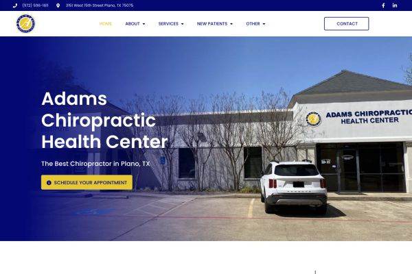
→ Leading medical sites treat every page element as a conversion opportunity, with booking CTAs appearing multiple times per page.
Patient-Centric Messaging Formulas
Top medical websites speak directly to patient pain points rather than listing clinical capabilities.
- Problem-first headlines: About 65% lead with patient struggles before solutions. Frye Chiropractic
 opens with “We Have Helped Many People Who Thought They Could Not Be Helped,” while Barber Mental Health Associates uses “Find Your Path to Healing, Growth, & Resilience”
 - Outcome-focused copy: Nearly 90% emphasize results over processes. Erik J. Tallbacka promises “Experience the most pleasant & relaxing dental care,” and AJ Health
 positions as “YOUR ONLINE NATUROPATHIC CLINIC” with immediate accessibility implied
 - Personal connection language: Roughly 70% of WordPress mental health services sites like Fort Worth Counseling
 use first-person messaging (“we walk with clients”) and conversational tone over clinical jargon
→ The most effective medical websites position practitioners as guides helping patients achieve specific outcomes, not just service providers.
Stop designing medical websites that look like every other clinic. The top performers understand that patients choose based on trust and comfort, not credentials alone. Focus on warm visuals, clear conversion paths, and patient-centered messaging that addresses real concerns.