21 Best WordPress Photography Website Examples

A photographer’s website has one job: prove your eye is worth hiring. The best WordPress photography websites lean on serif body text far more than other categories. That pattern showed up clearly after I ran every site here through Claude. The pairing matters, so compare the examples below and notice how the type sits next to the photos. When the serif feels wrong, the images usually do too.
Category
Platform
Style
 Mimic this
This photography platform site uses a knockouteffect where oversized "DARKLIGHT" text overlaps a centered black-and-white ocean photograph.
 Mimic this
This video production site anchors its hero with a film-noir gun image and lists five service categories—from creative development through ads & marketing—in a five-column grid.
 Mimic this
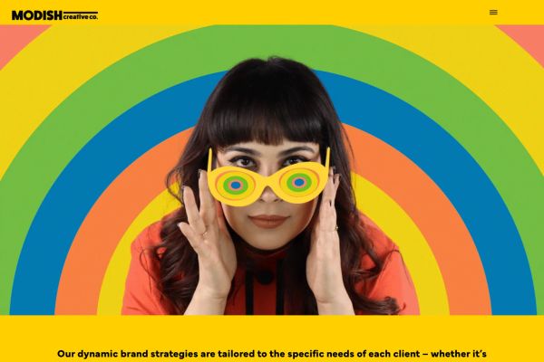
This creative agency site leads with a woman in spiral sunglasses against rainbow arcs, then sells services through italic serif copy on solid yellow before transitioning to a Warhol-style pizza grid.
 Mimic this
Imageotory
This photography studio site layers overlapping portrait photos on the right against dark backgrounds, with the hero heading "Capturing Life's Best Moments" split across lines in serif italic.
 Mimic this
This photographer portfolio site uses a masonry grid hero of varied-aspect-ratio images, then alternates white and dark sections with gold accents to showcase events, corporate, and food photography.
 Mimic this
This newborn photography site layers overlapping baby portraits with script typography to anchor the emotional value proposition "for the sentimental mama."
 Mimic this
This wedding photography site layers watercolor florals and torn-paper textures over a self-portrait collage, pairing "Always joyful" tagline with decade-long experience copy.
 Mimic this
This photography services site pairs dark backgrounds with gold accents and anchors the hero with "Keep Your Memories **Forever**" — the word "Forever" isolated in gold with an underline.
 Mimic this
This family photography site overlaps three golden-hour portraits in an asymmetric collage, with stacked serif headlines in alternating cream and warm gold.
 Mimic this
Karlie The Golden Maeve
This newborn photography site uses circular credential badges and a hero split of warm beige copy paired with a cutout portrait of the photographer holding a camera.
 Mimic this
This wedding photography site opens with a full-width carousel hero and centers the value prop—"Wedding photography is more than just capturing moments"—in serif type over white space.
 Mimic this
This photography portfolio leads with a full-bleed seal-on-iceberg hero and organizes content as two-column layouts with photography dominating the left side.
 Mimic this
This wedding photography site opens with a macro shot of blonde hair instead of a couple, positioning destination weddings through fine art imagery rather than traditional portraits.
 Mimic this
This photography portfolio site stacks full-bleed service images with left-aligned headings and "More Information" buttons, letting the portraits, weddings, and headshots work speak for themselves.
 Mimic this
This lifestyle photography site uses polaroid-style photo collages with slight rotations arranged asymmetrically, anchored by the pull quote "I'm So Honored And Proud Of The Families I Get To Serve In My Community."
 Mimic this
This newborn photography site organizes service offerings as an asymmetric masonry grid with alternating image sizes, pairing "Baby Photoshoot" against smaller "Couple Casting" and "Baby Casting" cards.
 Mimic this
This photography portfolio opens with "I don't trust words. I trust pictures" and uses gold accents to highlight key words within white serif headings.
 Mimic this
This elopement photography site uses rotated photo frames with gold borders and teal text blocks to emphasize "YOU'VE NEVER SEEN YOUR LOVE LIKE THIS BEFORE."
 Mimic this
This photography site uses a transparent navigation overlay and motion-blurred hero carousel, with a tagline in italic serif: "Elevating brands and everyday moments through thoughtful, artistic & timeless imagery."
 Mimic this
This wedding photography site leads with a full-bleed hero image tinted deep purple, anchoring the editorial aesthetic before any text appears.
 Mimic this
This photographer site uses scattered, rotated family portraits with sage-green matte borders in the hero, anchored by "Creating honest imagery that tells your story" in rust serif italic.
Design Data
The colors, fonts, and layout choices used across 21 WordPress photography websites.
Background color
How dark or light the page background is (background luminance).
- White / near white 42.9% (9)
- Black / near black 23.8% (5)
- Light 19% (4)
- Mid-tone 9.5% (2)
- Dark 4.8% (1)
Hero imagery
The kind of visual the top section leads with.
- Photography 100% (21)
Color intensity
How colorful the palette is, from black-and-white to bold color (saturation).
- Soft, muted color 71.4% (15)
- Black & white 19% (4)
- Bold, vivid color 9.5% (2)
Percentages are the share of sites where each trait could be measured, with counts in parentheses. Last updated August 2026.
Every hero in the best wordpress photography website examples is a photograph
Hero media splits 100% photo here against 64.1% across the whole gallery, with all 21 measured sites in the bucket. That is a complete departure from the norm elsewhere in the collection, and it makes sense for the niche: a photographer’s homepage is a portfolio before it is anything else, so the hero has to prove skill on arrival rather than describe it. Laura Jaeger Photography , darciekaylee
 , and Chris Kelechukwu
 all open on full-bleed imagery, and the pattern holds whether the surrounding palette is muted or vivid, near-black or white. If you’re designing in this space, a text-led or illustrated hero is not a stylistic option worth testing. It’s an outlier the data does not support.
Serif body text shows up four times more often than typical
Body typefaces split 70% sans against 30% serif here, and that serif share is far above the 7.5% seen across the wider gallery (six sites out of the twenty measured). Photography sites lean on serif type to borrow the vocabulary of print and editorial spreads, reinforcing the idea that the work on screen deserves the same reverence as a printed plate. Iliasis Muniz Photography sets body copy in Butler Ultra Light, and Hobart Photographer
 pairs serif sensibility with Playfair Display headings. Still, sans remains the majority choice, carried by sites like darciekaylee in Montserrat and Laura Jaeger Photography in Futura bold, so serif is a strong secondary signal rather than a default.
Muted color dominates more heavily than elsewhere
Saturation profile here reads 71.4% muted, well above the 55% muted share across the full gallery, with fifteen of the twenty-one measured sites in that bucket. Monochrome takes 19% and vivid trails at 9.5%, confirming that restraint, not intensity, is the working palette across WordPress photography design. Muted tones let the photographic subject carry the color story instead of competing with saturated UI chrome. Sherryn Leigh Photography , Laura Sparks Photography
 , Mehdi Naghashzadeh
 , and Paz Imaging
 all sit in this muted majority, spanning white and near-black backgrounds alike. Vivid treatments exist, as with Chris Kelechukwu and Modish Creative Co.
 , but they are a minority approach, not a viable default for a portfolio meant to stay out of the way of the work.