45 Best Ecommerce Supplements Website Examples
I found the best supplements websites that boost sales sky-high!
These sites crack the trust code… they blend scientific credibility with approachable design, making complex wellness products feel both legitimate and irresistible. Here are some tips and tricks to make the best site:
- Lead with proof, not promises.
 GEM
GEM showcases compelling results data and real food vitamin credentials upfront, while Mayven
 builds instant trust through transparency and evidence from 100K+ women. H-PROOF goes bold with “Benefits You’ll Feel” backed by doctor credibility.
 - Balance premium aesthetics with approachable warmth. Forest Super Foods
 uses warm amber tones with clean typography for natural wellness excellence, while NUFYX
 pairs calming light blue and beige to make plant-based protein feel genuinely delicious. Nourished
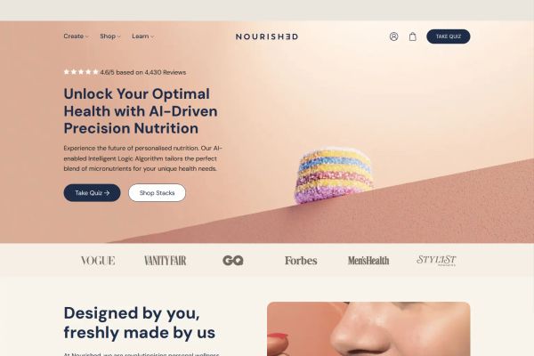 nails this with warm beiges and navy accents.
 - Make complexity simple with personality. I’m Nutrients uses peachy tones and playful illustrations to make gut health totally relatable, while Adaptogents
 commands confidence through bold, masculine copy positioning adaptogens as essential performance tools.
Check out these supplement website examples below.
 Mimic this
This fiber supplement site leads with "#1 Product of the day" credibility and sells a subscription model with "10% discount on every recurring order" prominently displayed.
 Mimic this
This wellness supplement site uses fashion editorial photography and "MENTAL WELLNESS, REDEFINED." as hero copy, positioning nootropics as luxury lifestyle.
 Mimic this
This personalized nutrition site sells 3D-printed vitamin stacks customized through a quiz, using a warm terracotta gradient hero and serif typography in navy.
 Mimic this
This vitamin supplement site pairs hands holding bottles with a cream-to-teal gradient and leads with "Doctor-Developed Vitamins with Benefits You'll Feel."
 Mimic this
This natural supplements e-commerce site leads with "The Natural Way to Feel Your Best—From the Inside Out" and uses overlapping amber glass bottles and benefit badges like "Brain Fog" and "Gut Health" to anchor product discovery.
 Mimic this
This jet lag supplement site opens with "Jet lag is a choice" and stacks product shots, app interface, and athlete testimonials in a two-column hero.
 Mimic this
This plant-based protein site arranges product categories in a four-column grid with lifestyle photos and stacks a split-layout Autoship section with circular benefit icons.
 Mimic this
This French supplement e-commerce site uses a scrolling orange ticker for stacked promotions and anchors product cards with colored benefit tags like "Sommeil réparateur" and "Sans sucres."
 Mimic this
This supplements site uses a two-column hero pairing product lifestyle photography with "30 million+ Bites enjoyed" social proof and time-segmented results stats (69%-79% improvement metrics).
 Mimic this
This men's supplement site leads with "STAY IN YOUR PRIME" and stacks trust badges (Made in USA / Free Shipping / Money Back Guarantee) beneath an all-caps hero headline.
 Mimic this
This functional wellness DTC site organizes products by benefit—Focus, Restore, Sleep, Hydrate—in a four-column grid with color-coded card backgrounds.
 Mimic this
This children's supplements shop uses a split hero with emoji-filled product copy ("good gut bugs 🌱 & smooth moves 💩") and a scrolling trust marquee featuring "Mum - Founded" and "Australian Made."
 Mimic this
This plant-based protein site leads with mixed typography—italic "Delicious" paired with bold sans-serif product copy—and repeats a marquee promo code banner across the top.
 Mimic this
This women's supplement site headlines "see-results vitamins. powered by evidence based ingredients." with a lime-green CTA and a scrolling trust banner listing clinical credentials.
 Mimic this
This frozen supplements shop leads with a split hero—serif headline paired with a hand holding vibrant popsicle-like tubes against a cream background.
 Mimic this
This health supplement site sells green powder with a split layout pairing lifestyle photography against benefit callouts with circular green icons.
 Mimic this
This wellness supplement site leads with a mosaic hero grid mixing product packaging, food prep, and lifestyle imagery beneath "Nourish your body naturally with Noode."
 Mimic this
This plant-based nutrition site uses a thin promotional banner, ingredient trust badges, and press logos to build credibility before showing product cards.
 Mimic this
This natural sweetener brand site uses a split-layout quiz section pairing product photography with a cream-colored content block to segment new versus returning customers.
 Mimic this
This supplement e-commerce site leads with "Hormone Balance IN ALL STAGES OF LIFE" over a woman holding the product, then scrolls through a trust bar of certifications before showcasing best-selling DIM variants.
 Mimic this
This hair vitamins ecommerce site contrasts "Forget Thin, Damaged Hair" against product badges that promise "LESS SHEDDING" and "FASTER GROWTH" in yellow pill shapes.
 Mimic this
This probiotic supplement site leads with scattered polaroid photos against a wooden texture, then stacks three "#1 trusted" badges before showing products.
 Mimic this
This supplement landing page sells an Ayurvedic powder through subscription tiers with "30% OFF" and "40% OFF" badges positioned as savings anchors.
 Mimic this
This Norwegian wellness e-commerce site anchors its hero with a classical marble statue and uses "One tree *planted* per order" as the sustainability hook.
 Mimic this
Infinite Health & Wellness
This supplement shop color-codes each product with saturated backdrops—purple for Daily Support, green for Iron Support, teal for Kidney Support—making the grid function as a visual ingredient legend.
 Mimic this
This fitness supplements site introduces products with full-width hero featuring oversized product bottles and a bold "MOJO 2.0" serif headline over dark geometric backgrounds.
 Mimic this
This plant-based nutrition site headlines "Trust" in cyan italics and organizes supplements, proteins, and meal plans as three equal product columns with pill-shaped cyan buttons.
 Mimic this
This supplements e-commerce site organizes products by health outcome (heart, brain, digestive, immune) rather than ingredient type, using circular category icons and tropical botanical imagery.
 Mimic this
This joint supplement site uses a 72-hour promise headline paired with anatomical body callout badges labeling specific areas: "JOINTS," "MUSCLES," "TENDONS," "LIGAMENTS."
 Mimic this
This functional mushroom supplement site uses dark forest photography with cream serif typography and italicizes product names like "Multi-Mushroom" for emphasis.
Design Data
The colors, fonts, and layout choices used across 62 supplements websites.
Background color
How dark or light the page background is (background luminance).
- White / near white 77.4% (48)
- Black / near black 9.7% (6)
- Mid-tone 6.5% (4)
- Light 4.8% (3)
- Dark 1.6% (1)
Accent color
The color of each site's primary button, measured from its code (accent hue family).
- Black, white & gray 31% (18)
- Amber / orange 20.7% (12)
- Red 13.8% (8)
- Green 10.3% (6)
- Teal / cyan 10.3% (6)
- Blue 8.6% (5)
- Purple 3.4% (2)
- Pink 1.7% (1)
Hero imagery
The kind of visual the top section leads with.
- Photography 67.2% (41)
- Product screenshot 29.5% (18)
- Illustration 1.6% (1)
- No imagery 1.6% (1)
Color intensity
How colorful the palette is, from black-and-white to bold color (saturation).
- Soft, muted color 62.9% (39)
- Bold, vivid color 21% (13)
- Black & white 16.1% (10)
Percentages are the share of sites where each trait could be measured, with counts in parentheses. Last updated July 2026.
Best supplements website examples default to near-white, almost never dark
Among the best supplements website examples, 77.4% of the 62 sites sit in the near-white luminance bucket, while near-black accounts for just 9.7% and true dark themes barely register at 1.6%. Supplement brands are selling ingestible trust: clean, clinical, pharmacy-adjacent white space reads as purity and safety, which is why Noode , NUFYX, GoodOh
 , and TruFibr
 all build on white backgrounds. The handful that go near-black, like Maniq
 and Bully Max
 , use it to signal performance or intensity rather than wellness, proving dark mode is a deliberate genre swap, not a stylistic default.
Neutral buttons beat every color family, with amber the only real challenger
Accent color choices split unevenly: neutral leads at 31% (18 sites), with amber second at 20.7% and red third at 13.8%. Green and teal tie at 10.3% each, and blue trails at 8.6%. Black-and-white buttons dominate the example set, seen on Noode, Maniq, GoodOh, HairTru , and GEM, which treats the interface as a neutral frame around product photography rather than a place to compete for attention. Amber shows up as the boldest deviation, exemplified by H-Proof’s vivid amber buttons, useful when a brand wants energy or warmth instead of clinical restraint.
Muted is the working palette, not vibrant or monochrome
Saturation profiles favor restraint: 62.9% of sites run muted palettes, while vibrant sits at 21% and monochrome at 16.1%. This matches the near-white background pattern: supplement sites layer soft, desaturated color over white rather than saturated blocks, as seen across NUFYX, KOR Shots , Vitgo
 , and Boosty Foods
 . Full black-and-white treatments, like 22 Days Nutrition
 and Apex Laboratories
 , function as a distinct minimalist subgenre rather than a compromise.
Photography leads product mockups by a wide margin
Hero media splits 67.2% photo versus 29.5% product mockup, with illustration and no-media each at 1.6%. Photography-led heroes, used by Noode, Maniq, GoodOh, and Mayven, sell lifestyle and body outcomes, while mockup-led heroes like TruFibr, KOR Shots, and 22 Days Nutrition foreground the packaging itself. Typography reinforces the same restraint: 91.8% of sites set body copy in sans, and the median site carries four nav items, keeping navigation and reading equally uncluttered.