23 Best Lovable Tech Website Examples
I found the best Lovable tech websites that attract top clients.
These sites prove that clear prompting creates clean, credible tech design on Lovable’s AI platform. Here’s what separates the winners from the generic AI output:
- Lead with brutal clarity, not feature lists. Validgator
 and Sortmap
 nail this with blunt, outcome-driven copy that tells you exactly what problem dies in 30 seconds. Lovable SaaS sites like Bamboo AI
 cut through data chaos with promises, not jargon.
 - Use split-screen heroes and card layouts to guide dual audiences. Coinheim’s
 warm split-screen serves parents and kids simultaneously, while Lovable AI sites like DraftNova
 balance minimalist icons with strategic dual CTAs. Wasteless
 and MyWardroby
 prove intuitive layouts beat complex navigation every time.
 - Make AI features feel approachable, not intimidating. Chunky’s
 warm creamy tones with orange accents transform complex tools into friendly interfaces. Billy
 balances sleek dark design with crystal-clear feature communication. Lovable developer tools succeed when they show, not tell.
Browse these Lovable tech website examples for your next build.
Mimic your favorite site with AI!
- Select an image
- Describe your project
- Click generate
- Open in Lovable or copy the prompt to another AI builder
Mimic is free to use and no sign-up is required. Lovable has a free tier.
 Mimic this
This developer tools site sells code generation with "Design files in. Production code out." and a split-pane live editor showing Figma-to-TSX conversion.
 Mimic this
This proposal software site uses serif italics to emphasize key phrases—"and pricing," "faster," "brief to signed"—creating visual rhythm throughout the copy.
 Mimic this
This financial forecasting site replaces spreadsheets with "Real-time cash flow, *without the* spreadsheet chaos" and syncs Stripe, Mercury, QuickBooks data into a runway metric.
 Mimic this
This cash flow forecasting site emphasizes founder identity by italicizing "Bootstrapped" in the headline and repeating "stay in the green" as styled accent copy.
 Mimic this
This developer tools studio site headlines its value with "Tools that *spin* the wheels of every developer," using italicized wordplay and vinyl record imagery to differentiate technical credibility.
 Mimic this
This project management site illustrates the before/after of client briefs—messy chat bubbles transform into a structured proposal with scope, timeline, and budget.
 Mimic this
This mental wellness app site sells micro-habits with oversized serif typography split across the viewport and floating handwritten annotation labels around a phone mockup.
 Mimic this
This food waste app landing page opens with "Stop throwing money in the trash" over a photograph of hands holding an iPhone, then sells the value prop through numbered feature cards showing app screenshots.
 Mimic this
This AI content platform sells trend-aware creation with the headline "Create Content That Rides The Trends" and stacks feature cards in a 3-column grid.
 Mimic this
This wardrobe management site opens with a photo of overflowing clothes and the quoted pain point "I don't know what to wear. Sounds familiar?" before explaining the solution.
 Mimic this
This sales tech landing page pitches "personalized outreach (slow) or scaled outreach (generic)" then claims Billy delivers both through AI-generated prospect research.
 Mimic this
This document processing tool site sells privacy with "100% offline capable. 0 data transmitted." and a wise owl mascot wearing glasses.
 Mimic this
This wine product visualization site uses a side-by-side toggle comparing "Original Photo" and "3D Rendering" to demonstrate the service value.
 Mimic this
This productivity app site mixes serif typography sizes within the headline—"PRODUCTIVITY" and "CREATIVITY" dwarf an italic "MEETS" between them.
 Mimic this
This mental health SaaS uses monospace typography and stark black-on-white cards to sell AI therapy with copy like "When you can't take it anymore and you feel like screaming."
 Mimic this
This financial literacy platform for kids uses a debt-scare headline—"88% of Millennials Are in Debt"—paired with italic green text stating "*Don't Let Your Kids Be Next.*"
 Mimic this
This QR code generation platform splits its headline across colors—"Generate QR Codes" in black, "Like Never Before" in orange-to-yellow gradient—to emphasize the transformation promise.
 Mimic this
This product prioritization SaaS site italicizes "actually believes in" within the H1 to emphasize team buy-in as the core differentiator.
 Mimic this
This travel planning site highlights the AI output with floating travel cards in the hero—flights, hotels, and landmarks arranged like a mood board.
 Mimic this
This AI photo editing SaaS uses orange accent text and a drag-slider comparison widget to demonstrate instant transformation from "Raw Factory Photo" to polished marketing visuals.
 Mimic this
This neurotechnology landing page leads with "Think clearly. Act decisively." and explains the product as a three-step closed-loop system: Read, Calibrate, Write.
 Mimic this
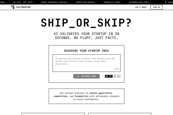
This startup validator site uses monospace typewriter typography and black-bordered cards to reinforce "NO FLUFF, JUST FACTS" positioning throughout.
 Mimic this
This marketing analytics site highlights fragmented reporting through scattered dashboard mockups labeled "MISSING" and "DATA MISMATCH" in red.
What the Top 0.1% of Lovable Tech Websites Get Right
I analyzed these Lovable tech sites and found three patterns that separate the best from the rest.
Visual Identity: Brutalist Meets Warm
Tech brands are ditching the sterile blue-and-white playbook for something more human.
- Monospace typography dominance: About 60% of sites use typewriter fonts as their primary typeface. Validgator and Luna Chat lean fully into Courier-style brutalism, while Coinheim balances serif headlines with monospace body text for approachability.
- Warm neutral backgrounds: Roughly 70% avoid pure white, opting for cream (#F5F0EA), sage green (#C5E8D0), or light beige (#F7F5F3). Sortmap and MyWardroby use these tones to feel less corporate and more trustworthy.
- Single accent color strategy: 8 in 10 sites stick to one primary color. HANSMADE commits to orange (#F47B20), NextQR uses orange gradients, and Hum Technologies employs strategic yellow sparingly against monochrome palettes.
→ The best Lovable tech websites feel more like indie publications than corporate SaaS platforms.
Layout and UX: Narrow and Focused
These sites prioritize clarity over complexity with deliberately constrained layouts.
- Ultra-narrow content widths: About 75% use max-widths under 600px for their primary content. Luna Chat restricts to ~480px, while DraftNova caps at ~450px, forcing ruthless content prioritization and improving mobile readability.
- Pill-shaped everything: Roughly 85% use border-radius values above 20px for buttons and badges. Hum Technologies, HANSMADE, and Bamboo AI all embrace full pill shapes (~25px border-radius) that feel more approachable than sharp corporate rectangles.
- Comparison widgets as hero elements: 30% feature before/after sliders or toggle comparisons prominently. HANSMADE shows factory photos transforming to marketing gold, while Renderly displays wine bottle renderings versus original photos as the primary value demonstration.
→ When you constrain the canvas, every design decision becomes intentional and impactful.
Copy and Messaging: Emotional First, Features Second
The strongest performers lead with feeling rather than functionality.
- Problem-first headlines: About 80% open with pain points before solutions. Luna Chat starts with “When you can’t take it anymore,” Wasteless leads with “Stop throwing money in the trash,” and Sortmap asks “Build roadmaps your team actually believes in” rather than listing features.
- Conversational CTAs with personality: 70% avoid generic “Get Started” buttons. HANSMADE uses “✦ Transform Your First Photo Free →” while FruityBolt opts for “Start Creating Magic ✨ →” and EpicVoyage chooses “✦ Start Chatting” with sparkle emojis adding warmth.
- Specific value quantification: Nearly 90% include precise numbers in their value props. Coinheim mentions “$27,251 average debt,” HANSMADE promises “10x faster than manual,” and Bamboo AI integrates with “16+ marketing platforms” rather than vague “many integrations.”
→ The best tech copy reads like a friend explaining a solution, not a salesperson pitching features.
The pattern is clear… these Lovable SaaS sites and Lovable AI sites succeed by feeling human first, technical second. They prove that even the most complex Lovable developer tools can communicate with warmth and clarity. Stop optimizing for feature lists and start designing for the moment someone realizes you understand their actual problem.