101 Best Lovable Website Examples
I found the best Lovable website examples that build websites instantly through smart prompting and AI-powered iteration.
These sites prove that success on Lovable comes down to clear prompts, strategic copy, and understanding the platform’s React-based output. Here’s what separates good from great:
- Lead with brutally honest copy. Lovable AI sites like Validgator
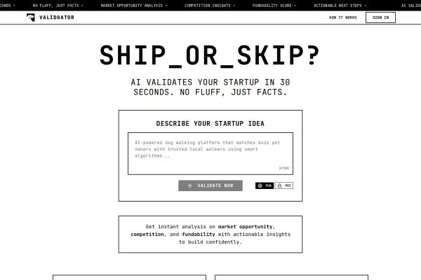 and HANSMADE
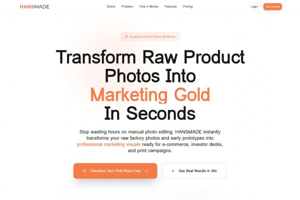 skip the fluff… they promise specific outcomes in seconds, not vague benefits. Your copy clarity directly improves AI generation quality.
 - Design for speed, not perfection. Lovable SaaS sites like Luna Chat
 and Renderly
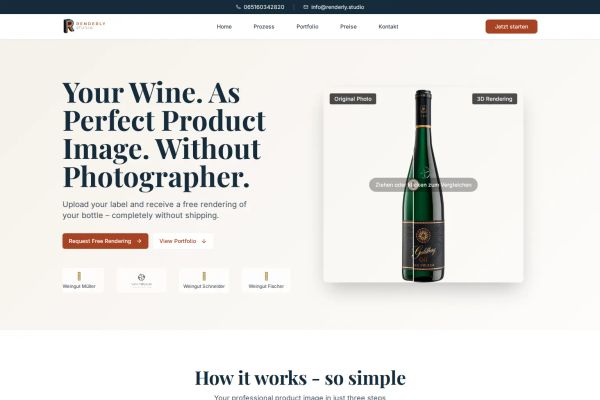 nail single-purpose layouts. One clear hero section, minimal navigation, fast conversions. The AI excels at focused structures.
 - Prioritize emotional storytelling over complexity. Lovable portfolio sites like Nick
 and Nick Studios
 use cinematic imagery and clean data visualizations. Prompt for mood and feeling… the AI handles technical execution better when given creative direction.
Check out the Lovable design gallery below for more inspiration.
Mimic your favorite site with AI!
- Select an image
- Describe your project
- Click generate
- Open in Lovable or copy the prompt to another AI builder
Mimic is free to use and no sign-up is required. Lovable has a free tier.
 Mimic this
This mental wellness app site sells micro-habits with oversized serif typography split across the viewport and floating handwritten annotation labels around a phone mockup.
 Mimic this
This Pilates instruction site leads with a grayscale reformer close-up and stacks "ALIGN WITH ALLIE" in letterspaced serif, then layers value props across warm beige sections with paired CTAs.
 Mimic this
This food waste app landing page opens with "Stop throwing money in the trash" over a photograph of hands holding an iPhone, then sells the value prop through numbered feature cards showing app screenshots.
 Mimic this
This EdTech landing page sells personalized revision with a handwritten-style "personal" in the H1 and floating chat/dashboard mockups showing real-time AI tutoring and grade tracking.
 Mimic this
This specialty coffee shop site uses small peach decorative lines above each section heading and warm-toned photography to emphasize its home-kitchen operation.
 Mimic this
This AI content platform sells trend-aware creation with the headline "Create Content That Rides The Trends" and stacks feature cards in a 3-column grid.
 Mimic this
This nonprofit site opens with an italicized serif headline "Together, we nurture hope in the Philippines" paired with a collage of rotated child portraits and gold star accents.
 Mimic this
This telehealth wellness site compares GLP-1 medications side-by-side with expected weight loss percentages highlighted in warm amber text.
 Mimic this
This event anchor portfolio uses a dark-luxury layout with golden accents and a cutout photo of Sayanti composited over a warm gradient hero.
 Mimic this
This film streaming site pairs noir imagery with golden accents and positions "Dive into the Shadows of Cinema" as italic serif contrast against white body text.
 Mimic this
This wardrobe management site opens with a photo of overflowing clothes and the quoted pain point "I don't know what to wear. Sounds familiar?" before explaining the solution.
 Mimic this
This fitness coaching site sells discipline-building with "100+ committed individuals" testimonial and gold accent stats showing "89% completion rate."
 Mimic this
This beauty salon site leads with a team photo of six staff members and anchors trust through "Where beauty meets artistry" messaging.
 Mimic this
This luxury black car service site pairs dark moody SUV photography with gold accents and sells "Luxury Nashville Transportation, *Redefined*" in italicized serif.
 Mimic this
This wedding planning SaaS uses serif-italic typography for key words—"Plan Your **Perfect** Wedding"—and pairs warm brown buttons with cream backgrounds throughout.
 Mimic this
This GTM messaging site uses yellow highlighter marks on phrases and "The Brutal Truth" section to position research-based campaigns against polished but ineffective agency work.
 Mimic this
This sales tech landing page pitches "personalized outreach (slow) or scaled outreach (generic)" then claims Billy delivers both through AI-generated prospect research.
 Mimic this
This designer portfolio uses a angled photo crop and purple gradient buttons to introduce a creative specializing in healthcare brand campaigns.
 Mimic this
This commercial real estate site sells self-storage properties using yellow-gold accents and credential badges ("Licensed Agent," "Royal LePage," "MLS® & REALTOR®").
 Mimic this
This supplement landing page uses "17 sacred Appalachian ingredients" as its hero claim and pairs product photography with ingredient collages instead of lifestyle imagery.
 Mimic this
This dental practice site centers the doctor's portrait alongside "Transformando sorrisos com arte e tecnologia" and uses gold accents with a cream background throughout.
 Mimic this
This painting contractor site emphasizes neighborly credibility with "15+ Years in the Neighborhood" stat and italicized "Personal Touch Guaranteed" promise alongside team photography.
 Mimic this
This wedding site announces "¡NOS CASAMOS!" in massive serif type above a two-column grid mixing black-and-white couple portraits with color lifestyle photography.
 Mimic this
This YouTube agency site leads with "Your YouTube, OUR Focus" and sells video editing through conversion metrics: subscriber counts, watch time gains, and revenue generated.
 Mimic this
This document processing tool site sells privacy with "100% offline capable. 0 data transmitted." and a wise owl mascot wearing glasses.
 Mimic this
This martial arts enrollment site uses italic, underlined, and color-blocked text in the headline to emphasize "Transform your family into confident leaders for life."
 Mimic this
This fractional CMO site leads with italic serif copy "Driving Growth Through Operational Excellence" and structures startup wins as two-column achievement pairs.
 Mimic this
This wine product visualization site uses a side-by-side toggle comparing "Original Photo" and "3D Rendering" to demonstrate the service value.
 Mimic this
This legal SaaS site pairs serif headlines ("Complete legal support, every step of the way") with a dashboard mockup showing lawyer access, templates, and compliance tools in one sidebar.
 Mimic this
This productivity app site mixes serif typography sizes within the headline—"PRODUCTIVITY" and "CREATIVITY" dwarf an italic "MEETS" between them.
What the Top 0.1% of Lovable Websites Get Right
I analyzed these sites and found three patterns that separate exceptional Lovable designs from the rest.
Visual Identity: Warm Minimalism Rules
The standout pattern here is sophisticated restraint.
- Earth tone dominance: About 70% of sites use warm, muted palettes over stark black/white. Sites like Shots by Nick and ARQ EDIT
 leverage creams, golds, and soft beiges to create premium feels without overwhelming users
 - Typography mixing: Roughly 80% pair serif headlines with sans-serif body text. AdBlume
 uses elegant serifs for “Fine Jewelry Photography” while keeping descriptions clean and readable
 - Selective color pops: Nearly every site limits accent colors to one or two strategic choices. NextQR’s orange CTAs and Bamboo’s turquoise create focus without visual chaos
→ The best Lovable designs feel expensive through restraint, not excess.
Layout and UX: Hero Simplicity Wins
These sites prove that complex features don’t require complex presentations.
- Split-screen heroes: About 60% use asymmetrical split layouts with text left, visual right. EpicVoyage
 and DraftNova
 demonstrate how this creates immediate visual hierarchy while showcasing product value
 - Minimal navigation: Roughly 85% stick to 5 or fewer top-level nav items. Lovable SaaS sites like Billy
 and Validgator prove that focused navigation converts better than feature-heavy menus
 - Card-based sections: Nearly 90% organize features in clean card grids rather than dense paragraphs. Sortmap
 and FruityBolt
 use three-column cards that scan quickly and highlight key benefits
→ When your product is complex, your interface should be simple.
Copy and Messaging: Problem-First Headlines
The most effective sites lead with pain, not features.
- Emotional problem hooks: About 75% open with user frustrations rather than product descriptions. Luna Chat’s “When you can’t take it anymore” and MyWardroby’s
 “I don’t know what to wear” connect before they sell
 - Benefit-driven CTAs: Roughly 70% use outcome language over generic “Get Started.” HANSMADE’s “Transform Your First Photo Free” and Renderly’s “Request Free Rendering” promise specific value
- Social proof integration: Nearly every high-performing site embeds metrics directly in hero sections. Lovable Portfolio sites like Sayanti’s “6.7M followers” and ARQ EDIT’s “600k+ photos edited” build credibility immediately
→ Start with what hurts, then show how you heal it.
The pattern is clear: Lovable AI sites and beyond succeed when they prioritize human psychology over technical features. Your users don’t care about your capabilities until they trust you understand their problems.