69 Best Beauty Salon Website Examples

Beauty salon sites live or die on how clean and bright they feel. That makes background choice the single most important decision on the page. I ran every site here through Claude, and the best beauty salon websites lean overwhelmingly toward light, white, or cream backgrounds. That pairing of a light backdrop with strong photography has to travel together for it to work. You can check it across the examples below and use it as a starting point for your own build.
Category
Platform
Style
 Mimic this
This beauty services site leads with a full-bleed portrait and positions credentials—"14 years," "40 hands-on training sessions," "5000 international students"—as proof of expertise.
 Mimic this
This permanent makeup studio site pairs a two-column hero with a maroon pill badge eyebrow and positions "Premier" in italic serif within the H1.
 Mimic this
This luxury hair salon site mixes serif italic with uppercase sans-serif in its value proposition to distinguish color specialties: "COLOUR," "BLONDES," "COPPERS," "BRUNETTES."
 Mimic this
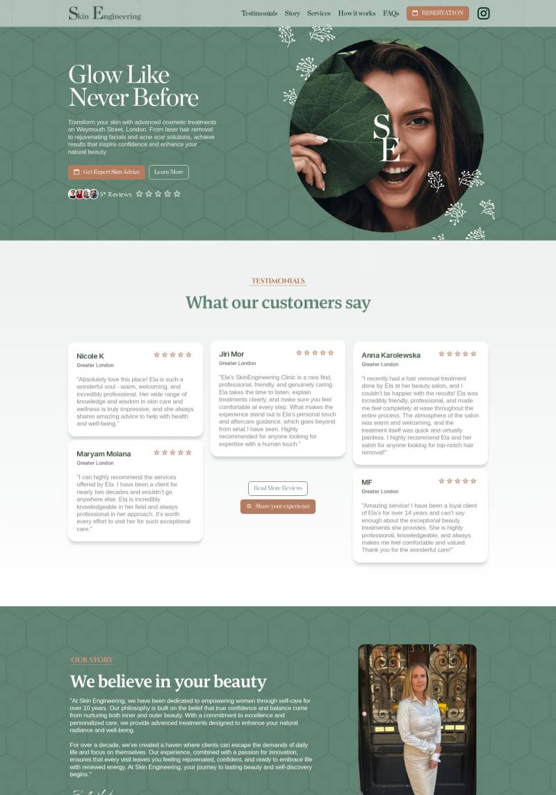
This cosmetics clinic site uses a sage-green diamond pattern backdrop with overlaid serif typography and circular hero imagery featuring botanical leaf details.
 Mimic this
This beauty salon site opens with a strikethrough word—"Your hair and nails called. They want some sass"—and frames services with pampas grass botanical borders.
 Mimic this
This salon site leads with "Crafted with Care, Styled with Passion" and uses tilted client photos with white borders arranged in a fanned layout.
 Mimic this
This luxury spa site uses gold italic serif for accent words—"Reimagined" and "Location"—paired with maroon buttons and spa still-life hero imagery.
 Mimic this
This skincare clinic site pairs serif branding with service cards that list pricing as left-aligned labels with right-aligned costs.
 Mimic this
This hair salon site leads with "Curly Hair Specialist in North Leeds" and uses overlapping client photos with embedded testimonial cards to establish expertise.
 Mimic this
This medical aesthetics clinic site introduces the prescriber with a portrait photo and handwritten signature, positioning Jane's 30 years nursing experience as the treatment guarantee.
 Mimic this
This beauty salon site leads with a team photo of six staff members and anchors trust through "Where beauty meets artistry" messaging.
 Mimic this
This luxury hair salon site anchors its hero with a full-bleed portrait of braided work and repeats "Luxury Style **Braids**" with only the keyword in gold.
 Mimic this
This spray tan studio site leads with a decorative serif headline and anchors credibility with founder Caitlin's bio card overlapping the hero image.
 Mimic this
This nail salon site pairs serif headings with pill-shaped buttons and alternates white, blush, and gray backgrounds to segment services.
 Mimic this
This beauty salon site stacks "ELEGANT" and "YOU" in competing font sizes over a portrait, with the logo "BC" overlaid left-aligned.
 Mimic this
This medical spa site italicizes key phrases like "easy-to-access" and "balance" within serif headings to emphasize core messaging without changing typeface.
 Mimic this
This aesthetics clinic site sells premium treatments through a black-and-white photo collage hero and the tagline "Unveil your balanced beauty today."
 Mimic this
This medical aesthetics site uses warm beige containers, golden CTAs, and circular hero imagery to position laser treatments as luxury self-care rather than clinical procedures.
 Mimic this
This skincare studio site uses Instagram-style gallery cards with overlapping fan layouts and a circular bordered portrait to personalize the booking experience.
 Mimic this
This cosmetic medicine site anchors its value proposition in a headline—"Ethical aesthetics that elevate what's naturally yours"—paired with a burgundy and cream palette that avoids clinical coldness.
 Mimic this
This aesthetics clinic site uses stacked serif and italic typography in the hero ("Enhance Your Natural Beauty") paired with treatment cards that overlay service names on full-bleed imagery.
 Mimic this
This medical aesthetics site leads with "FEEL CONFIDENT. LOOK RADIANT." over a hero image, then anchors trust through a two-column layout pairing interior photography with practitioner-client treatment shots.
 Mimic this
This permanent makeup studio site pairs moody close-up procedure photography with yellow-green nav labels and a burnt-orange booking announcement bar.
 Mimic this
This skincare practice site uses "Glowing Skin is Always in" as H1 copy and before/after photos in angled collage format to prove treatment results.
 Mimic this
This body sugaring service site leads with italic serif headlines in mustard gold and emphasizes "certified" expertise and "thousands" of satisfied clients with underlined text.
 Mimic this
This esthetician studio site uses a two-column hero split—black-and-white photo opposite serif headline and "CLINICAL SKINCARE STUDIO" positioning.
 Mimic this
This aesthetics practice site uses a scrolling marquee ticker to list services and positions the founder's 12-year credential as an underlined text link within body copy.
 Mimic this
This aesthetics clinic site leads with tight close-ups of diverse women's faces, then repeats "Flores Aesthetics" in an infinite serif scroll banner.
 Mimic this
This beauty center site uses a split hero layout with a cropped portrait image overlapping serif and sans-serif typography, anchoring "Odkryj swoją naturalną urodę" in warm beige tones.
 Mimic this
This eyelash extension site uses a two-column hero with procedure close-up paired against serif typography stacked as "Elevate your eyes with / Ani's Beauty / Eyelash Services."
Design Data
The colors, fonts, and layout choices used across 53 beauty salon websites.
Background color
How dark or light the page background is (background luminance).
- White / near white 58.5% (31)
- Light 26.4% (14)
- Mid-tone 11.3% (6)
- Dark 1.9% (1)
- Black / near black 1.9% (1)
Accent color
The color of each site's primary button, measured from its code (accent hue family).
- Black, white & gray 46% (23)
- Amber / orange 22% (11)
- Pink 14% (7)
- Red 14% (7)
- Green 2% (1)
- Blue 2% (1)
Hero layout
How the top section arranges its headline and imagery.
- Text left, image right 42.2% (19)
- Text over a full-width image 33.3% (15)
- Text above full-width media 8.9% (4)
- Image left, text right 8.9% (4)
- Centered text 4.4% (2)
Hero imagery
The kind of visual the top section leads with.
- Photography 94.3% (50)
- No imagery 3.8% (2)
- 3D artwork 1.9% (1)
Button shape
Corner rounding on primary buttons (border radius relative to height).
- Rounded corners 59.1% (13)
- Pill (fully rounded) 22.7% (5)
- Square corners 18.2% (4)
Font combination
How heading and body typefaces pair (serif vs. sans-serif).
- Serif headings, sans-serif body 58.3% (14)
- All sans-serif 41.7% (10)
Color intensity
How colorful the palette is, from black-and-white to bold color (saturation).
- Soft, muted color 77.4% (41)
- Black & white 17% (9)
- Bold, vivid color 5.7% (3)
Dark mode support
Sites whose code adapts to the visitor's light/dark preference (prefers-color-scheme).
- Yes 0% (0)
- No 100% (25)
Most-used fonts
The typeface each site leads with, read from its live CSS.
- Playfair Display 33.3% (8)
- Erode 4.2% (1)
- Dela Gothic One 4.2% (1)
- Figtree Local 4.2% (1)
- Avenir 4.2% (1)
Percentages are the share of sites where each trait could be measured, with counts in parentheses. Last updated August 2026.
The best beauty salon website examples lean almost entirely on photography
Photo-led heroes appear on 94.3% of these pages, against 64.1% across the wider gallery. This is the defining trait of beauty salon website design: the service is a face, a scalp, a set of hands, and clients need to see the result before they read a word of copy. Demi Muse Artistry , Luxury Style Braids
 , and Bal Kaur Lee Hair
 all build their opening screen around a full photographic shot rather than illustration or abstract graphics. Only a couple of sites skip imagery entirely, and just one, Beauty Bar ATX
 , substitutes a 3D hero in place of a photograph, which makes it a genuine outlier rather than an alternate strategy.
Pink shows up as a real accent choice, not a rounding error
Pink is the accent hue on 14% of these sites, compared with 4.1% gallery-wide. Neutral still leads the accent field at 46%, and amber sits second at 22%, so pink is not challenging for the top spot. But its jump from a negligible presence elsewhere to a genuine seven-site cluster here marks it as a niche-specific signal: salons are far more willing to let a warm, cosmetic-adjacent hue carry the call-to-action than other business types are. Nails & Details and Confidence by Kirsten
 both put pink directly on their buttons, treating the color as a branding cue rather than decoration.
Light backgrounds edge out the gallery’s usual near-white default
Backgrounds classed as light (rather than near-white) reach 26.4% of these sites, versus 11.3% across the full gallery, while near-white still dominates at 58.5%. That secondary bump toward light backgrounds gives salon sites a softer, warmer canvas than the stark white common elsewhere, useful when skin tones and pastel treatments need a gentler surround. Jessy O’Dwyer, Centrum Stylizacji , and Flores Aesthetics
 all sit in this light band, pairing it with muted palettes and photography rather than bold color blocking.
Typography stays quiet even as imagery does the loud work
Body text is sans-serif on 92.3% of measured sites, and heading fonts split across sans at 41.7%, display at 37.5%, and serif at 20.8%, with Playfair Display alone accounting for a third of all fonts logged. This restraint balances the photographic intensity: HONEY Beauty Salon , Iki Total Body Care
 , and Fresh Edit SKIN CO
 all pair Playfair Display headings with plain sans body text, letting the imagery, not the type, carry the visual weight.