198 Best AI Website Examples
I found the best AI website examples that accelerate your growth.
These sites cut through AI hype with specificity… they show exactly what the tool does and prove it works. Here’s what makes them convert:
- Lead with concrete outcomes, not buzzwords. Oun
 says “automates transaction coordination” while Validgator
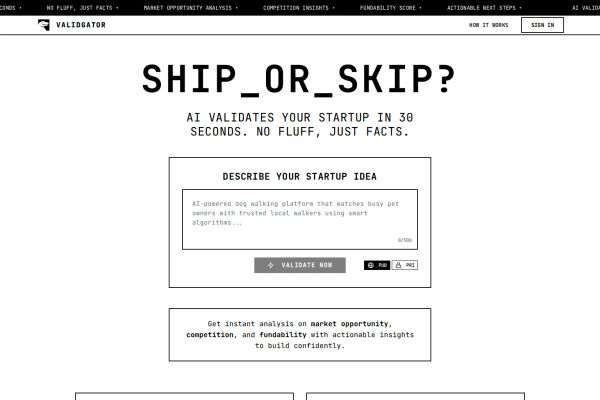 promises “ruthless honesty in thirty seconds.” No vague “AI-powered innovation” here.
 - Use clean, technical aesthetics that signal credibility. LLMagnet’s
 lavender gradients and 0neAI’s
 purple-to-blue palette feel sophisticated without the cliché robot imagery. EUrouterAI’s
 dark minimalism with trust badges screams enterprise-ready.
 - Make demos instantly accessible. Anything.Design
 lets you edit AI images like native Figma files. Floutwork
 shows the actual workspace browser solving real productivity pain.
Browse the gallery for more AI design inspiration.
Mimic your favorite site with AI!
- Select an image
- Describe your project
- Click generate
- Open in Lovable or copy the prompt to another AI builder
Mimic is free to use and no sign-up is required. Lovable has a free tier.
 Mimic this
This AI creative studio site uses a dramatic eye close-up hero and splits its value prop: "WE **BLEND** REALITY & UNREALITY" with orange accent on the verb.
 Mimic this
This AI marketing platform site centers its dashboard mockup with a purple glow border and uses "Ask Leo" conversational prompts to position the product as a teammate.
 Mimic this
This AI consulting site uses a glitch-effect portrait in the hero and frames its value prop as "without the noise."
 Mimic this
This AI agent platform site mixes serif italics with pill-shaped badges to introduce "Smart AI Agents" alongside glassmorphic blue shapes.
 Mimic this
This AI analytics platform leads with "See your brand through the eyes of AI" and uses a dashboard screenshot showing bot-visit metrics and AI visibility scores.
 Mimic this
This AI automation site uses serif headlines over a moody green-black hero and pairs feature cards in salmon backgrounds with dark UI mockups.
 Mimic this
This customer intelligence platform sells analysis speed with "Know your customers better than you know yourself, in 15 minutes" and a yellow card anchoring the product screenshot.
 Mimic this
This productivity browser site pairs a warm sunset illustration hero with scattered-tabs screenshots to position browser clutter as the problem Floutwork solves.
 Mimic this
This AI tool builder site sells expertise-to-product with colored cards displaying specific use cases ("Roast My Twitter/X", "Analyze Instagram Competitors") and a "Turn Your Expertise into AI mini tools!" headline.
 Mimic this
This workforce consulting site opens with "Stay relevant in the AI powered future" in large serif type, then splits content between warm off-white and black abstract imagery.
 Mimic this
This real estate agency site uses rotating industry terms in the hero headline and tabs to segment solutions by buyer type (agents, teams, brokerages, companies).
 Mimic this
This AI lead-scoring platform headlines "Turn Data Into Deals" and overlays product cards with holiday pricing directly on an illustrated starry cityscape hero.
 Mimic this
This no-code design tool site sells speed with "Build better images — faster" and pairs the pitch with a functional dashboard mockup showing a classical bust.
 Mimic this
This AI social media tool uses a radial crimson-to-amber gradient hero and serif typography to position itself as "The AI that does your social media marketing for you."
 Mimic this
This AI contact center site opens with "AI that talks like a human. Handles millions of calls." and proves it with client logos, then leads with an 88% deflection rate stat.
 Mimic this
Monoliteai
This AI consulting site leads with a glitched portrait and positions itself with "A CLEAR AI PLAN FOR YOUR BUSINESS" in massive uppercase against a two-tone black-and-white layout.
 Mimic this
This patent litigation AI platform uses a blueprint-style ampersand illustration and names its assistant "Andy" to humanize technical work product generation.
 Mimic this
This AI productivity site positions multi-model access with "Every model. One interface. Pure productivity." and leads with a GitHub link.
 Mimic this
This AI infrastructure site positions itself against competitors with "Not duct-taped automations" and showcases three overlapping product mockups in perspective tilt.
 Mimic this
This voice data platform leads with "You are the source. Feul is your refinery"—positioning users as raw material suppliers to AI while a surreal ascending-figure hero image literalizes the ascent narrative.
 Mimic this
This AI consulting site uses monospace typography and cosmic artwork to position AI as "a strange, new intelligence we have to learn how to navigate."
 Mimic this
This tax software site markets AI as a supernatural creature bound to Singapore's Income Tax Act, using redacted text blocks and yellow highlighter effects.
 Mimic this
This AI video ad generator uses a grid-paper laboratory texture background and shows product-to-video transformation with before/after columns.
 Mimic this
This AI receptionist site positions itself as "AN EMPLOYEE WHO NEVER CALLS IN SICK" with a retro-industrial skeleton mascot and condensed slab-serif typography.
 Mimic this
This barbershop SaaS uses a dark interface with cyan accents and side-by-side before/after image containers for AI hairstyle previews.
 Mimic this
This AI infrastructure site leads with a compliance guarantee—"Integrate any AI model you need, without sending data overseas"—then visualizes smart routing through a copper-colored branching diagram to model cards.
 Mimic this
This AI platform builder site sells "Turn your idea into working AI apps" with a pastel gradient mesh hero and feature cards split between Free and Pro tiers.
 Mimic this
This prenatal AI site leads with "Meet The Face You've Been Dreaming Of" and uses an ultrasound-to-realistic-baby before/after slider as its hero proof point.
 Mimic this
This AI security testing site uses a pipeline diagram to position red-team testing as the missing SDLC phase between QA and deploy.
 Mimic this
This AI design tool site frames the problem through scattered chat bubbles voicing user frustrations—"Why can't I just change the text"—then solves it with "AI images, made editable like Figma or Canva design files."
What the Top 0.1% of AI Websites Get Right
I analyzed these elite AI websites to uncover the design patterns that separate leaders from followers.
Visual Identity: Dark Themes and Warm Accents Dominate
The color story here is clear and unexpected.
- Dark-first aesthetics: About 70% of sites use dark or near-black primary backgrounds (Giga
 , OrcaWorcs.ai
 , Thoughtform
 , &AI), but they’re not the cold, sterile dark themes you’d expect. Sites like Thoughtform pair deep space blacks with warm gold accents, while MonoliteAI
 uses teal graph-paper textures over dark green.
 - Warm accent rebellion: Roughly 60% reject the typical blue-heavy AI palette for warmer tones. LLMagnet uses purple/pink cloud gradients, HANSMADE
 features consistent orange (#F47B20), and Tell Sid
 opts for amber/golden hues. The message is clear: AI doesn’t have to feel cold.
 - Typography mixing: About 8 in 10 sites mix serif display fonts for headlines with clean sans-serif for body text. Thoughtform’s monospace creates raw intellectual energy, while &AI’s serif conveys precision and authority.
→ Dark themes with warm accents signal sophistication while avoiding the sterile tech trap.
Layout and UX: Hero-Heavy with Chat Interface Previews
These sites frontload everything into powerful hero sections.
- Oversized hero sections: Nearly 80% dedicate 50%+ of viewport height to hero content. Floutwork uses a full-height sunset landscape illustration, while Giga spans the entire viewport with dramatic mountain photography. The hero does all the heavy lifting.
- Chat interface mockups: About 60% feature conversational AI interfaces prominently. Theo
 shows a chat with “Hey Andy, what does Asano ?” while Scalt
 displays agent conversation flows. These aren’t buried in feature lists - they’re the visual centerpiece.
 - Product screenshot dominance: Roughly 75% use dashboard or interface screenshots as primary visual proof. LLMagnet centers its analytics dashboard with 95% AI visibility score, while Leo
 shows the purple-bordered dashboard with “Hi Marcus” greeting. The product IS the hero.
→ Massive heroes with chat previews make AI feel conversational, not computational.
Copy and Messaging: Benefits Over Features, Always
The headline formulas reveal a clear pattern of outcome-focused messaging.
- Transformation promises: About 70% lead with transformation language. HANSMADE promises “Transform Raw Product Photos Into Marketing Gold In Seconds” while DraftNova
 offers “Create Content That Rides The Trends.” The focus is what you become, not what the tool does.
 - Human-centric positioning: Roughly 65% emphasize human collaboration over automation. Thoughtform states “Thoughtform pioneers intuitive human-AI collaboration” while Giga promises “AI that talks like a human.” They’re selling partnership, not replacement.
- Time-specific value props: About 80% include specific time savings or speed claims. CantTalk
 .AI promises “I compute in 10 minutes what takes humans days” while HANSMADE offers “30s Average Processing Time Per Image.” Precision beats vague efficiency claims.
→ Lead with human outcomes and specific time savings, not AI capabilities.
The best AI websites treat artificial intelligence as a design partner, not a product category. They use warm visual languages, showcase conversational interfaces, and promise human transformation over technical features. The sites that get this right don’t just explain AI - they make it feel inevitable and welcoming.