29 Best Hardware Website Examples

Before picking colours or layout, anyone building a hardware site has to decide what goes behind the product shot. The best hardware websites overwhelmingly go dark, putting their devices against near-black backgrounds, a pattern I confirmed by running every site here through Claude. The examples below all do it. Start your hero with a dark background. Let the product photo supply the contrast, so the device itself is the brightest thing on the page.
Category
Platform
Style
 Mimic this
This action camera product page anchors its hero with an enormous "LX-41" typographic background that the product image overlaps, then pivots to "Minimal Gear. Maximum Impact." as the core positioning.
 Mimic this
This robotics product page sells an exoskeleton through dramatic backlighting of the device itself, paired with worker testimonials emphasizing pain relief rather than technical specs.
 Mimic this
This spatial audio hardware site uses serif-italic typography and edge-to-edge product lifestyle photography to convey reference-grade studio credibility.
 Mimic this
This palm-payment fintech site positions biometric scanning against traditional cards through product-in-hand photography and the tagline "Hold nothing, Handle everything."
 Mimic this
This asset-tag landing page sells professional gear labels through a terminal interface, complete code block with "DON'T LET YOUR GEAR GROW LEGS" messaging.
 Mimic this
This neurotechnology landing page leads with "Think clearly. Act decisively." and explains the product as a three-step closed-loop system: Read, Calibrate, Write.
 Mimic this
This professional camera accessories shop leads with full-width product photography, orange accent buttons, and a value proposition stating it "crafts premium camera and gimbal accessories designed to save operators time on set."
 Mimic this
This AI hardware site prices the r1 device at $199 and uses rabbit ear letterforms integrated into the display typeface's "r" characters.
 Mimic this
This indoor climate monitor site leads with a bird figurine perched on the product, then validates design credibility through Vogue, Wallpaper*, and designboom logos.
 Mimic this
This EV charging site leads with a hero featuring a homeowner beside their wall-mounted charger, positioning the product as residential infrastructure rather than automotive accessory.
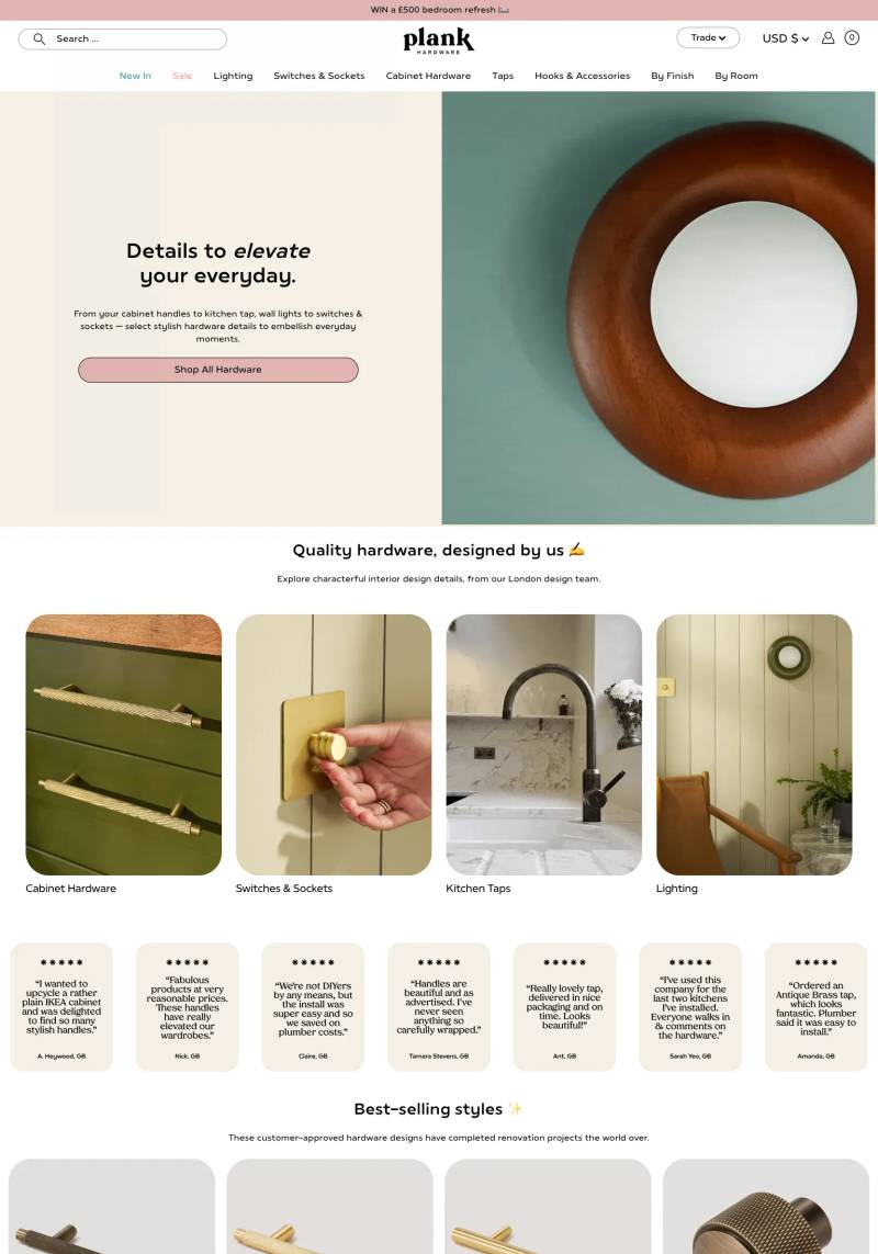 Mimic this
This hardware e-commerce site uses a split hero with "elevate" italicized in the headline and pairs blush pink with sage green to position functional products as interior design details.
 Mimic this
This smart home site leads with "Get next-generation protection for your smart home, for less" over a split hero pairing dark teal background and product collage.
 Mimic this
This video streaming platform site sells "build your streaming empire" with gradient text and badges claiming "NO CODING, NO IT TEAMS, NO UPFRONT SPENDING."
 Mimic this
This smart lock retailer presents products in a flush 2-column grid where black electronic deadbolts butt directly against light gray backgrounds with no spacing between cells.
 Mimic this
This semiconductor site anchors its hero with a tiled "RDM" watermark backdrop and a glowing 3D holographic chip render as the primary visual proof.
 Mimic this
This NFC card product site prices entry at "R149" and "R199" while anchoring urgency with "Pre launch offer only for 1 00 000 people."
 Mimic this
This security camera shop stacks trust badges in a scrolling bar below navigation, then leads with "SAVE 25% SITEWIDE" and strikethrough pricing on featured products.
 Mimic this
StereoLabs
This spatial AI hardware site annotates a warehouse video with product callouts connected by chartreuse lines, treating the real-world environment as the interface.
 Mimic this
This lidar sensor site pairs "CUTTING-EDGE R&D" hero typography with an amber accent stripe listing manufacturing advantages vertically.
 Mimic this
This knife sharpener brand site uses an all-caps serif heading with a hand-drawn gold swoosh and stages products across a dark background with minimal text.
 Mimic this
This mechanical keyboard product page uses a black background with neon chartreuse accents and a hero layout pairing large serif typography with a 3D angled product render.
 Mimic this
This tech accessories site uses a pixel-matrix typeface for all text and stacks full-viewport hero sections, each featuring a single product with "ONE TO POWER ALL" positioning.
 Mimic this
Zeus
This smart lock e-commerce site leads with "World's FIRST fire rated facial recognition digital door lock" and sells the bundle price "$699" in the announcement bar.
 Mimic this
This electronics accessories store uses full-width hero banners with dramatic product photography and stacked "Learn More" CTAs beneath left-aligned headlines.
 Mimic this
This LED lighting e-commerce site centers a purple-to-black gradient glow in the hero, positioning "the very best LED" as italic serif copy against near-black backgrounds.
 Mimic this
This defense technology site positions military drones through cinematic hero imagery and a headline reading "AI-ASSISTED MILITARY GRADE TACTICAL UAS" in industrial condensed caps.
 Mimic this
This mechanical keyboard and design goods site showcases 3D-rendered products in isometric perspective across a minimal grid with no prices or descriptions.
 Mimic this
This gaming peripherals site arranges product categories in a 4-column grid on pure black, with overlapping monitor screenshots dominating the hero and "immerse yourself" as its repeated tagline.
 Mimic this
This AR glasses brand site positions the product with serif italic headlines stating "The Beginning of Real Human Augmentation" and a lime accent color highlighting navigation items.
Design Data
The colors, fonts, and layout choices used across 29 hardware websites.
Background color
How dark or light the page background is (background luminance).
- White / near white 37.9% (11)
- Black / near black 34.5% (10)
- Light 10.3% (3)
- Dark 10.3% (3)
- Mid-tone 6.9% (2)
Accent color
The color of each site's primary button, measured from its code (accent hue family).
- Amber / orange 34.6% (9)
- Black, white & gray 19.2% (5)
- Blue 11.5% (3)
- Teal / cyan 11.5% (3)
- Lime 11.5% (3)
- Purple 7.7% (2)
- Red 3.8% (1)
Hero layout
How the top section arranges its headline and imagery.
- Centered text 30.4% (7)
- Text over a full-width image 21.7% (5)
- Asymmetric 17.4% (4)
- Text above full-width media 13% (3)
- Text left, image right 13% (3)
Hero imagery
The kind of visual the top section leads with.
- Product screenshot 51.7% (15)
- Photography 27.6% (8)
- No imagery 10.3% (3)
- 3D artwork 3.4% (1)
- Illustration 3.4% (1)
Color intensity
How colorful the palette is, from black-and-white to bold color (saturation).
- Soft, muted color 51.7% (15)
- Black & white 41.4% (12)
- Bold, vivid color 6.9% (2)
Percentages are the share of sites where each trait could be measured, with counts in parentheses. Last updated August 2026.
The best hardware website examples lead with the product itself
Product mockups anchor 51.7% of hero sections here, against 12.2% across the broader gallery. That is the widest gap on the page, and it reflects how this category sells: a router, a lock, or a sensor has to be seen before its features get explained. k.no.b.1 opens on a product-screenshot hero against a near-black background, and Syng
 and Ezilok
 both build their entire first impression around the object rather than a lifestyle scene or abstract graphic. Hardware buyers want to see the thing, so the render or screenshot does the selling before a single line of copy loads.
Centered layouts beat the diagonal, split-screen habits of other niches
Centered hero arrangements show up in 30.4% of the sites measured here, well above the 13% rate across the whole gallery. Where consumer software sites often split the hero into copy on one side and imagery on the other, hardware sites tend to stack everything on a single axis and let the product mockup or headline sit dead center. This suits a single flagship product story better than a two-column layout built for feature comparisons. Split-copy layouts still appear (three sites lean left, one right), but they are a minority pattern next to the centered approach.
Near-black backgrounds are almost as common as white ones
Near-black backgrounds account for 34.5% of this page, more than double the 18.1% share seen gallery-wide, and they sit only a few sites behind near-white’s 37.9%. Teyuto , German Bionic
 , Nixeus
 , Ignite Digi
 , Kura
 , Hesaitech
 , and Rabbit
 all commit to near-black, giving their product mockups and photography a stage-lit contrast that white backgrounds can’t match. This is a category willing to go dark to make a device glow under studio lighting, rather than defaulting to the clean white product-page convention seen in general e-commerce.
Muted color dominates, and amber is the accent to beat
Muted palettes cover 51.7% of sites, ahead of monochrome’s 41.4% and far ahead of vibrant’s 6.9%. Among sites with a defined accent, amber leads at 34.6%, with neutral tones a distant second at 19.2%. RAMA WORKS , Taglein
 , EVOS
 , and Defender Cameras
 all sit in the muted camp, showing that hardware branding favors restraint: enough color to guide the eye to a buy button, never enough to compete with the product photography itself.