18 Best Event Planner Website Examples
I found the best event planner websites that book more events.
These sites prove credibility instantly through bold visuals and clear specialization. Here’s how to make your event planner site convert:
- Lead with dramatic visual hierarchy. Syncra uses bold yellow typography against black backgrounds to command attention, while RSVP Art House
 creates anticipation with minimalist yellow accents that make events feel unmissable.
 - Segment your aesthetic by audience. Luxury Loo
 targets upscale planners with sleek black-and-beige sophistication, while The Beach Picnic Company
 uses soft pastels for intimate beach events. Couture Designs
 weaves pink, purple, and gold for Bahamian luxury weddings.
 - Make navigation effortless. Gathrly
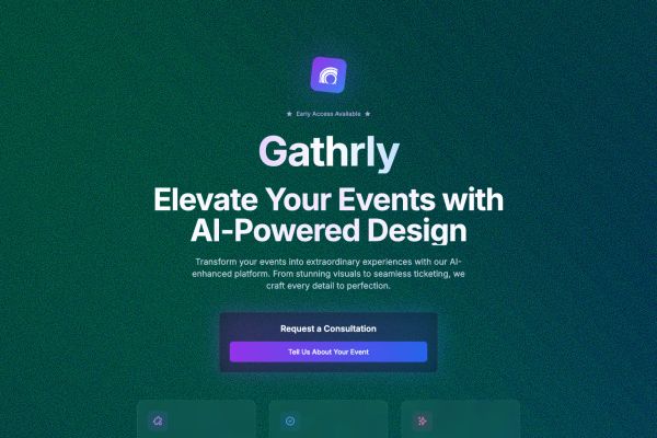 showcases AI-powered planning with minimalist top navigation and centered hero design, while Soundslinger
 uses bold horizontal menus that let festival seekers explore instantly.
Check out these event planner website examples in the gallery below.
Mimic your favorite site with AI!
- Select an image
- Describe your project
- Click generate
- Open in Lovable or copy the prompt to another AI builder
Mimic is free to use and no sign-up is required. Lovable has a free tier.
 Mimic this
This music festival site sells out nights with "SOLD OUT" marquee banners overlaid diagonally across neon event cards in a brutalist condensed typeface.
 Mimic this
This event management platform uses dark backgrounds with orange accent glows and marquee-scrolling client logos to target nightlife professionals.
 Mimic this
This corporate events site pairs a soft pink background with neon yellow CTAs and overlapping photo collages showing people laughing together.
 Mimic this
This event technology landing page uses stacked gradient-bordered buttons and a four-step "How It Works" grid with color-coded numbered circles.
 Mimic this
This luxury event planning site uses a dark editorial layout with serif headings in italic, rotated image diamonds, and forward-slash prefixed CTAs like "/ EXPLORE OUR EXPERTISE."
 Mimic this
This destination wedding site anchors its hero with a styled photograph of a client in front of elaborate floral arrangements, then displays past work as a masonry grid below.
 Mimic this
This event production agency anchors its hero with "bringing **LIVE** back to **LIVE EVENTS**" and displays a mosaic of six to eight event photos on the right.
 Mimic this
This luxury picnic service site alternates blush and sage backgrounds to frame rotated imagery and uses "We like to picnic" as the entire value proposition.
 Mimic this
This elopement planning site italicizes "I Do" in the hero headline and structures packages as expandable accordion cards with serif typography throughout.
 Mimic this
This civil celebrant site mixes serif headings with script accents and sells personality through hero copy: "Hopeless romantic, a little eccentric *and* ready to craft your perfect ceremony."
 Mimic this
This virtual assistant site uses italicized keywords ("*focus*" and "*leave*") in the hero headline and pairs calligraphic script headings with peach watercolor blobs.
 Mimic this
COLLAGE
This fashion industry site layers serif typography and editorial grids to position "Disruptive By Nature™" as a Colorado fashion week platform competing at global scale.
 Mimic this
This portable restroom rental site sells upscale service with split-screen hero pairing "DO YOUR BUSINESS IN FIRST CLASS" headline against luxury trailer interior photography.
 Mimic this
This music festival site uses a scrolling ticker ("BE. HERE. NOW.") and neon color-blocking cards to announce venue details and community impact.
 Mimic this
This event venue site uses serif-italic headlines paired with ghost buttons and a three-column grid of event-type cards overlaid on warm-toned photography.
 Mimic this
4Ever.events
This event catering site pairs a split-tone hero with a numbered serif display system and overlapping lifestyle photography to showcase its mobile gin bar service.
 Mimic this
RSVP Art House
This event landing page pairs a Venice Beach sunset hero with a neon chartreuse countdown timer, using "augmenting in" to tease the AR experience.
 Mimic this
This experiential marketing portfolio uses hand-drawn green accents and a scrolling service ticker to frame "I CREATE IMMERSIVE BRAND EXPERIENCES TO TURN MOMENTS INTO CULTURAL MOVEMENTS."
What the Top 0.1% of Event Planner Websites Get Right
I analyzed these top event planner websites and found three trending patterns that separate the best from the rest.
Visual Identity: Bold Color Psychology and Typographic Contrast
Event planner websites are abandoning safe color palettes for psychologically strategic ones.
- Dark-dominant themes with neon pops: About 60% of sites use dark backgrounds with electric accents. Klevr
 Events pairs near-black with cyan (#00d4ff), while Okeechobee Festival uses psychedelic neon yellow (#E8F54A) against black for maximum impact.
 - Warm gradients for luxury positioning: Roughly 40% of high-end planners like Benja
 and Fitz & Foster
 use warm gradient backgrounds (orange to pink to salmon) to trigger emotional warmth and premium perception.
 - Heavy serif-sans contrast: 8 in 10 sites pair ultra-bold condensed display fonts (Impact, Druk-style) for headlines with clean sans-serif body text. Hottest Summer Ever
 uses brutal condensed caps for “18 MASSIVE NIGHTS” while Laugh
 .Events combines bold serif headlines with clean sans-serif descriptions.
→ Your color palette isn’t decoration… it’s conversion psychology wrapped in brand identity.
Layout and UX: Asymmetric Grids and Scarcity-Driven Design
The best event planner website designs are ditching perfect symmetry for psychological triggers.
- Asymmetric image collages: About 70% use scattered, overlapping photo layouts instead of rigid grids. Simply Eloped
 arranges diamond-rotated images at varying angles, while Laugh.Events uses organic rounded rectangles in staggered clusters to feel more human and approachable.
 - Sold-out overlays as social proof: Premium festival sites like Hottest Summer Ever use repeating “SOLD OUT” marquee banners diagonally across every event card, creating instant scarcity perception even when viewing past events.
- Split-hero layouts with 60/40 ratios: The majority avoid centered hero layouts, instead using 60% text and 40% imagery splits. Luxury Loo dedicates 55% to dark text blocks and 45% to bathroom interior shots, maximizing copy space while maintaining visual interest.
→ Perfect grids feel corporate… strategic asymmetry feels exclusive.
Copy and Messaging: Action-Focused Headlines and Sensory Language
Top event planners are writing copy that triggers immediate action rather than describing services.
- Question-based headlines that create urgency: Sites like Ange Phillips
 lead with “Do you find yourself frustrated by the behind-the-scenes admin that takes up so much of your time?” while Gathrly asks “Ready to focus on growing your business and leave the administrative tasks to someone else?”
 - Sensory experience language: Roughly 80% emphasize physical sensations over logistics. The Beach Picnic Company uses “We like to picnic” and Fitz & Foster promises to “Elevate. Every. Moment” rather than listing package details first.
- Outcome-driven CTAs: Instead of “Learn More,” successful sites use specific action phrases. COLLAGE
 uses “SELL WITH US,” Sinc
 says “Get Started,” and Luxury Loo commands “DO YOUR BUSINESS IN FIRST CLASS.”
→ Stop describing what you do and start promising what they’ll feel.
The best event planner websites understand that people don’t hire planners for logistics… they hire them for transformation. Your website should feel like the experience you’re selling.