21 Best Ecommerce Tech Website Examples
I found the best tech website examples that attract top clients.
Tech sites win when they make complex products feel instantly understandable. These examples nail the balance between technical credibility and business clarity. Here’s what the best sites do:
- Lead with outcomes, not architecture. AI sites like Kurama Studios
 cut through hype by showcasing “production-ready agents that deliver measurable business impact” while Dimension AI
 promises to “instantly convert sketches into precise 3D models.” Your homepage isn’t a spec sheet.
 - Use design to signal technical competence. SaaS platforms like Juump
 pair dark layouts with electric blue accents for that premium tech vibe, while Sparkle’s
 clean split-screen hero and macOS screenshot prove the product works. Janky UI makes people question your code quality.
 - Build trust through progressive disclosure. EUrouterAI
 uses trust badges and centered hero positioning for enterprise buyers, while Developer Tools like LLMagnet
 balance soft lavender gradients with technical credibility. Serve
 both evaluators and decision-makers without overwhelming either.
Check out the full gallery of tech websites below.
 Mimic this
This professional camera accessories shop leads with full-width product photography, orange accent buttons, and a value proposition stating it "crafts premium camera and gimbal accessories designed to save operators time on set."
 Mimic this
This indoor climate monitor site leads with a bird figurine perched on the product, then validates design credibility through Vogue, Wallpaper*, and designboom logos.
 Mimic this
This coaching site pairs a dark navy hero with a woman reaching upward, uses "Live by design, not by default ✦" as a scrolling ticker, and anchors CTAs in gold pill buttons.
 Mimic this
This nasal wellness DTC site leads with "The best gift is better breathing" and uses a horizontal logo marquee featuring CNN, Fox, and Men's Health.
 Mimic this
This sales intelligence site sells lead qualification with "Stop chasing bad leads" and interactive UI cards showing scoring logic embedded in a gray feature container.
 Mimic this
This hardware e-commerce site uses a split hero with "elevate" italicized in the headline and pairs blush pink with sage green to position functional products as interior design details.
 Mimic this
This elder care tech site sells an AI companion through lifestyle photography of an older adult smiling at the device, with serif headlines and pill-shaped CTAs in salmon and green.
 Mimic this
This security camera shop stacks trust badges in a scrolling bar below navigation, then leads with "SAVE 25% SITEWIDE" and strikethrough pricing on featured products.
 Mimic this
This email marketing automation site opens with "It's time to break up with your platform if..." and uses magenta accent buttons paired with purple workflow mockups.
 Mimic this
This audio retailer site pairs product photography with bold all-caps overlay copy like "BASS SO BIG IT HAS WHEELS" and "BORN TO BE WORN" over split-screen hero imagery.
 Mimic this
This e-ink tablet marketplace site frames puzzles as "Handwritten Cognitive Workflow" and organizes products in monochrome line-art grid cards.
 Mimic this
This card game pre-launch page uses isometric 3D cube characters and a "DROP SOON" watermark to build anticipation for a pixel-art matching game.
 Mimic this
This electronics e-commerce site sells tech accessories through lifestyle photography of products held in hands, with inline bold keywords emphasizing "the latest" and "most advanced."
 Mimic this
This tech accessories site uses a pixel-matrix typeface for all text and stacks full-viewport hero sections, each featuring a single product with "ONE TO POWER ALL" positioning.
 Mimic this
This vinyl record cleaning product site highlights its three-step process—"Spray Wipe Play"—in oversized serif numerals alongside the product bottle on dark microfiber cloth.
 Mimic this
This card game retailer uses yellow highlight blocks to break up black uppercase headlines line-by-line, emphasizing copy like "PLAY THE GREATEST GAME OF SOCIAL STRATEGY EVER CREATED, NOW FROM HOME!"
 Mimic this
This football apparel shop pairs cinematic hero imagery of models in artistic jerseys against Roman landmarks with a rotating marquee announcing shipping thresholds across European regions.
 Mimic this
Zeus
This smart lock e-commerce site leads with "World's FIRST fire rated facial recognition digital door lock" and sells the bundle price "$699" in the announcement bar.
 Mimic this
This electronics accessories store uses full-width hero banners with dramatic product photography and stacked "Learn More" CTAs beneath left-aligned headlines.
 Mimic this
This 3D printing shop organizes products across three distinct grids: colorful geometric renders, zodiac statues at uniform pricing, and architectural landmarks with photographic overlays.
 Mimic this
This Shopify page builder site anchors its hero with "The page builder for stunning Shopify stores" over black, then proves it with a full-screen editor mockup showing layered UI panels.
Design Data
The colors, fonts, and layout choices used across 200 tech websites.
Background color
How dark or light the page background is (background luminance).
- White / near white 66% (132)
- Black / near black 24% (48)
- Mid-tone 4% (8)
- Light 3% (6)
- Dark 3% (6)
Accent color
The color of each site's primary button, measured from its code (accent hue family).
- Black, white & gray 34.6% (65)
- Blue 16.5% (31)
- Amber / orange 13.3% (25)
- Green 11.2% (21)
- Purple 7.4% (14)
- Red 6.9% (13)
- Pink 4.3% (8)
- Teal / cyan 3.7% (7)
- Lime 2.1% (4)
Hero imagery
The kind of visual the top section leads with.
- Product screenshot 37.6% (74)
- No imagery 24.4% (48)
- Photography 18.8% (37)
- Illustration 15.2% (30)
- 3D artwork 4.1% (8)
Button shape
Corner rounding on primary buttons (border radius relative to height).
- Rounded corners 47.9% (34)
- Pill (fully rounded) 47.9% (34)
- Square corners 4.2% (3)
Font combination
How heading and body typefaces pair (serif vs. sans-serif).
- All sans-serif 78.2% (61)
- Serif headings, sans-serif body 15.4% (12)
- All serif 5.1% (4)
- Monospace 1.3% (1)
Color intensity
How colorful the palette is, from black-and-white to bold color (saturation).
- Black & white 50% (100)
- Soft, muted color 40.5% (81)
- Bold, vivid color 9.5% (19)
Dark mode support
Sites whose code adapts to the visitor's light/dark preference (prefers-color-scheme).
- Yes 12.2% (11)
- No 87.8% (79)
Most-used fonts
The typeface each site leads with, read from its live CSS.
- Inter 21.8% (17)
- Poppins 5.1% (4)
- Anton 3.8% (3)
- DM Sans 3.8% (3)
- ui-sans-serif 3.8% (3)
Percentages are the share of sites where each trait could be measured, with counts in parentheses. Last updated July 2026.
Best tech website examples default to white, not dark mode
Sixty-six percent of the 200 tech sites in this gallery sit on a near-white background, while only 24% go near-black and dark mode support itself is rare: just 12.2% of sites offer it. That gap matters for anyone assuming tech audiences want dashboards drenched in black. The reality is that most teams ship one clean light-mode surface and stop there. Scrintal , Jodoo
 , and Submt
 all run white backgrounds with black-and-white palettes, and none of them list dark mode support. When a site does go dark, like Gecko
 , DynamicLake
 , or Beae
 , it tends to pair that choice deliberately with dark mode toggling, treating black as a considered theme rather than a default.
Neutral wins the accent war, but blue and amber are real contenders
Neutral tones lead accent choices at 34.6%, with blue next at 16.5% and amber at 13.3%. That ordering means a black-and-white button system, as seen on Peec AI , 3DNS
 , and Votintsev
 , is the safest starting point for a tech product, but it is not the only valid one. Blue remains a legitimate second choice, visible in New Foundation
 and Surmount
 , both of which pair blue buttons with otherwise neutral, white-background layouts. Saturation data reinforces the same restraint: half of all sites are monochrome and another 40.5% are merely muted, leaving vibrant color schemes to just 9.5% of the field. Hyptt
 is one of the few that breaks from the pack with a vivid palette against a near-black background.
Rounded and pill buttons are tied, square is nearly extinct
Rounded and pill-shaped CTAs are dead even at 47.9% each, while square buttons appear on only 4.2% of sites. The median CTA radius of 16px confirms that even the “rounded” camp is generously curved rather than boxy. Surmount and New Foundation use rounded buttons, while Watt and UFG
 opt for pills, and both approaches read as equally current. Ryvn
 is a rare holdout with square buttons, making it an outlier worth studying precisely because it breaks convention.
Hero sections favor product mockups over marketing photography
Product mockups anchor 37.6% of heroes, ahead of no media at all (24.4%), photography (18.8%), and illustration (15.2%). This split shows that tech buyers expect to see the interface before anything else, which is why Jodoo, UFG, and Wawplus
 all lead with product screenshots. Text-only heroes are still common enough to be a real strategy rather than a compromise, as Peec AI, Submt, and HANSMADE
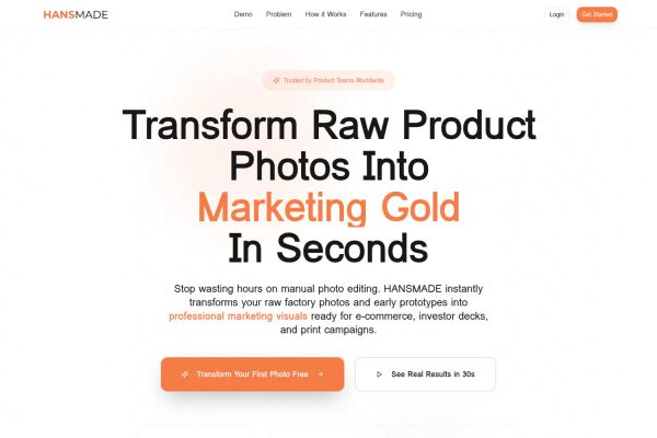 demonstrate. Builders comparing patterns across SaaS Websites, Developer Tools Websites, and AI Websites will find the mockup-first approach repeats across all three, since each depends on showing the product to earn trust.
Typography stays almost entirely sans-serif and system-safe
Sans+sans pairings cover 78.2% of fonts, body text is 94% sans-serif, and Inter alone accounts for 21.8% of all top fonts logged. Serif headings survive only as an accent choice, seen on HANSMADE and Wawplus, or as a full aesthetic swing on Glyph , which pairs Playfair Display headings with an illustrated hero. For a builder scanning Hardware Websites or Cryptocurrency Websites for reference, the lesson holds across categories: legibility-first sans systems dominate tech website design far more consistently than any single accent color or hero style.