Best Website Builder for Designers (The Google Test)
Holy cow does the internet have horrible recommendations for the best website builder for designers. I'm going to set the record straight.


It's honestly disgusting the garbage that's published out there.
When searching for the "best website builder for designers" you're going to find platforms like:
- Hostinger website builder
- GoDaddy website builder
- SITE123
THESE WEBSITE BUILDERS ARE ABSOLUTELY NOT THE BEST BUILDERS FOR DESIGNERS.
They are the pretty good for affiliate marketing... meaning the bloggers included them in there because they are affiliates for those platforms.
And yes, while I do affiliate for some of the platforms in this article, I have thoroughly used them and ranking them solely on their abilities... as you'll see.
Let's Find the Photoshop of Website Builders
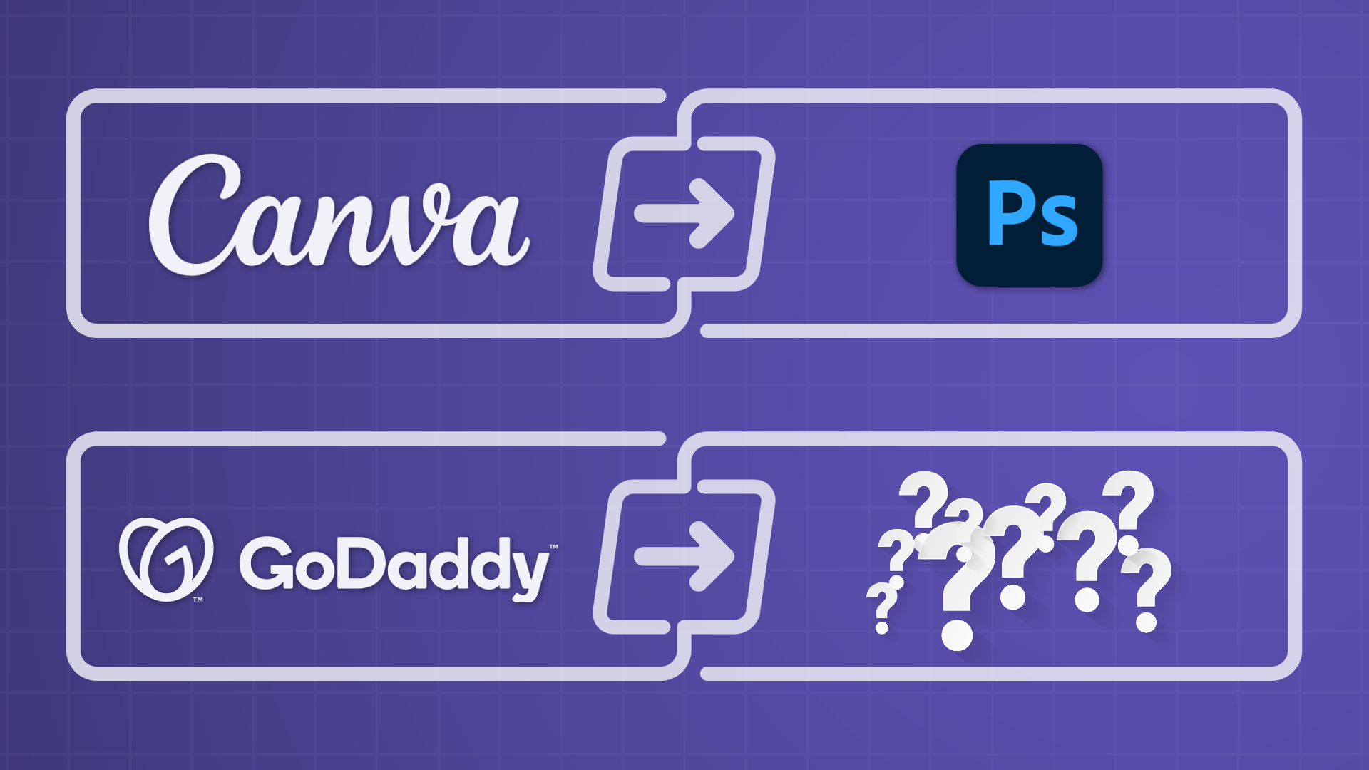
Graphic designers, you most likely use Photoshop.
Why Photoshop instead of Canva?
Easy. Photoshop is exponentially more powerful. Cutting out images, using masks, filters, effects, and the list goes on.
Photoshop is infinitely customizable. Graphic designers are not locked into templates and elements like they are in Canva.
Alright this is all the stuff you already know.
But I bring this up because website builders have similar traits.
Sure a platform like GoDaddy is easier to use so most beginners use it. Just like some people do graphic design on Canva. And while sometimes it suffices, other times it's so limiting and frustrating not being able to unleash your graphic design ideas.
GoDaddy is the Canva of website builders. Let's find the Photoshop of website builders.
What Makes the Best Website Builder for Designers
So when I recommend the best website builder for designers, I'm mainly looking these things:
- How advanced/flexible is the website builder
- How similar is it to design tools (e.g., Figma)
- The quality of the website builder (few bugs, fast, intuitive)
"The Google Test"
One of my favorite ways of testing website builders is by building the Google homepage on it.
Why?
A seemingly simple page actually is very challenging for most website builders. The results are often shocking.
Some of the challenges:
- Two buttons under a form
- Icons within the form (i.e. the search field)
- A navigation with items on the left and right
- Aligning icons with text
Note, these aren't challenges with the web designers, rather the actual capabilities of the website builders.
Notes on the creation:
- I built for desktop only
- I didn't fine-tune (80/20 rule)
- No custom CSS is allowed (I'm testing the builder, not CSS or coding knowledge)
- I used free website designers not paying for pro/paid features
Note
Note, If you're not familiar with the 80/20 rule, it says that 80% of the results come from 20% of the efforts. I would have to put in a significant amount of time to fine-tune. I consider fine-tuning as setting hover styles, mobile designs, and getting alignment down perfectly.
Here's the target (if you haven't seen Google before):
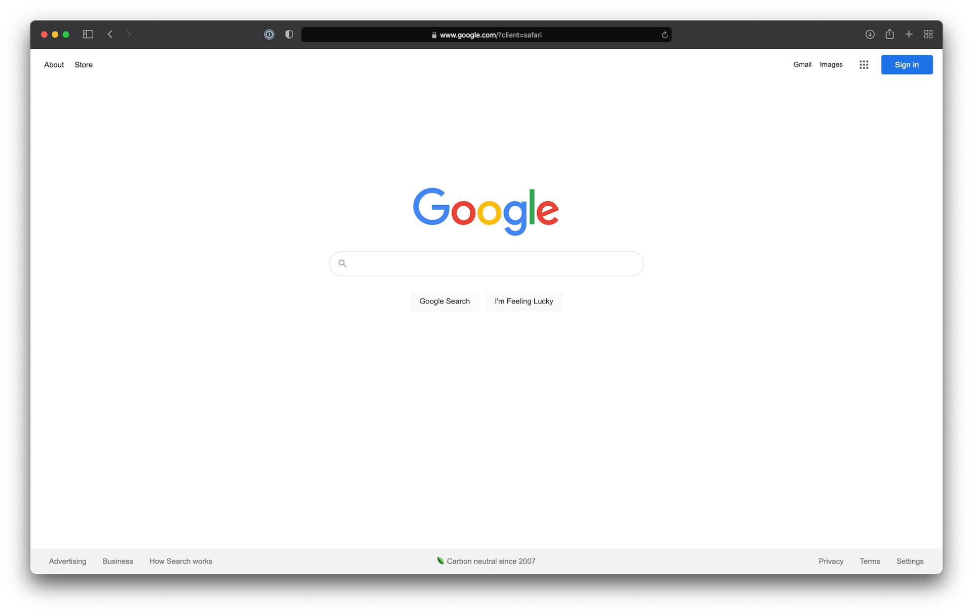
Let's test out these website builders and find the best one for designers!
List of the Best Website Builders for Designers
Some of the ones I test end up not being the best website builders for designers, but I wanted to include them to make a point.
Webstudio: Best for Speed, Maintainability, and Price

Webstudio is an up and coming website builder. It's really good for designers.
It's becoming my favorite website builder (I'm a web designer and developer).
Check out what I was able to build on it:
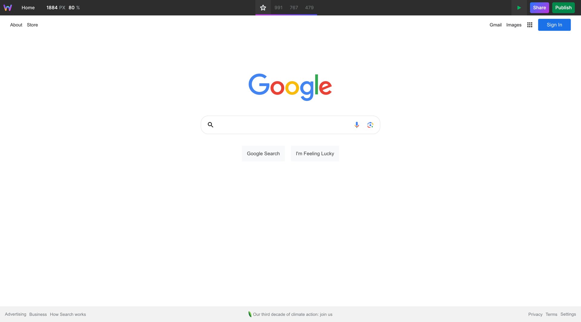
Yeah, it's a spot on implementation of Google. Webstudio passes the test with flying colors!
I made a video of me building Google on Webstudio if you want to get an idea of what it takes.
Webstudio highlights:
- Published sites are the fastest I've ever seen from a website builder (partially thanks to automatic image conversion and compression)
- Whatever you envision you can create
- Generous free plan (like really generous)
- Amazing community
- Amazing SEO tools
- Has a portfolio template if you wish to start with that
- It's open source
Webstudio cons:
- Because it's newer, there are some missing features
- Learning curve if you've never used a tool like it before
Speaking of similar tools, lets go over the competitor of Webstudio, Webflow.
Webflow: Best for Animations and Features
With Webflow, you can make an exact replica of the Google homepage. Webflow is another entirely visual website builder or, in other words, a no-code/code-free website builder.
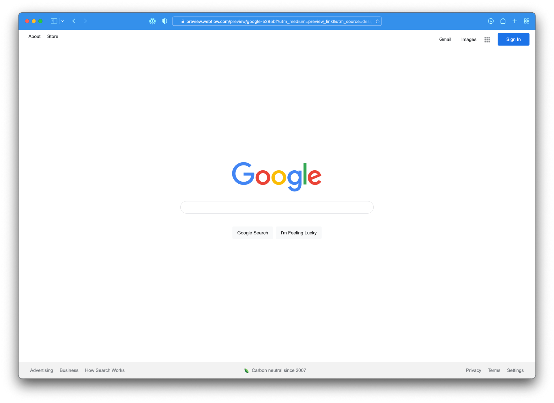
Webflow is one of the best website builders for designers (and it's free to use until you go live!). It has a bit of a learning curve, but the more capable something is, the more learning you'll have to do.
Webflow highlights:
- Very matured platform
- Has strong animation capabilities
- Lots of tutorials online
Webflow cons:
- Can get expensive, quickly
- Sites are harder to maintain due to some of its limitations
- Many requested features sit on the backlog for a LONG time
Webflow has been a dominant player, but recently some other platforms are giving it a run for its money. Checkout this Webstudio vs Webflow article to get a better understanding of these two platforms.
Framer: Best for Lowest Learning Curve
Do you use Figma? If so, you'll love Framer. If you don't use Figma then it'll be a bigger learning curve.
Framer is basically Figma, but you can actually publish it to a custom domain and it's a fully working website!
Because so many designers use Framer, there are amazing websites built on Framer.
Figma is another tool that is able to nail the Google homepage.
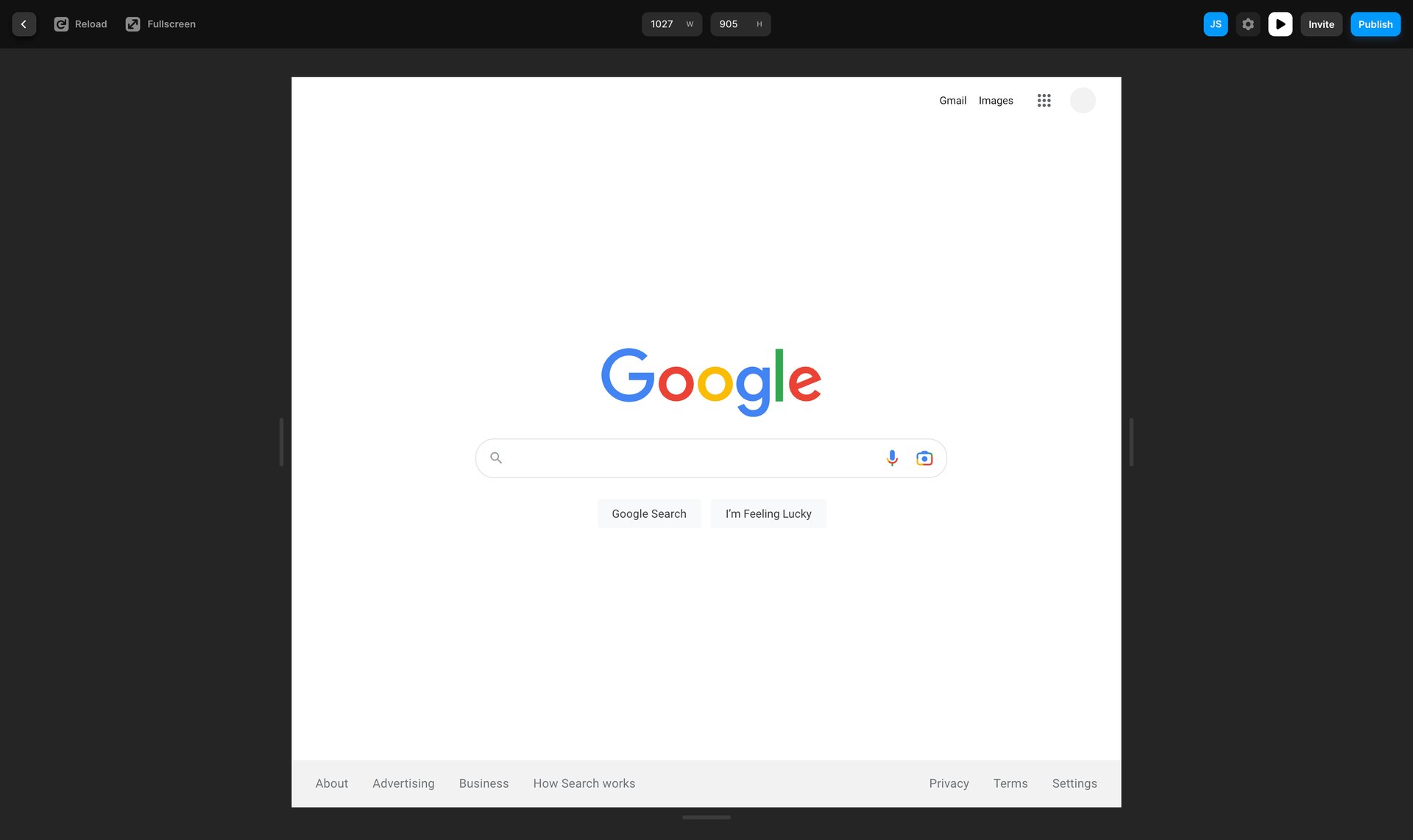
And if you do use Figma, you can actually copy a design out of Figma and paste it into Framer (psssttt credit for the above implementation goes to @iniyavanappu... I copied his Figma design and pasted into Framer to save me a bunch of time).
These platforms are easier to use but lack the flexibility most designers prefer
Duda

I like to think of Duda as a lightweight version of Webflow and Webstudio. It has some CSS styles exposed in the UI vs. most of them.
While Webflow and Webstudio are way more capable, Duda has its own advantages.
Here are some Duda highlights:
- Premade sections and templates
- Flexible row and column tools
- Popular CSS properties exposed in UI
- Great for managing a portfolio of websites
- Makes assumptions about the webpage (can be good or bad)
- Amazing for search engine optimization due to how fast it is
- Built-in analytics tools
- Lots of templates
Designers can make great use of the Duda platform and website builder. It's not as flexible as some of the others, but it's easier to use, and you can still accomplish unique designs.
WordPress / Elementor
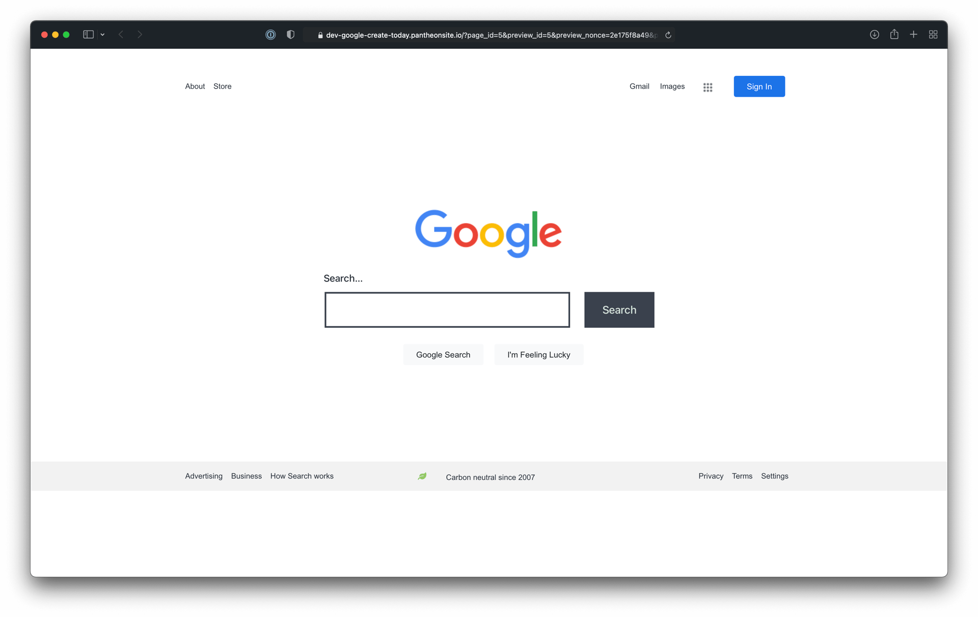
WordPress, unlike Duda, doesn't come with a page builder. It comes with a blog builder, which doesn't achieve multi-column layouts and a lot more necessities.
You have to find your own page builder. I'm not saying Elementor is the best one, but it's very capable. Unfortunately, without the pro version, there was only so much I could do.
I've grown to prefer having the website builder integrated into the platform along with web hosting.
When using a third-party tool, you enter a different mode when designing pages. For example, when you go to a page, you have to open the designer, which hides all of WordPress and only allows you to design.
One downside of this is that when you switch pages, you have to click around a lot, whereas there is a page switcher built-in on the integrated ones.
Designers can make excellent designs on Elementor and WordPress, but there's a lot of baggage that comes along with it. I try to stay away from WordPress unless there is specific functionality that requires it.
WordPress highlights:
- Very flexible because it has so many plugins
- Can manage massive blogs
- Lots of tutorials online
- Can integrate an online store
WordPress cons:
- Have to find web hosting and pay for it
- Not a decent free plan out there
- Can be hard to get search engine optimization dialed in with all the different plugins
- Out of the box it's pretty basic. You need to add plugins to get it useable.
Squarespace
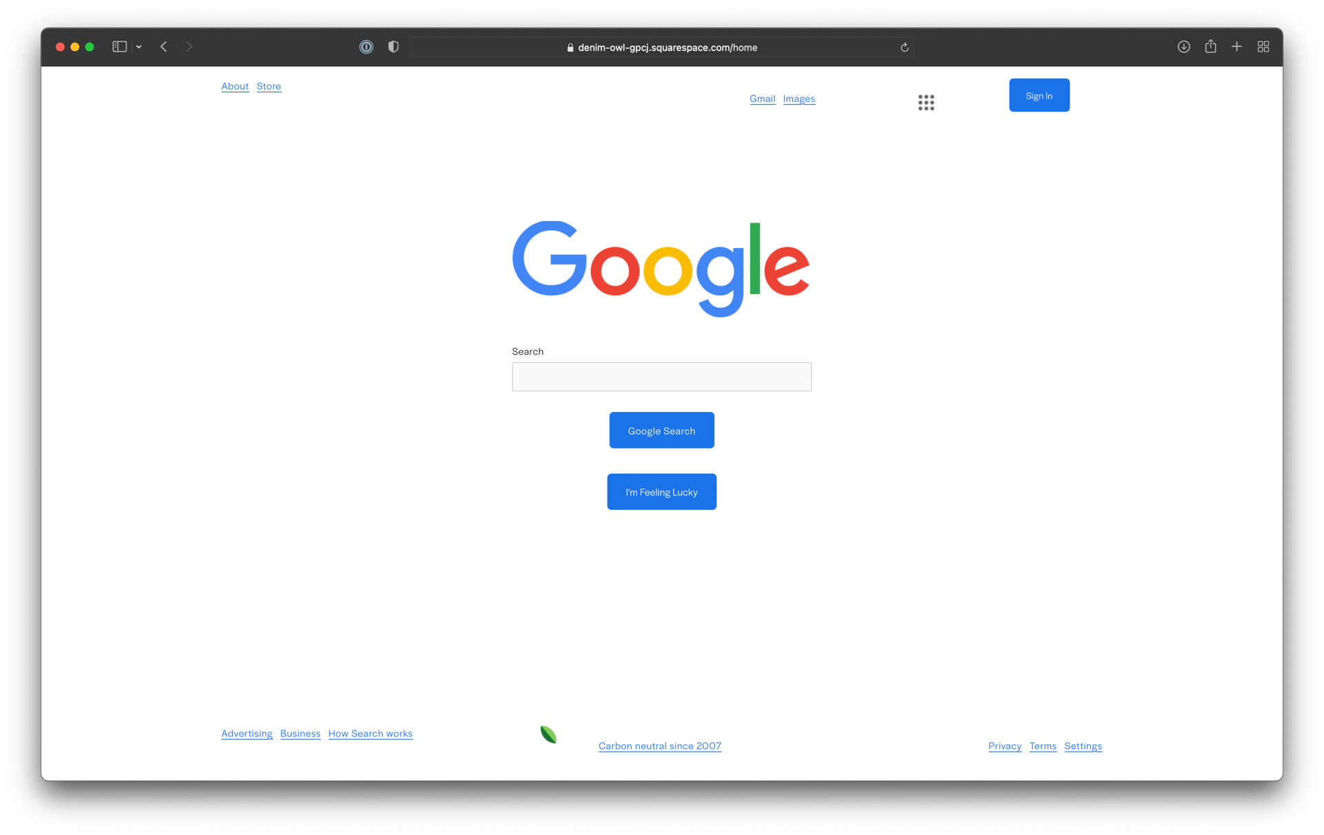
Squarespace is a great platform if you're flexible. This means you can't design freely - you have to work within the constraints of their system.
Their system is very easy to use and outputs beautiful websites. It makes for a great option to create an online portfolio, check out all these Squarespace portfolio sites.
Squarespace highlights:
- Lots of templates
- Lots of features out of the box
- Drag and drop editor
- Can build an online store
- You can build a site very quickly
Squarespace cons:
- Less flexibility
- Some SEO tools, but not everything I'd prefer
If you're looking to build a website with little experience OR build a website where you're okay with working within their designs, this platform is good. If you want to design freely and do things like have different color buttons, then stay away.
Summary and How to Choose Between the Top Three Builders
The three best website builders for designers are:
They are all the best website builders in their own ways.
For picking between Webstudio and Webflow, I prefer Webstudio if it has the features I need. Here's a comparison between the two to help you decide.
Framer is quite different than the first two. If you use Figma, then you will understand Framer without much learning curve at all.
These three are really good. But, they come with a learning curve. They are the Photoshops of website builders.
If you aren't interested in building premium, top-notch sites, then other website builders will suffice. They just aren't as flexible. Rather you have to be flexible. These are the Canvas of website builders.
Happy website building, designers!
